


![]() Ninja Logo PNG
Ninja Logo PNG
The Ninja logo conveys an image of a trained person who knows their business and can make quick decisions. According to the emblem, it is difficult for rivals to compete with him because he is guided not by emotions but by logic and scientific data.
Ninja is the pseudonym of Richard Tyler Blevins, a multimillionaire, professional gamer, YouTuber, philanthropist, #1 streamer in the world, and owner of the clothing brand of the same name. He is originally from Detroit, Michigan, born on 06/05/1991, and then moved to Chicago with his family. According to Time magazine, this blogger is among the world’s top 100 most influential people. He started playing seriously in 2009. In 2021, the number of his subscribers on Twitch was over 16 million, and on YouTube, over 24 million.
After graduating from school, Richard decided to pursue eSports: opening his channel, playing, participating in tournaments, broadcasting them live, and playing for professional teams. He started playing in 2009, choosing Halo 3 as his platform. He was a member of various teams, including Team Liquid, Renegades, and Cloud9, and in 2017, he joined Luminosity Gaming.
Ninja became a real streamer in 2011 when he switched to H1Z1 and PlayerUnknown’s Battlegrounds. Then PUBG appeared in his cyber career, and he won it. But real fame came to him in 2018: that was when he started playing the fateful Fortnite Battle Royale. In March of that year, the gamer broke the record for the most online viewers on Twitch, drawing 635,000 viewers to a single stream. Then he played Fortnite against JuJu Smith-Schuster, Travis Scott, and Drake.
The broadcast prompted Fortnite Battle Royale, Epic Games, to host a charity tournament featuring some of the world’s most iconic streamers. Teaming up with musician Marshmello, Richard Tyler Blevins won a resounding victory in the cyber competition, gaining even more resounding fame. Therefore, it is not surprising that the next month he broke his record of views on Ninja Vegas 2018, gathering 667 thousand live viewers. His Twitch subscriber count has also grown, and he now has the most popular channel.
Blevins has now risen to the level of a multi-millionaire and owner of his clothing brand without changing the logo until 2022. He uses it not only for personal purposes (as an expression of his personal “I”) but also as a mark on T-shirts and sweatshirts (like a print), which he mass-produces, and which has also become a fashionable trademark.
Meaning and History
![]()
Since Ninja is both a nickname, a video channel, a fashion brand, and a personal brand, Richard Tyler Blevins chose himself for the logo. He created a digital image based on personal characteristics. Therefore, the character in the emblem is closely related to its owner. The initial version was most optimized for a real ninja, as evidenced by the angle and bandage on the forehead. A later version reflects the hero’s main feature: his tousled hairstyle, with turquoise-colored strands raised.
2018 – 2022
![]()
The recognition of the simple Ninja logo became mega-huge. He was not only lured away by other gaming platforms but also paid a lot of money. Therefore, there was a time when the esportsman abandoned Twitch, choosing another similar service. Red Ball and Astralwerks signed him. He was the first in the cyber community to be featured on the cover of ESPN’s sports publication The Magazine, effectively recognizing video games as a new sporting trend. He also has many prestigious titles and awards.
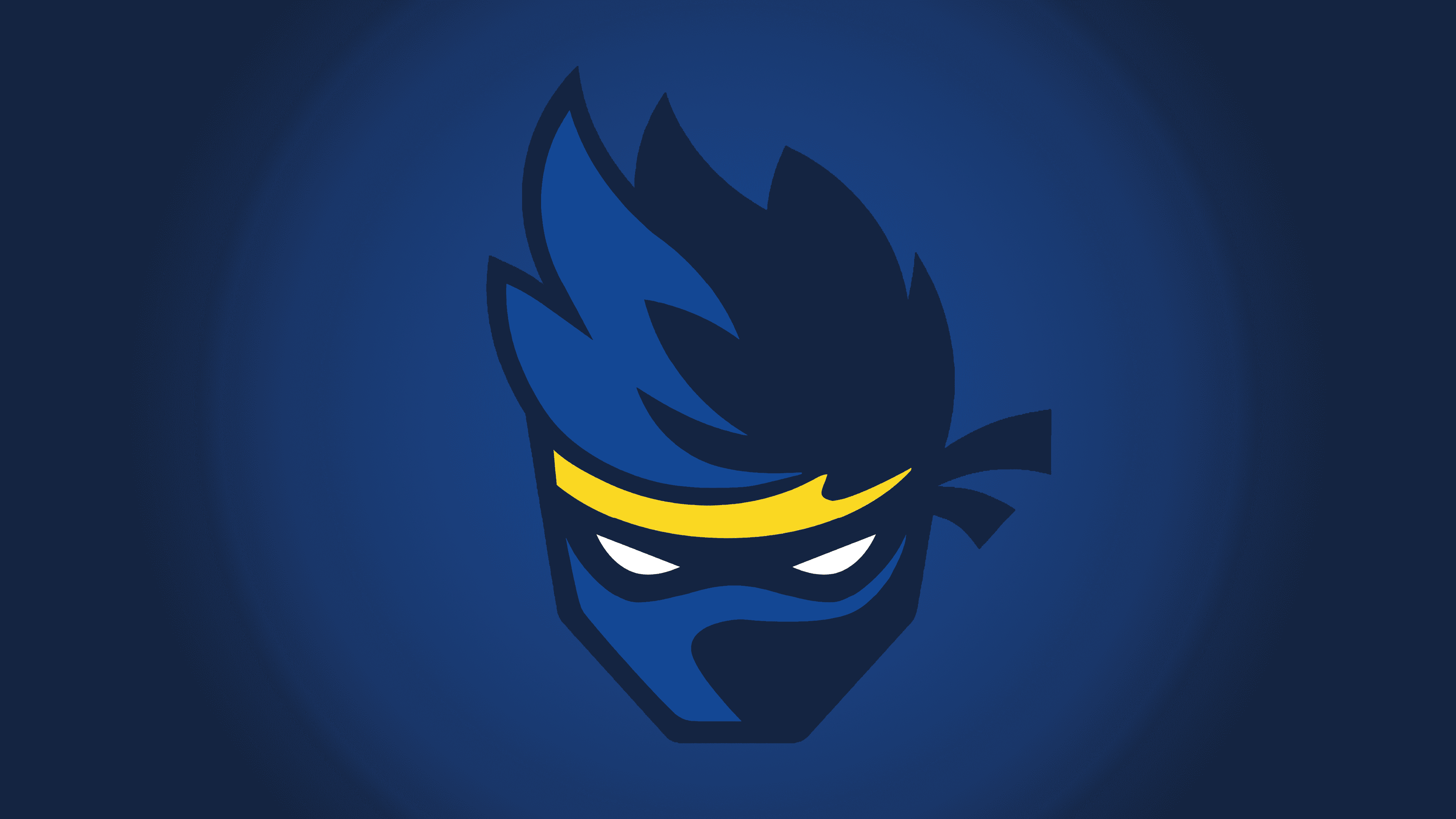
Of course, Richard Tyler Blevins’s personal badge features a ninja image that echoes his nickname. The vertical rectangle depicts a person’s head in frontal view. The look is tense, sullen. Instead of eyes, narrow white slits are drawn. A dark shadow falls from the putative nose on the right side of the face, indicating a nearby light source (monitor). The light flare on the hair on the left also suggests illumination.
The character’s hairstyle is pulled up and features several high strands on top of the head, which Ninja tries to imitate in real life. His hair is tousled and raised, and also dyed blue, like in the emblem. A yellow bandana is tied to his forehead. Richard also wears it in reality. It features a logo with his cyberhero. The upper part of the emblem is light blue; the lower one is dark. Under the character’s portrait are the brand name and the gamer’s nickname.
2022 – today
![]()
Ninja’s identity change brought a simple logo. This time, the emphasis is not on the look and face but on an extraordinary hairstyle. The emblem consists of a distinctive mohawk, formerly popular among punks and goths and now widespread among young people. It is depicted in profile to show the ridges. There are four in total. The tops point up, and to the left, so the face is supposed to be on the right. From this hair position, one can say for sure that the owner of an extravagant hairstyle is looking forward. There is a thin white stripe at the bottom. Next comes the brand name. It is made in a custom font with thickened “I” and “J.” The letter “a” is lowercase, and the rest are uppercase. The contrast between characters creates internal movement and effectively conveys the image’s dynamics.
Font and Colors
For its visual identity, the streamer opted for a custom typeface. The text is grotesque with pointed “N” s, in which the right corner extends beyond the bottom border. All characters are in uppercase. “J” has an elongated crossbar, like the letter “A.” The only difference is that it goes to the left for one, and to the right for the other.
![]()
The word “Ninja” has something in common with the bandana: they are both yellow. The remaining elements are colored blue in two shades. White is also used to paint the eyes.
![]()
After the identity update, the Ninja logo uses a different font. Mostly, it is located in upper case, except for the letter “a.” Two of the glyphs are thickened, so they look mega-bold, while the rest of the glyphs are very thin in comparison.
Turquoise became the predominant color. It is used in its pure form without a gradient. This choice is justified by the shade of the owner of the Mohawk and the brand’s owner, Richard Tyler Blevins. He wears this hairstyle most of the time.