If you’re looking for action-packed action, action-packed adventures, and fast-paced racing, the Nintendo logo platform is what you’re looking for. The emblem promises fresh experiences, a large selection of games, and suitable gadgets to control.
Nintendo: Brand overview
| Founded: | 23 September 1889 |
| Founder: | Fusajiro Yamauchi |
| Headquarters: | Kyoto, Japan |
| Website: | nintendo.com |
Meaning and History
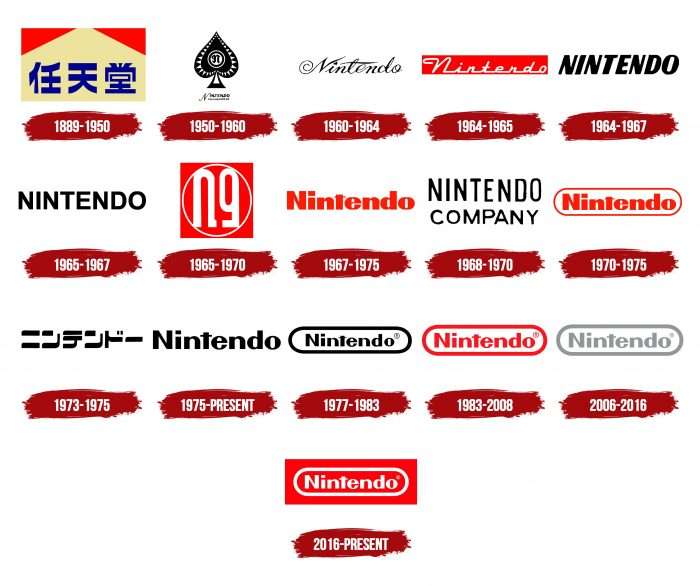
The Nintendo emblem has changed many times – both globally and in a minor way.
What is Nintendo?
It is a Japanese manufacturer of video game consoles and video games, the creator of the famous Mario franchise. It entered the market long before the advent of computers – in 1889. His first products were hanafuda cards; then, the company produced toys for children.
1889 – 1950
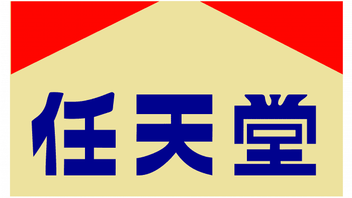
The first logo appeared on playing cards. It was a rectangle with three Japanese characters that read nin, ten and do.
1950 – 1960
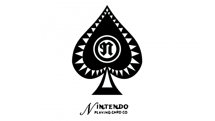
The second brand name contained the English word “NINTENDO PLAYING CARD CO” and the pike symbol.
1960 – 1964
The third emblem is the word “Nintendo” in calligraphic script with a small star instead of a dot above the “i.”
1964 – 1965
The designers changed the font in the fourth logo and placed the company name inside a red rectangle.
1964 – 1967
Simultaneously with the fourth version came the fifth: the word “NINTENDO,” written in bold italic sans serif letters.
1965 – 1967
To simplify the sixth emblem, the developers removed the italics and made the lines not so wide.
1965 – 1970
When Nintendo Playing Card Co. was renamed Nintendo, it introduced its seventh symbol – this time in a red square.
1967 – 1975
For the eighth brand name, the designers used the lettering in red and used lowercase letters.
1968 – 1970
The ninth logo in a hexagonal frame adorned children’s toys. In parallel with it, the tenth was used: the black inscription “NINTENDO COMPANY.”
1970 – 1975
The designers approached the creation of the eleventh emblem thoroughly, replacing the hexagon with a rounded rectangle.
1973 – 1975
The twelfth version with hieroglyphs was used for only two years.
1975 – today
In 1975, the thirteenth brand name appeared with the black word “Nintendo.” It was the only one and the main one until 1977. Now it is found only in copyright documents.
1977 – 1983
For the fourteenth logo, the designers placed the lettering in a rectangle with rounded edges.
1983 – 2008
When Nintendo began producing electronic games, it changed the color of the emblem to red.
2006 – 2016
In 2006, the sixteenth version of the brand name was adopted – gray. The main elements remained in place.
2016 – today
The seventeenth Nintendo logo is white with a red rectangle frame.
Nintendo: Interesting Facts
Nintendo, founded in 1889 by Fusajiro Yamauchi in Kyoto, Japan, has grown from a playing card company into one of the leading forces in the video game industry.
- Origins: Initially making handmade Hanafuda cards, Nintendo pivoted to video games in the 1970s, setting the stage for its future success.
- Early Ventures: Before focusing on video games, Nintendo explored various businesses in the 1960s, including taxis and love hotels, searching for its niche.
- Donkey Kong’s Success: The 1981 release of “Donkey Kong” marked Nintendo’s significant entry into gaming. It introduced Mario, who would become an iconic character.
- Home Console Revolution: The 1985 North American release of the Nintendo Entertainment System (NES) revitalized the industry, launching franchises like “Super Mario Bros.” and “The Legend of Zelda.”
- Innovations: Nintendo is celebrated for its hardware innovations, including the portable Game Boy, the motion-sensing Wii, and the versatile Nintendo Switch.
- Iconic Franchises: Nintendo has created enduring franchises like Mario, The Legend of Zelda, Pokémon, and Metroid, influencing culture beyond gaming.
- Quality Assurance: The “Nintendo Seal of Quality” was introduced in the 1980s to ensure games met high standards, rebuilding consumer trust after the industry crash.
- Pokémon Phenomenon: Through a partnership with Game Freak and Creatures Inc., Nintendo launched Pokémon, a franchise that’s grown into a global multimedia empire.
- Nintendo Direct: These presentations allow Nintendo to engage directly with fans and showcase new games and hardware without traditional media or conventions.
- Cultural Impact: Nintendo has deeply influenced popular culture, with characters like Mario and Pikachu becoming worldwide icons.
From card-making to shaping the future of gaming, Nintendo’s legacy is built on innovation, quality, and a keen sense of what makes games enjoyable.
Font and Colors
The manufacturer’s trademark contains the word “Nintendo.” For those who do not know Japanese, it sounds like nonsense. It is based on three hieroglyphs, which are deciphered as “the temple of free hanafuda.” After all, the company’s first product was precisely hanafuda – one of the varieties of a deck of playing cards.
The logo is written in a personalized font. It features rounded sans serif letters and a small horizontal stroke at the “t.” Throughout history, the palette has changed several times. Commonly used colors are red, black, and white. The same combination is presented in the current seventeenth emblem.
FAQ
What does Nintendo’s logo mean?
Nintendo’s logo uses red, white, and black, each with a specific meaning. Red symbolizes passion and energy, reflecting the excitement in Nintendo’s games and products. White represents purity and innocence, showing the brand’s commitment to family-friendly experiences. Black represents strength and reliability, highlighting the company’s long-standing reputation in the gaming industry.
These colors make the logo eye-catching and meaningful, embodying the brand’s core values. This use of color helps the company maintain its iconic status and connect deeply with its audience.
What is the symbol for Nintendo?
The symbol is a red and white logo created in 2016 and is still used today. This modern design has become iconic in the gaming world. The logo features the company name in white inside a rounded white rectangle on a red background.
Red symbolizes passion and energy, reflecting the excitement and creativity in Nintendo’s products. White represents purity and simplicity, emphasizing the brand’s commitment to creating enjoyable and family-friendly experiences. The rounded rectangle gives the logo a sleek and contemporary look, making it easily recognizable.
The logo’s simplicity and bold colors make it memorable, reflecting the brand’s reputation for quality.
Has Nintendo ever changed its logo?
Yes, the company has changed its logo several times. In the 1960s, with the debut of the “Ultra Machine,” the brand introduced a new logo, replacing the original wordmark from 1960. This new logo used a simpler font with several variations, paving the way for the modern wordmark.
The logo was revised in 1976 to the design that is still used today. It features the company name in a clean, rounded font inside a rectangular border. Over the years, the colors and slight stylistic elements have evolved, but the basic design has remained the same since 1976.
These changes show growth as a company and its ability to stay current while maintaining a strong brand uniqueness.
What is Nintendo’s current logo?
Nintendo’s current logo features the company name in white Museo Sans font, surrounded by a white line forming a rounded rectangle, all set inside a red rectangle.
This modern and clean design makes the logo easily recognizable. The red background symbolizes energy and passion, reflecting the brand’s dynamic presence in the gaming industry. The white text and outline convey simplicity and approachability, emphasizing the brand’s commitment to creating enjoyable, family-friendly experiences.
Why is the Nintendo logo red?
The logo reflects the brand’s heritage, as many of its early logos were red. Using red, the brand returns to its classic roots and moves away from the recent white and gray color scheme.
Red is a bold and vibrant color that symbolizes energy, passion, and excitement. These qualities align well with Nintendo’s image in the gaming industry. This color choice helps the logo stand out and be easily recognizable, capturing consumers’ attention and conveying the dynamic nature of Nintendo’s products.
Returning to the red color honors the company’s history and reinforces its identity as an innovative and engaging entertainment leader.
Who made the Nintendo logo?
Nintendo has not disclosed who designed its current logo, which dates back to 1970 and has reappeared several times with minor changes.
The logo’s long history shows its effectiveness in representing the brand. Its evolution demonstrates how the brand stays current while honoring its roots.
The lasting appeal of the Nintendo logo highlights its importance in the gaming industry. Even without knowing the specific designer, the logo shows the brand’s commitment to providing enjoyable gaming experiences.
