


![]() Nintendo Switch Logo PNG
Nintendo Switch Logo PNG
Plug-and-play the Nintendo Switch logo invites. The emblem symbolizes two ways to use the console: controlling characters from a distance. The elements of the sign represent the game between two partners or teams.
Nintendo Switch emerged during one of the most difficult periods in Nintendo’s history. The Wii U struggled after its 2012 launch because many consumers misunderstood the device, while competition from PlayStation 4 and Xbox One intensified pressure on the company. Nintendo reported its first financial losses in its gaming business, and president Satoru Iwata began work on a secret replacement project internally known as NX.
The concept focused on merging handheld and home gaming into one system. In October 2016, Nintendo officially revealed the Switch through a short presentation video showing a tablet-like console with detachable Joy-Con controllers. The hybrid format immediately attracted attention, especially after years of separation between portable and home devices.
The console launched worldwide on March 3, 2017, alongside The Legend of Zelda: Breath of the Wild, which was originally planned for the Wii U before becoming the system’s showcase title. Within 9 months, Switch sales surpassed Wii U’s lifetime sales. Later in 2017, Super Mario Odyssey became another major hit, while Game Freak confirmed new Pokémon games for the platform. Nintendo later expanded the lineup with Switch Lite in 2019 and the OLED model in 2021.
The system’s popularity continued to grow during the pandemic, with the release of Animal Crossing: New Horizons in 2020. In 2023, The Legend of Zelda: Tears of the Kingdom became one of the fastest-selling entries in franchise history. By the end of 2024, Switch sales exceeded 150 million units, approaching the PlayStation 2’s total.
Meaning and History
![]()
The gadget’s unusual appearance is associated with the concept of unifying the two play styles. For example, gamers in Japan choose portable devices because they play on the road and in online social groups. In the West, users prefer stationary devices, as they play alone at home. The Switch design is hybrid and fits both cultures. Removable controllers can connect the console to a TV screen or be used manually.
Moreover, the word “Switch” was chosen as the name not only because of its association with switching between portable and stationary modes. It is also the idea of switching to a new parallel reality – from everyday life to a bright, entertaining one. Given the importance of this principle, the designers used this word in the logo. There are three logo variants in the history of corporate identity.
What is Nintendo Switch?
It is a gaming console developed by Nintendo that combines the features of both a portable and home system. Its detachable Joy-Con controllers and built-in screen allow gameplay on a TV or in handheld mode. The console supports single-player and multiplayer games and offers exclusive titles such as The Legend of Zelda: Breath of the Wild, Super Mario Odyssey, and Animal Crossing: New Horizons.
2016 (pre-launch)
![]()
The very first logo debuted during the console’s development. It was a working version, a prototype code-named NX. This is what is mentioned in the Sonic Forces announcement trailer. The emblem’s original style echoes the design of the Wii and Nintendo eShop signs. And since this is a temporary version, not a fully formed concept, the inscription “Switch” is absent. The central place is occupied by the company’s name, executed in lowercase. The first letter is an exception; it is capitalized. The word “Nintendo” is in an oblong oval. Alongside, on the right, are the uppercase letters “NX.” All elements are in the same shade.
2017 – today
![]()
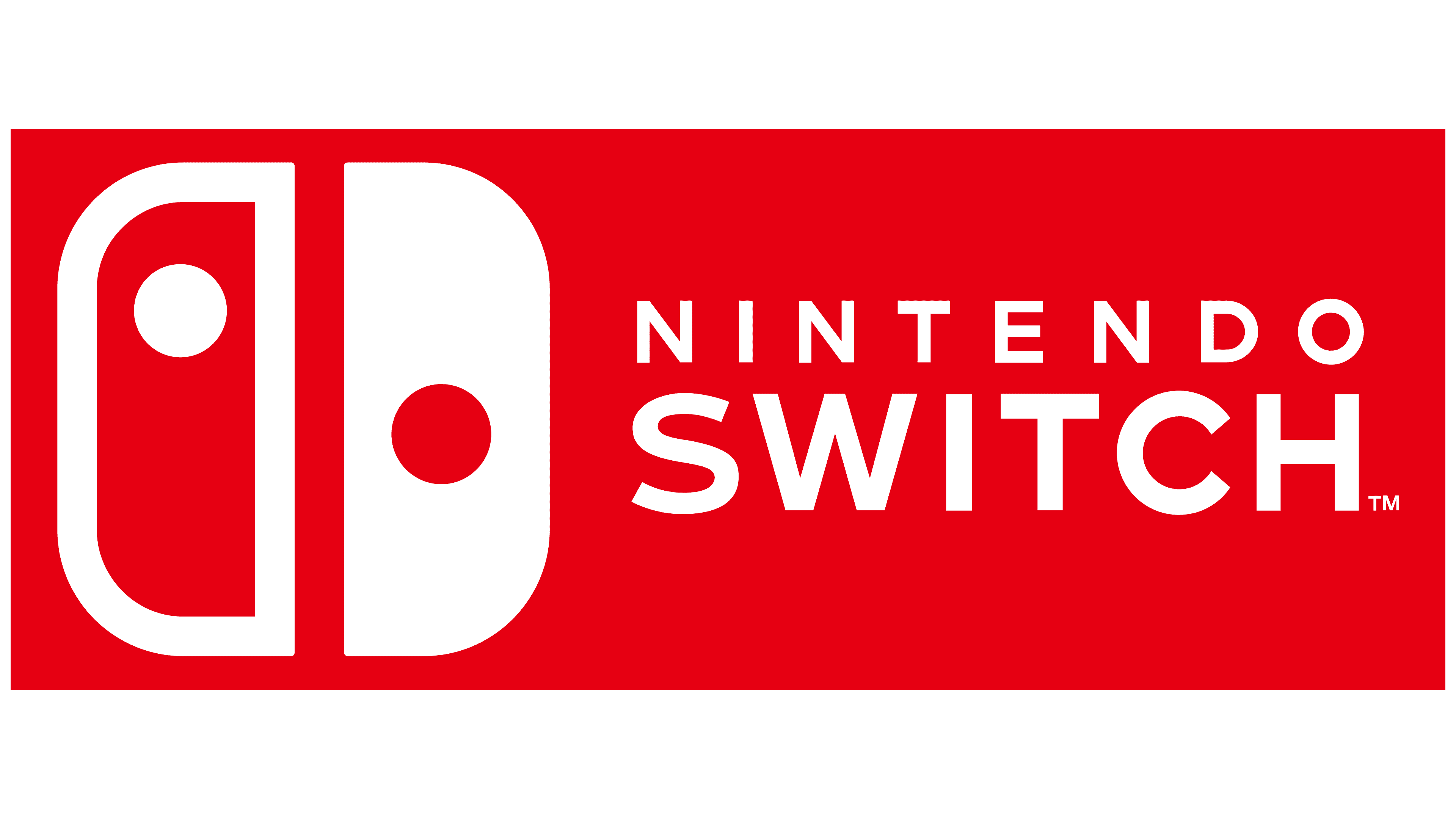
The new-generation game console, bearing a different logo, was launched in 2017. The shape of the key part resembles the side elements of the hybrid console, which are intended for connection and gameplay control. They are arranged according to the principles of the Asian yin-yang signs, side by side but not merged, with contrasting dots on a mirror-image background. This means that one side is colored red with a white circle inside (left), while the other, by contrast, is white with a red dot (right). Below is the name of the prefix, ungrouped into two lines: in the first one, it is written in small grotesque “NINTENDO,” and in the second, it is in large chopped type “SWITCH.” All elements are shown in a red square.
2019 – today
![]()
This logo first appeared on the Nintendo Switch Lite console, released in Fall 2019. It contains only one phrase: the full name of the console’s lightweight model. It is on a single line, emphasizing the last word, and is much larger than the rest of the inscription. All elements are gray.
2021 – today
![]()
In the summer of 2021, the gaming company introduced a new console with a 7-inch screen and a 720p resolution. She called the new Nintendo Switch OLED Model and used this phrase in the corporate logo. The inscription occupies two rows, with the top line emphasized, and the letters are bolder and larger than those in the bottom row. The words are in dark gray.
Font and Colors

The Nintendo Switch’s visual style includes several variations. The standard version features a red-and-white color palette that represents energy and a bold visual identity. Additional console versions use shades of gray to emphasize the model’s reliability and professional character.
The Nintendo Switch logo typography is defined by geometric structure and clean lines. Designers based it on a customized version of the FF Mark typeface, giving the letters a simple yet distinctive form.
Each version of the hybrid console received its emblem. Even the mid-tier model was given a unique design for marketing purposes, allowing it to stand out visually from other product variations.