The Nippon Paint logo fully reflects the enterprise’s scale and one significant event in the brand’s history. Its peculiarity is that it is presented in two versions. The company uses both the old corporate version and the new corporate badge, which appeared after a merger with a large firm. The use of 2 options demonstrates respect for the traditions of the Nippon Paint main holding and positive changes resulting from the capital pooling with the fairly successful Bee Chemical brand. Both badges symbolize the Japanese manufacturer’s incredible power and high quality and important contribution to the global market.
Nippon Paint: Brand overview
| Founded: | March 14, 1881 |
| Founder: | Jujiro Motegi |
| Headquarters: | Oyodo Kita, Kita-ku, Osaka, Japan |
| Website: | nipponpaint-holdings.com |
Nippon Paint is one of the largest paint manufacturers in the world. The company is of Japanese origin. The head office is located in Kita-Ku, Osaka. But in addition to it, the company has dozens of branches in different countries. Subsidiaries are located in the USA, Malaysia, Singapore, Indonesia, Poland, Lithuania, etc.
The company is a true giant in the chemicals industry. In 2020, Nippon Paint was recognized as the world’s fourth-largest paint and varnish manufacturer based on revenue. In monetary terms, it amounted to several hundred billion yen. Such incredible success has been achieved through well-established production, using quality materials, and developing branches in other countries. A stylish and diverse visual identity supports these brand features.
Meaning and History
Modern Nippon Paint uses two variants of the logo at once. One of them was created when the holding was founded and was a badge reminiscent of the symbolism of Japan. It clearly conveyed the solid status of the company at the country level and the scale of its production. The second option is a picture in which all elements focus directly on the company. Generally, the brand’s essence perfectly manifests in the first and second options.
What is Nippon Paint?
Nippon Paint is the name of a well-known Japanese manufacturer that produces various types of paints and varnishes. Among them are paints, fine chemicals, and special substances for coatings. Products are made not only in Japan but also in other countries. Branches of Nippon Paint are located in more than 20 countries. A wide network of overseas affiliates generates an annual income of about 535 billion yen.
1893 – 1984
The prerequisites for creating a major Japanese manufacturer of paints and varnishes were already in 1881. This year, the company’s founder, Jujiro Motegi, opened the Komyosha enterprise. But, after some time, the company expanded and changed its name to Nippon Paint Manufacturing. In 1893, it was already an established brand, which gradually improved its production. In 1927, he reached a new level and received the name still used today – Nippon Paint.
1984 – today
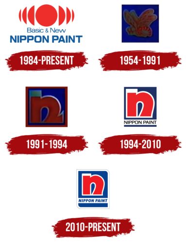
The famous company received its first official logo only in 1984. It was a direct reflection of the origins of Nippon Paint. This was manifested in the choice of a central thematic element, which was a picture similar to the image from the Japanese flag. It was based on a bright red circle symbolizing the sun. It is presented in an unusual form.
When looking at the picture, it seems that there are several more of the same drawings behind it, but a certain part of them is hidden behind the main element. This can be called a real mirror-reflection effect. It can be interpreted as an extension of the scope of activity. In the center is the symbol of the country in which the main production facilities are located, and the remaining parts show branches.
At the bottom was a two-level inscription consisting of the words Basic & New and Nippon Paint. They are written in a plain, sans-serif font. The top mark looks more subtle, while the bottom one is confident and massive. For the design of the inscriptions, a light blue hue was chosen, demonstrating reliability and trust.
1954 – 1991
In 1954, an incredibly significant event for the enterprise took place. Nippon Paint has formed a joint holding company with Bee Chemical. The appearance of a new member was the reason for the appearance of an updated emblem. It was a beautiful picture in the form of a square, inside of which there was a rather realistic image of a bee.
The image of the insect focused on the company Bee Chemical, whose share was 50%. Yellow was used to decorate the bee. The square itself was painted in a rich blue hue, demonstrating responsibility, security, and confidence. In general, the picture favorably emphasized the participation of Bee Chemical and its positive impact on the holding.
1991 – 1994
During this period, the company acquired a new logo, which was created based on the stylized letter n. He imagined the prototype of the modern emblem and demonstrated the company’s desire for renewal. The visual concept in this version involved placing a massive letter n in the center of the picture. The imposing forms symbolized the company’s confidence, success, and firmness in the market.
The presence of a small original serif also confirmed the tribute to the past of the famous brand. Additional characteristics were manifested in the choice of colors. Red symbolizes energy and strength, white – represents openness to new solutions, and blue – represents reliability.
1994 – 2010
In 1994, a more accurate and stylish version of the logo was adopted. The letter n was still used in the basis, but the concept has generally changed. In the word mark, the designers removed the serif, which made the logo more modern, and the Nippon Paint inscription was added at the bottom. The new wordmark was designed in straight, even letters in a capital case.
The combination of these elements looked very harmonious and perfectly emphasized the company’s prestige. During this period, it has already managed to enter the world market and win the trust of millions of foreign customers. The company’s credibility was also emphasized by using blue as a background. Red and white colors were still used for the design of the letter.
2010 – today
The current Nippon Paint logo was created in 2010. The designers used the previous version as a base but made some interesting changes. The font used to design the company name has become smoother and softer. In addition, the italic format has been added. The new design can be interpreted as a course toward development, active growth, and progressiveness. Another important change was the addition of white outlines. Due to this, the logo has become more attractive and expressive.
Font and Colors
Nippon Paint is currently using a beautiful, vibrant logo with all the details perfectly balanced. The inscription and the stylized letter n are designed in a stylish soft font, which features smooth curves and cuts. It also lacks traditional serifs. This style demonstrates innovation, dynamism, and development. The continuation of this thematic line is reflected directly in the colors.
The main element is painted in a rich red hue, and neutral white is used for its outlines. In the context of visual identity, this combination means a balance of energy and measured growth. The color scheme also includes blue. It is a symbol of reliability, safety, and high quality – the basic principles that guide Nippon Paint in its activities.
Nippon Paint color codes
| Pigment Red/span> | Hex color: | #f01b22 |
|---|---|---|
| RGB: | 240 27 34 | |
| CMYK: | 0 89 86 6 | |
| Pantone: | PMS Bright Red C |
| Safety Blue | Hex color: | #07428f |
|---|---|---|
| RGB: | 7 66 143 | |
| CMYK: | 95 54 0 44 | |
| Pantone: | PMS 287 C |
