


![]() Nivea Logo PNG
Nivea Logo PNG
The Nivea logo is a symbol of a cream jar, instantly recognizable and loved by users. The emblem demonstrates the completeness of the action and the contents of a single bottle, which contain all the necessary ingredients for caring for different skin types.
Nivea traces its origins to 1882, when Paul Carl Beiersdorf founded a laboratory in Hamburg that produced medical dressings. His key product was an adhesive plaster, designed to fix bandages without bandages, with no initial focus beyond the pharmacy market.
In 1890, he sold the business to Oscar Troplowitz, who shifted the focus to skin care chemistry. Together with dermatologist Paul Gerson Unna, he explored new cosmetic formulations.
Around 1900, they built on the work of Isaac Lifschütz, who showed that lanolin can form stable water-in-oil emulsions. The result was a cream that did not separate and remained stable without preservatives, unlike earlier products.
In 1911, the cream was launched as Nivea, named from the Latin “niveus”. Early packaging used a yellow tin with floral decoration, and the product was marketed for the whole family through pharmacies and perfumeries.
After Troplowitz died in 1914, World War I disrupted exports and supply chains. Beiersdorf faced similar constraints to Henkel during the war period.
In 1925, the brand introduced the blue tin, which improved shelf visibility and established a long-term visual code. In the 1930s, campaigns focused on healthy, active lifestyles, and in 1938, a sun care product appeared in a metal tube.
World War II led to partial nationalization, raw material shortages, and loss of trademarks abroad, including in the US. Recovery required years of legal and commercial work.
From 1959, the range expanded with body milk, then men’s care in 1963, and broader lines in the 1980s. By the late 1990s, Nivea had achieved widespread recognition in Europe and, in the 2000s, expanded into Asia, Latin America, and Africa, competing with L’Oréal.
Meaning and History
![]()
The company began considering a multilingual emblem after the Second World War, and by 1949, it had an updated brand name. Throughout its existence, the trademark has supplemented the logo three times. As a result, all versions are still relevant (except one).
What is Nivea?
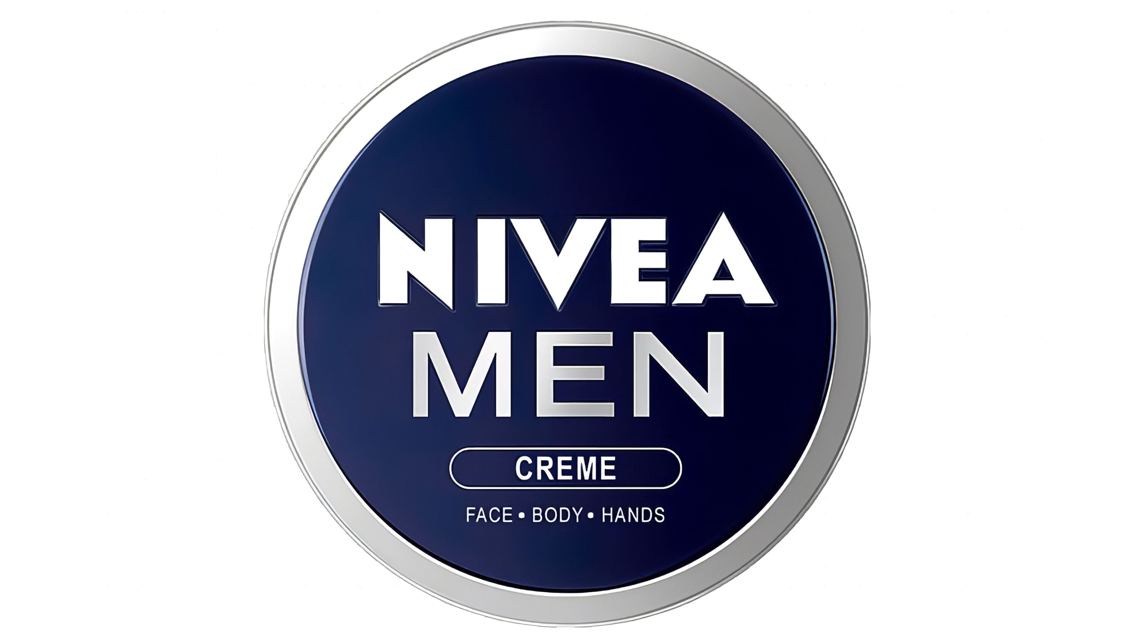
Nivea is a German brand that offers body care products. Its product range includes a wide selection of hygiene products, from hand cream to cleansing preparations. It was launched under its current name in 1911. Its owner is Beiersdorf Global AG.
1925 – 1934
![]()
The Nivea brand, owned by the German multinational company Beiersdorf AG, was introduced in 1911. Under it, a lanolin-based cream was produced. All jars looked the same: small and round, with the brand’s name on their lids. In the mid-1920s, the logo’s design changed: a contrasting font with long, thin serifs was used for the word. At the same time, the white inscription was set against a dark background to make it easier to see. For the same purpose, all glyphs were converted to uppercase.
1934 – 1949
![]()
In the 1930s, the official Nivea logo was redesigned. The designers removed the serifs and made them spiky and aligned in height (previously, the “A” was lower than the other glyphs). The general structure of the typeface resembled Motor Oil 1937 M54 Regular by justme54s, Mesmerize Semi Bold by Typodermic Fonts Inc., or Zeronero Black from Monocromo, but without the protruding “N” corners. A few more similar analogs: Steagal Bold from Insigne Design, Mesmerize Bold from Typodermic Fonts, and Journal Sans New Bold from ParaType. In the main version, the inscription was black.
1949 – 2021
![]()
During that period, there were four variants of the emblem’s design, based on the same type of spelling of the word “Nivea.” They differ only in color: black on white, blue on white, and white on blue in wide and narrow formats.
2004 – 2011
![]()
In 2004, the management decided to play with the shape of the legendary cream jar. To do this, the designers used a familiar design and added a thin, silvery line above and below it, as if it were a reflection of a metal container. The result is a 3D effect.
2011 – 2021
![]()
In this version, a jar of cream is presented on top. Therefore, the logo has a flat blue box with the brand name.
2021 – today
![]()
As in the previous case, the Nivea logo follows the shape of the lid of a round jar of cream, the brand’s first product, which was introduced in 1911. And although the range of cosmetics has expanded since then, the word mark is traditionally located inside the circle. And not simple, but blue is the color of the can. After the 2021 redesign, it became lighter and brighter to attract potential buyers. As for the inscription, it remained white. But the font has changed a bit: now the letters are thinner and more elegant than before. However, it is still a bold, grotesque design with sharp corners where the diagonals meet other lines.
Font and Colors
All versions of the logo use the word “Nivea.” There are no graphic elements in them. Some have a well-defined background: a circle, a narrow rectangle, or a wide rectangle.
The emblem is written in a typeface reminiscent of the commercial type Eagle Bold, with pointed ends at the N, V, and A. The color scheme is stable: dark blue and white.