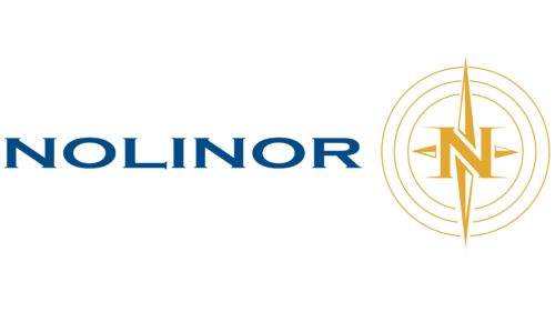
The Nolinor Aviation logo tells the story of a unique company that provides special services to its clients. The emblem signifies elite treatment, comfortable flights, and attentiveness to client wishes, making the brand a model of VIP service.
Nolinor Aviation: Brand overview
Nolinor Aviation is a well-known charter airline based in Mirabel, Quebec, Canada. Founded in 1992 as Les Investissements Nolinor Inc., the company has been a leader in providing exceptional charter passenger and cargo services throughout Canada and the United States for over two decades.
Nolinor Aviation began in 1992 under the leadership of Jacques Prud’homme, a respected figure in the aviation industry. With a single Boeing 737 aircraft, the company sought to redefine the Canadian market through its commitment to reliability and efficiency.
In 2004, Nolinor Aviation made a strategic leap into cargo transportation. Today, the company’s fleet of freighter aircraft efficiently transports cargo throughout Canada and the United States, demonstrating an unwavering commitment to the highest level of service.
With a modern fleet of Boeing 737 freighter aircraft and a team of more than 200 skilled professionals, Nolinor Aviation continues to be a leader in the aviation industry.
Nolinor Aviation’s relentless pursuit of excellence has been recognized with numerous awards, including the prestigious Air Cargo Excellence Award.
Meaning and History
What is Nolinor Aviation?
Nolinor Aviation was founded in 1992 under the registered name Les Investissements Nolinor Inc. The company is based in Mirabel, a suburb of Montreal, Quebec, Canada, and specializes in air charter services. Since its inception, the company has been committed to providing its clients with quality aviation services.
1992 – today
The Canadian airline’s logo stands out for its unique personality. Given the prevalence of coniferous trees in the region, the letters in the company’s name have small pointed tips resembling thin pine needles. This design represents a unique approach to serifs. To the right of the text is a compass arrow that serves as a background for the letter “N.” Both elements are located in the center of three concentric circles and are painted in a golden hue reminiscent of the glow of the sun at dawn or dusk. Light highlights are present in the emblem. The text itself is in a dark blue color.
The dark blue color symbolizes depth and professionalism, which corresponds to the airline’s focus on customer trust and quality of service. The golden hue of the compass and the letter “N” give the brand an element of luxury and aspiration, increasing its attractiveness for the most diverse categories of travelers. The tips of pine needles on the letters link the logo to the local natural landscape, emphasizing the airline’s regional roots and its commitment to sustainability.
