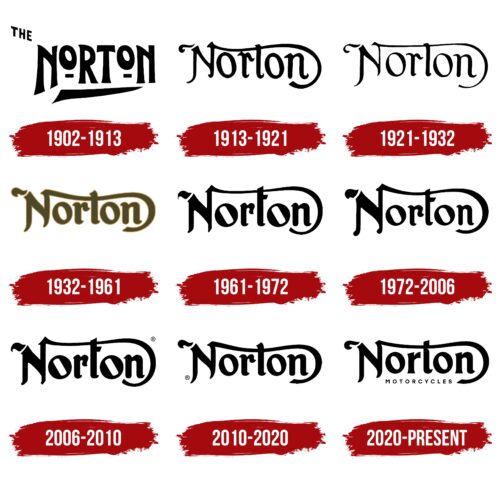
The Norton logo is as elegant and airy as the bikes themselves. The company treated the bikes as works of art, thinking through all the details. The emblem tells about the friendly team that worked on the models.
Norton: Brand overview
| Founded: | 1898, 2008 (relaunched) |
| Founder: | James Lansdowne Norton |
| Headquarters: | Solihull, West Midlands, England |
| Website: | nortonmotorcycles.com |
Norton is an English motorcycle brand owned by the Indian TVS Motor Company since 2020. The company is headquartered in Donington Hall.
Being a legendary engineer, J. Norton assembled motorcycles for friends in his store of parts since 1902. He became famous when he won the Isle of Man TT race in 1907. After that, the demand for the products increased so much that he had to move to more extensive premises and start serial production. Thus began the history of one of Europe’s oldest motorcycle companies, open to the present day.
Meaning and History
The company’s logo has undergone many minor changes, but the overall image and concept have been maintained almost since the first years after opening. This is due to the desire of the owners to preserve the historical heritage left by the founder. Norton himself worked on the logo together with his daughter Ethel. His vision of the style of the company he created and the sophistication brought by the heiress to the empire make the Norton Motorcycle Company unique.
What is Norton?
English manufacturer of the famous Dominator and Commando motorcycles, founded in 1898. The modern factory is located in Solihull.
1902 – 1913
The first logo consisted of disproportionate elements. The O’s in the name was reduced and raised upward.
In addition, the company’s first motorcycles were propelled by a motor-driven belt. The belt was mounted like a bicycle chain on two wheels, small in size.
The lower underline of the inscription in the form of an arrow pointed to travel and roads and symbolized the desire to develop.
1913 – 1921
In 1913, the logo, which became legendary, was designed, consisting of elegant letters with a long rung t, which began at the edge of the N, and on the other side, wrapped around the whole word, descending in a curl over the edge of the last n. The emblem was called the curly N.
The sign showed the elegance of the first models of motorcycles built based on bicycle frames and tires. Remotely reminiscent of the wheels, it hinted at the belt, due to which there was a movement.
The top line, as if hugging the rest of the letters. This design represented protection and care for all employees. The firm became a second home, where were born new inventions of James Norton, who was the so-called “Pa. His children took part in the work, and since 1913, his best friend Bob Shelley has been in charge of the financial side. And the emblem conveyed this spirit of family life that hung over the workshop.
1921 – 1932
The company resumed production of motorcycles after World War I. The logo of this period is shown as the most delicate and elegant of all. This is due to the small flow of bikes going on sale. There was a queue for them, as most of the products went to the state order.
1932 – 1961
The fame of the company was growing. It was noted by the new logo. The sign kept the same look, but the lines became thicker and gold color was used instead of black. The appearance of colors is practically the only case in the first 120 years of the brand’s history.
The noble metal is related to the particular success of Norton during these years. During seven years, starting from 1930, company motorcycles won 78 races out of 92 and 7 out of 9 Isle of Man Senior TT, which indicated an absolute leadership and leading position. The new OHC engine, developed in 1930, especially contributed to its success.
That’s why the emblem shines with the gold of medals and cups. The thickening of the lines indicates the consolidation of positions and the growth of popularity.
1961 – 1972
The year 1960 was a special one in history. The first mass-produced Manxman superbike was launched. One of Norton’s most famous bikes. The 650cc twin-cylinder. It was exported to America, Europe, and even Australia.
An updated logo marked its appearance. In it, for the first time, the encompassing line was no longer the top t-stroke and finally became the ending N, emphasizing the first letter. The change demonstrated the appearance of a leading model, reminiscent of the founder’s last name and the brand’s legendary history.
The lowering of the t and the appearance of its top stroke below the wave also pointed to the special slimline frames developed in the 1960s. They reduced the distance between the rider’s knees and allowed for comfortable bike handling for short riders.
In addition to the slant, the two O’s got rectangular inner holes reminiscent of battery caps and bolts. The pairing emphasis spoke of two cylinders. The appearance of such models allowed the brand to keep up with its multi-cylinder Italian competitors at the races.
1972 – 2006
From 1953 Norton was owned by Associated Motorcycles, which went bankrupt by 1966 and was turned into Norton-Villiers. And in 1972, the government promised to sponsor BSA Triumph, which was close to bankruptcy, if it merged with Norton and AMC. Thus the Norton Villiers Triumph was born.
In connection with this, a new logo was developed. The lettering inside the loop became thinner, and the letters were smaller, demonstrating a decreased share in the overall merger and lower revenues (since the formation of NVT did not improve the financial situation of the three firms).
2006 – 2010
In 1975, production was discontinued, and NVT was liquidated. The rights to Norton were divided among several owners, and the brand existed in fragments for a long time until Stuart James Garner became its full-time manager in 2008.
The logo of this period demonstrates the hope for a successful future and carries a sense of the ground beneath our feet. The letters of the inscription are more solid and strong. They represent a brilliant beginning. Garner opened a major new factory, redesigning and launching updated models.
2010 – 2020
The company received a large government loan and planned to double production. The production of the 961 Commando and the development of the Dominator SS is actively going on. Norton models are racing again.
The new logo shows quiet growth and stability. The sign is balanced and harmonious. The top line is again part of the letter t, reminiscent of the first very successful years of the brand.
2020 – today
In 2020, the company was bought by a major Indian concern TVS Motor Company, making Norton a subsidiary corporation. In connection with this, the embracing feature of the logo took on a different connotation, associated with the support and protection of a stronger partner.
For the first time, an addition appeared in the updated sign: a small inscription Motorcycles below the name. This made the logo more understandable for modern buyers and added style to it since TVS decided to start hand-assembling luxury bikes.
Font and Colors
The main color of the logo is black. It reads the reliability, consistency, and powerful characteristics of superbikes. The shade conveys the global fame and scale of the company.
The font is Noelle Serif modified, unique due to the transformation of the letters N and T. It resembles the Arabic script, which makes it fabulous, alluding to the legendary speed of the models and the history of racing victories.
Norton color codes
| Black | Hex color: | #000000 |
|---|---|---|
| RGB: | 0 0 0 | |
| CMYK: | 0 0 0 100 | |
| Pantone: | PMS Process Black C |


