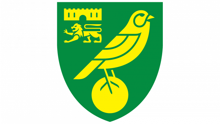
SomeOne recently unveiled a new logo for the Norwich Football Club. Surprisingly, the crest logo has not changed since the 70s, so it looks ridiculous and even comical in modern reality.
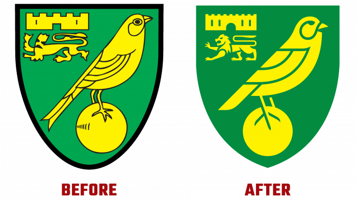
Previously, the logo was a variant of the coat of arms in yellow and green with black edging. The images of a bird with a ball and a lion were stylized in the Middle Ages, and there was also an image of a fortress, which the lion supposedly protects. Looking now at the style of the logo, I want to laugh and cry at the same time. It looks out of fashion, grotesque (especially the image of a lion), does not correspond to the visual design traditions of our time. The bird and the ball look good, and the fortress is too simple. But it should be noted that it was decent and solid for the time when the logo was created.
Finally, the logo has acquired a beautiful appearance and relevance. SomeOne’s creatives have tried to make the coat of arms stylish, sophisticated, sharp for perception. Sharpness is felt in the contour lines, the darkening of the colors, which make the logo as a whole richer and richer visually.
The lion generally becomes a majestic and solid figure on the canvas. The fortress took on a rounded shape, leaving a square base to preserve the legacy of the early logo.
The beautiful bird in the foreground has gaps in the body, which gives the green and yellow lines a balanced combination in the coat of arms.
Also, the logo does not have a signature because this should not be expected from the coat of arms of a football club. This is a business card that should not be interpreted; everyone knows that this emblem belongs to the cool Norwich football club.
Interestingly, the design agency won a competitive tender to improve the brand. And it took almost two years to implement the idea! There were many consultations and dialogues; involved about 5,000 fans as a reference group and club directors, club legends, and staff, so that the result was progressive and unequivocally successful.
The studio believed that the old logo was full of technical flaws, so in the modern era of digital technologies, it is urgent to revive the logo, the images of which were created by hand.
The result of long-term work and cooperation with various experts in the field of sports and not only turned out to be successful. The new logo is an improved version of the old one.
Now fans will be doubly pleased to see such a coat of arms logo. He expresses continuity, respect for the club’s history, and exudes positiveness. Therefore, the football team will perform many sporting feats in a new guise and delight the fans with their victories.
