![]() NOS (broadcaster) Logo PNG
NOS (broadcaster) Logo PNG
The NOS (broadcaster) logo is confident and swift. The symbol reflects the speed of the modern world. It conveys the global flow of news passing through the company. The symbols in the emblem emphasize conciseness and the ability to highlight what’s important.
In 1947, during the post-war era, the Netherlands embarked on a journey to establish a national broadcasting service, laying the foundation for public radio with the NRU. The evolution into television broadcasting saw the creation of the NTS in 1951, marking a new chapter in Dutch media.
The pivotal moment came on May 29, 1969, when the NRU and NTS amalgamated to form the Nederlandse Omroep Stichting (NOS), symbolizing the unification of public radio and television under a single banner. This merger represented a strategic consolidation of resources and talent to enhance the delivery of broadcasting services across the Netherlands.
Through the transformative decades of the 1970s and 1980s, NOS embraced advancements in broadcasting technology, expanding its reach through diversified programming and additional channels. A shift towards producing homegrown content significantly enriched the Dutch broadcasting sphere, reducing reliance on international acquisitions.
Currently, NOS is a prolific content creator, operating several national television channels and a host of national and regional radio stations, all under the NPO umbrella. It has earned its reputation by offering a comprehensive mix of news, sports, cultural, and entertainment programming tailored to the Dutch audience. Additionally, NOS plays a pivotal role in the cultural fabric of the Netherlands by overseeing prestigious musical groups, including the Radio Filharmonisch Orkest.
More than half a century since its formation from the merger of NRU and NTS, NOS has steadfastly pursued its public service mandate. It continues to play a central role in informing, educating, and entertaining the Dutch populace, utilizing a blend of traditional and digital platforms to reach audiences nationwide. In doing so, NOS upholds its commitment to being a premier source of news and cultural programming in the Netherlands.
Meaning and History
![]()
NOS is the result of a merger, so its identity and name rely on the visual symbols of its predecessors. Each rebranding results from changes in broadcasting laws, leading to the reorganization and renewal of NOS’s powers.
What is NOS (broadcaster)?
A Dutch media company that broadcasts via television, radio, and the Internet. Formed by the merger of NTU and NRU. It covers news, international, and sports events. The organization employs 850 workers, half of whom are involved in news.
1947 – 1969
![]()
The history of NOS begins with the union of radio companies Nederlandse Radio Unie. The emblem of this association consisted of three uppercase letters arranged vertically, overlapping.
The choice of this arrangement hinted at the attempt to create a national broadcasting system. However, in the end, each station operated independently, providing its programs for the formation of NRU’s airwaves and using the association’s property. The logo emphasizes teamwork and connection without a dominating firm.
In 1950, NRU became one of the European Broadcasting Union’s founders and joined its ranks.
1951 – 1953
![]()
The second organization that led to the creation of NOS was NTU. This union of television companies was formed in 1951. A flag-like emblem represented its first logo.
Three black uppercase letters indicated the union of many companies into a larger association. The lettering was placed vertically, resembling an acronym, to demonstrate gradual growth and expansion. The letter NTS stands for the Netherlands Television Stichting, which translates to the Netherlands Television Foundation in Dutch.
The inscription was placed on a white cloth with three black stripes running through the center. The white flag symbolized the transmission of signals through clear air. It was associated with honesty and transparency in broadcasting. The black lines represented sound waves. The number 3 is also associated with the three public television channels: NPO 1, 2, and 3.
The flag also resembles the Netherlands’ flag, which has 3 stripes of different colors.
1953 – 1969
![]()
The broadcast program consisted of shows produced by the companies in the association. In 1953, the emblem changed to reflect this feature.
The uppercase letters turned lowercase, and the pompousness the flag gave the emblem disappeared. The grand role initially anticipated turned out to be insignificant. The sign put all media in the union on the same level.
The forward tilt of the letters demonstrated development, keeping pace with time. Television programs covered the latest and most important events. The state-funded programs and the media were required to report events as accurately and impartially as possible.
The first program produced by NTS appeared only in 1956.
1969 – 1994
![]()
In 1969, the state changed the broadcasting law and merged the radio and television unions NRU and NTU to form NOS. The first emblem of the new organization looked very futuristic.
The sign consisted of the three letters NOS, made with individual lines so that the viewer had to guess which letter was being referred to. For example, N was represented by two parallel lines, and O was represented as a solid black mass with a white ring at its center. Each element resembled a square with partially rounded corners.
The inscription conveyed a new, more modern approach to television and radio.
The name is an acronym of the company’s Dutch name, The Nederlandse Omroep Stichting.
1995 – 2005
![]()
In 1995, the logo was slightly modified. The rebranding reflected innovations from the latest broadcasting law. As a result of the transformation, NOS focused only on news and sports events. Other categories were transferred to Nederlandse Programma Stichting. The italics made the letters of the emblem more dynamic, like the constantly changing news. The rich blue intensified the emphasis on professionalism.
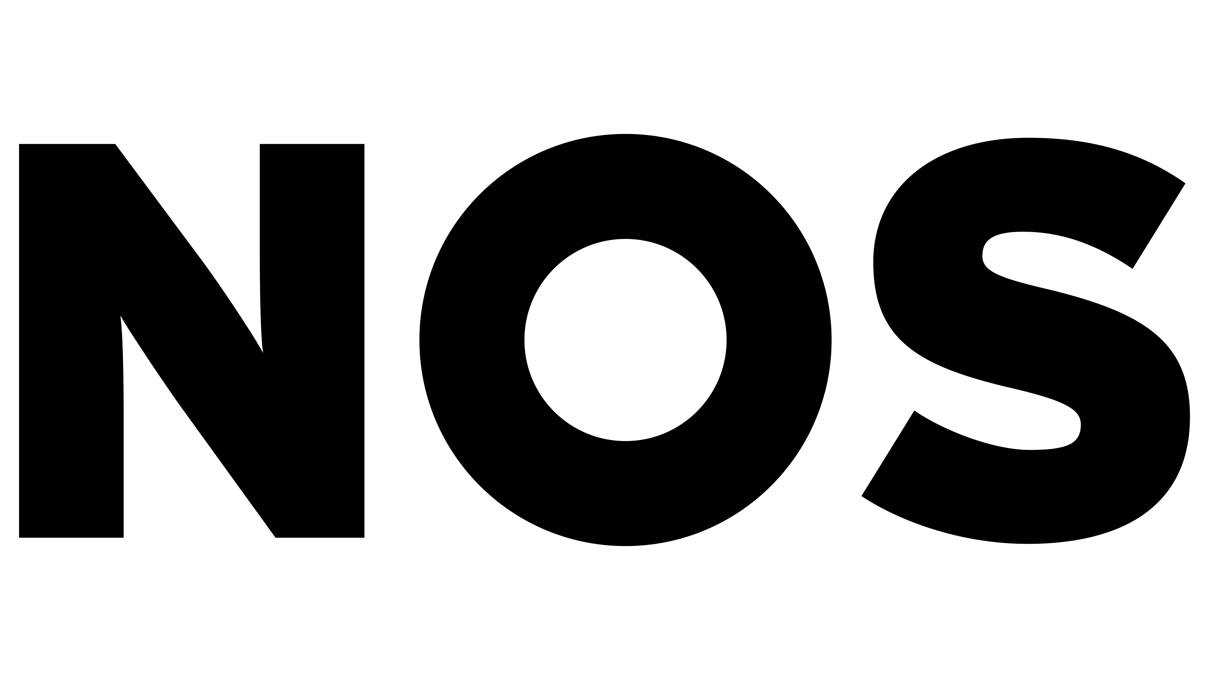
2005 – today
![]()
The company’s modern logo became less cumbersome. It was designed by the branding agency Lambie-Nairn. The three uppercase letters with the red-highlighted font O look more airy and stylish. The color contrast creates an effect that draws the eye to the center, where it focuses on the most important events.
The elongated upward symbols signified the unification of divisions responsible for radio, television, and the internet, and the emergence of mixed groups NOS, NOS News, and NOS Sports.
Font and Colors
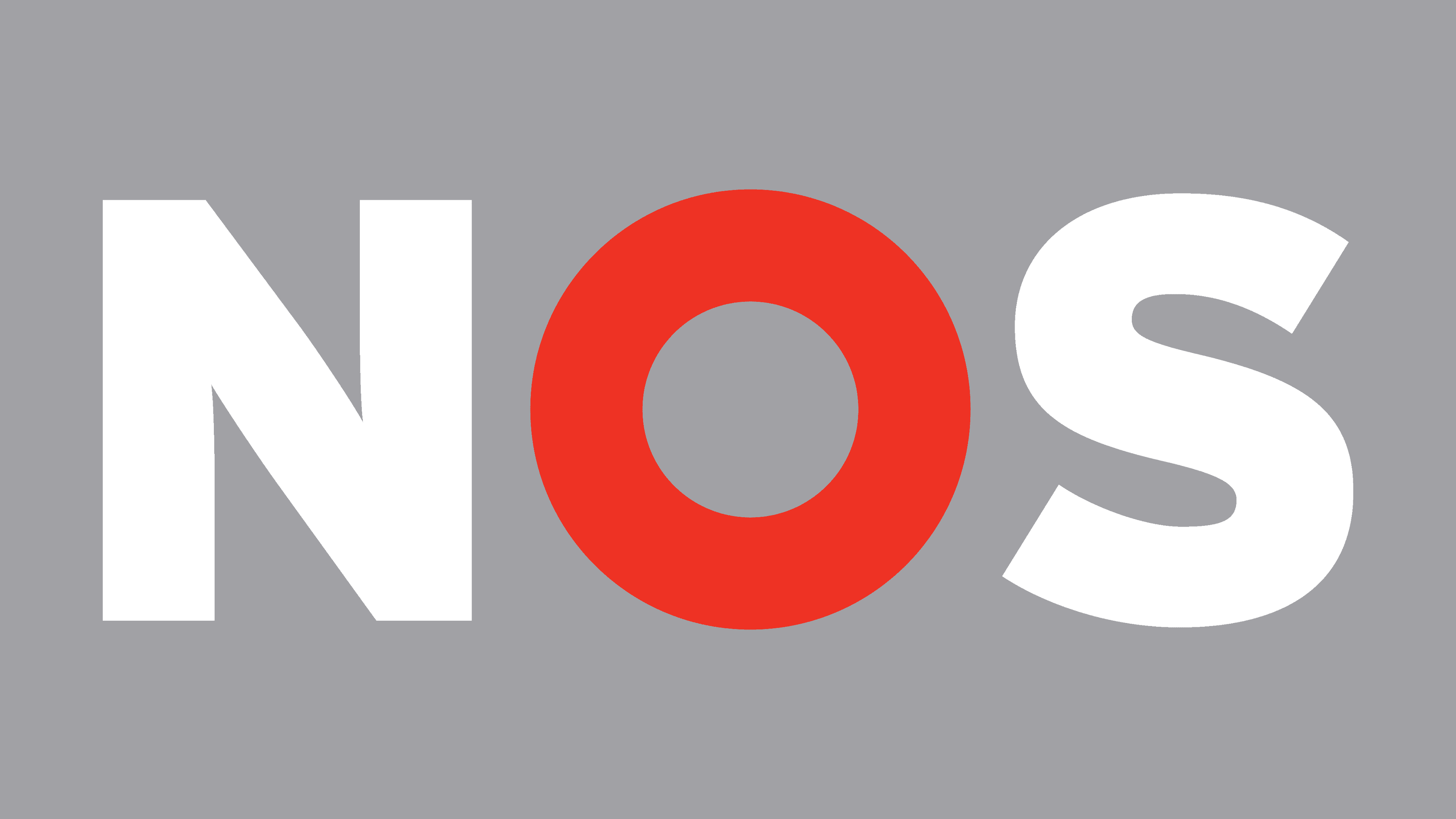
Light gray and red blend well with the company’s broadcasting theme. Gray indicates the ability to filter out secondary events and focus on the main ones. The two shades represent two directions of work. Red reflects sensation, urgency, and the importance of news topics. It signifies speed, which is crucial in sports. Gray is the meticulous work in forming the airwaves, invisible to viewers and listeners.
The font of the inscription is Gotham, with smooth and slender glyphs.