


![]() NOS Logo PNG
NOS Logo PNG
The NOS logo is concise and confident. The emblem resembles a compressed energy sphere that illuminates the path. The symbol inspires movement, speaking of a drink that provides strength and helps achieve goals.
NOS was launched in February 2005 by Fuze Beverage, the company founded by Lance Collins in 2000. At the time, the U.S. energy drink market was growing quickly, with Red Bull leading the way, while newer brands were trying to differentiate themselves through lifestyle niches. Fuze built NOS around car tuning, racing, and performance culture rather than a general extreme-sports image.
The name was licensed from Holley Performance Products, the owner of Nitrous Oxide Systems, a brand associated with engine-boosting equipment since the 1950s. Holley presented NOS as the first food or drink product to use an automotive performance brand’s name and visual identity. Early packaging included blue 16-ounce cans and bottles shaped like nitrous oxide tanks. The original formula contained about 260 milligrams of caffeine per 16-ounce serving.
From the beginning, promotion focused on motorsport, including drifting, racing events, and NASCAR. In February 2007, Fuze Beverage was acquired by Coca-Cola, and NOS entered Coca-Cola’s national distribution network. Broader retail access helped sales rise sharply, while the line expanded beyond the original flavor to include grape and cherry varieties.
On June 12, 2015, Coca-Cola transferred NOS, Full Throttle, and Burn to Monster Beverage Corporation as part of a wider partnership. Monster kept the automotive link and continued working with driver Kyle Busch, who returned to the NOS brand in 2016 after an earlier period with Monster Energy. That same year, the company released NOS Rowdy, named after Busch’s nickname, and later added NOS Zero to meet demand for lower-sugar options.
Meaning and History
![]()
Both the emblem and the name were immediately stylized after compressed nitrous oxide. Since the releasing company obtained a license for the name from Holley Performance Products, the emblem was released after the legal issues were resolved. When approval was granted in 2005, the logo was developed.
What is NOS?
An energy drink owned by Holley Performance and produced under a license from Monster Beverage. It consists of carbonated water, sweeteners, colorings, and toning compounds, the main one being caffeine. It comes in 4 flavors: NOS Original, GT Grape, Sonic Sour, and Nitro Mango.
2005 – today
![]()
The visual sign consists of the drink’s name. An arrow extends from the upper glyph N. The indicator sets the direction forward towards the goal. The emblem promises that the customer will have the strength to move forward with NOS. To continue moving at a steady pace, without delays.
The arrow also points to the theme of speed and racing. Its broad base resembles a track, a finishing straight. The analogy is not coincidental.
The energy drink’s name was chosen based on the internal combustion engine for cars that operate on nitrous oxide. The decomposition of the substance releases oxygen, which is used to power the car. This development is called the nitrous oxide system (NOS). It is mainly used for racing cars.
Nitrous oxide boosts a car’s engine power; similarly, the drink stimulates the human body’s functioning. Interestingly, the trademark rights belong to a company that produces a nitrous injection system for cars. The drink itself was initially available in bottles mimicking a nitrous oxide container.
The letter N seems to embrace the other two symbols, representing the energy drink as an auxiliary component for strengthening and support.
Around the white letters is a black-and-orange outline. The first gives the logo confidence and reliability. The drink has a long-lasting effect and a high concentration of active substances. The second creates the sensation that the symbols are glowing. This technique symbolizes energy. The refreshment that the drink imbues in the consumer.
Below the brand name is a smaller indication that it can contain an energy drink.
Font and Colors
The emblem features three colors: white, black, and orange. White highlights the energy drink’s ability to boost energy and strength. After consuming the drink, the user feels like starting their day anew. It reminds one of the shade of soda and the fizz of bubbles. The color is associated with snow and its invigorating coolness.
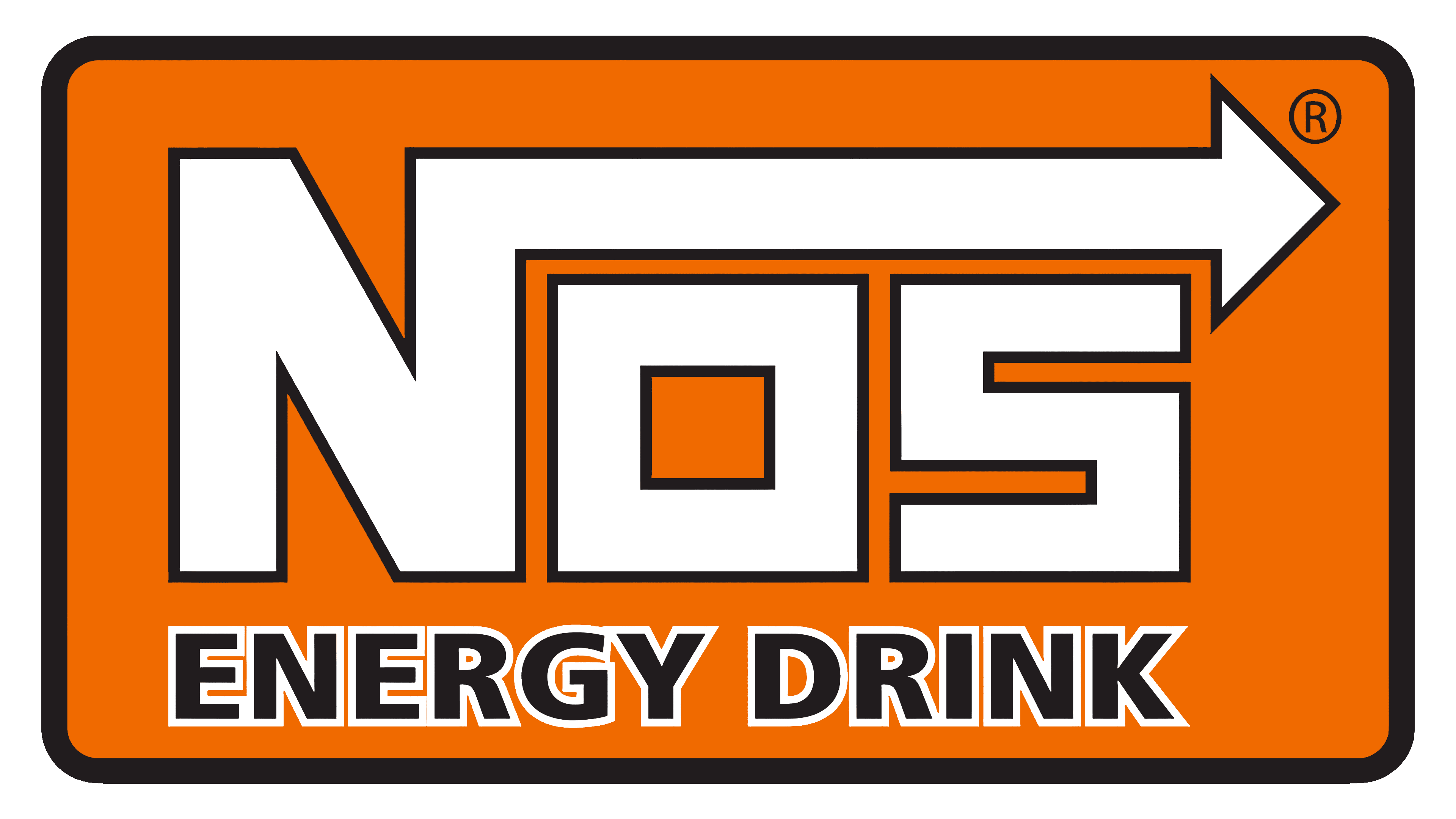
Orange conveys warmth and support. The color is associated with the sun and its energy. It hints at the drink’s mango flavor.
The inscription is made of square letters with sharp angles, emphasizing the formula’s potency.