![]() NWA Logo PNG
NWA Logo PNG
Despite the protest nature of their songs, the NWA logo doesn’t come off as defiant. It encapsulates a range of emotions: bubbling energy, hatred, a desire to stand out, and an urge to shield oneself from injustice. But not protest. The emblem reveals the sacrifices of the social layer it represents and the trials its people face.
NWA began in Compton, a poor and violent district of Los Angeles. In 1986, Eric Wright, known as Eazy-E, used drug money to start Ruthless Records. At first he financed other artists, then became a performer. The group formed with Dr. Dre, DJ Yella, Ice Cube, and later MC Ren under the name NWA, short for Niggaz Wit Attitudes.
In 1987, “N.W.A” | and the Posse introduced the group to a wider audience. The breakthrough came in August 1988 with Straight Outta Compton, released by Ruthless Records through Priority Records. Recorded in six weeks for about $8,000, it described life in Compton through shootings, poverty, gangs, and police abuse.
“Fuck tha Police” caused the largest scandal around the group. In August 1989, the FBI sent Priority Records a letter expressing concern over the song. The letter had no legal force, but police pressure led some venues to cancel shows. In Detroit, police stopped a concert during the track. Without radio support or major TV promotion, the album sold over two million copies in its first year.
Internal conflict soon followed. Ice Cube left in late 1989 after disputes over royalties and released AmeriKKKa’s Most Wanted in 1990, which went platinum. In 1991, NWA released Efil4zaggin, the first hip-hop album to debut at number one on the Billboard 200. That year, Dr. Dre left Ruthless Records after conflict with Jerry Heller and joined Suge Knight’s Death Row Records. Eazy-E died from AIDS-related complications in March 1995 at age 30.
Meaning and History
![]()
Initially, the NWA group consisted of two people: gangsta rapper Eazy-E (Eric Lynn Wright) and rapper-producer Dr. Dre (Andre Romell Young). Later on, other members joined them: Arabian Prince, Ice Cube, DJ Yella, and MC Ren. Forming the core of the hip-hop ensemble, they released their first album, which immediately skyrocketed their fame. That album was “Straight Outta Compton” (1988), debuting the logo that was subsequently used until their final collection, Efil4zaggin (1991).
What is NWA?
NWA stands for the most influential rap group, Niggaz Wit Attitudes, pioneering the gangsta rap subgenre. It was founded by Eric Lynn Wright (stage name: Eazy-E) in 1987 and operated continuously until 1991. Afterward, there were two more active periods in their career, but they weren’t as prolonged as the first: 1999 to 2002 and 2015 to 2016. The musical ensemble was based in Compton, California.
1988 – 1991
![]()
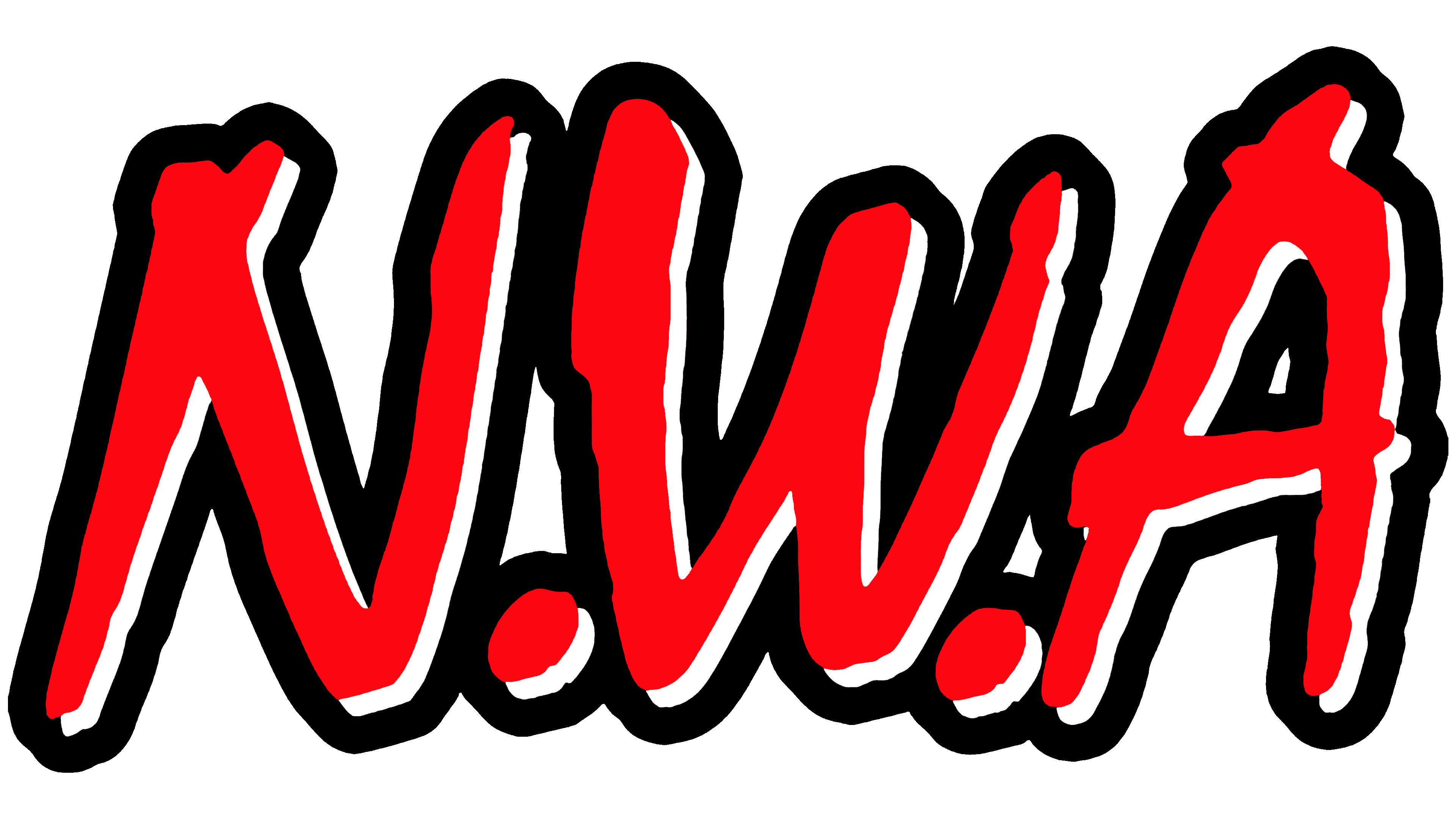
The NWA logo is as unconventional as the musical direction the group represents. It effectively mirrors the intrinsic energy of the genre and the group members. Several factors highlight this: its shape, style, and color.
At a glance, the inscription on the emblem appears like graffiti on a wall or symbols scratched into a fence. This bold design, capturing the protest aesthetics of the rap group, is perfect for the expressive concept of hip-hop musicians. The central letter is flanked by dots on both sides. Conversely, there’s no dot after the “A,” aligning with the grammatical norm for British English.
In terms of style, the logo boasts a balanced blend of sharp edges and smooth contours.
Essentially, it strikes a harmony between elegance and audacity. The bold design is influenced by rebellion and raw energy, embodied in careless strokes. In this way, the typographic marvel has conveyed the pioneering legacy of the musical group that introduced the world to gangsta rap.
The emblem’s color also aligns with a spirit of confrontation, struggle, and explosive energy. It seems like a challenge thrown at society. Primacy is given to red, a symbol of courage, bravery, and freedom. Any of its shades wonderfully contrasts with the rest of the palette, regardless of the background used on the album covers. It conveys the message of these iconic performers.
Font and Colors
The inscription used in the NWA badge seems unique. However, it’s not. The typeface wasn’t specifically designed for the project and had existed for a long time. It was crafted by typographer Roger Excoffon and seamlessly meshed with the essence of the innovative musical style. The font, reminiscent of a brushstroke, is called Mistral. The logo’s palette is red, the color of rebellion, emotional heat, and peak tension.