


 NYC Logo PNG
NYC’s logo is large and imposing, like a metropolis. The logo symbolizes the indestructible spirit of New Yorkers, the city’s importance in U.S. history, and the world-famous skyscrapers reaching up to the clouds.
New York’s history as a global name began before its modern identity took shape. In 1524, Giovanni da Verrazzano became the first European to enter its harbor. In 1609, Henry Hudson, sailing for the Dutch, traveled up the river later named after him. In 1624, the Dutch West India Company founded New Amsterdam at the southern tip of Manhattan.
In 1626, Peter Minuit acquired Manhattan from the Lenape for goods worth 60 guilders. The settlement grew through the fur trade and stood out for its religious tolerance and a diverse population of Dutch, Walloons, French, Germans, and the first Jews, who arrived in 1654. In 1664, the British took New Amsterdam without firing a shot and renamed it New York after the Duke of York.
During the American Revolution, New York served as a British base from 1776 to 1783. In 1789, George Washington took the oath there as the first US president. The 1811 Commissioners’ Plan imposed Manhattan’s street grid, while the Erie Canal, completed in 1825, linked the Hudson River to Lake Erie and turned the city into the country’s trade capital.
In the 19th century, New York became the main gateway for immigrants through Ellis Island, which opened in 1892. The Brooklyn Bridge opened in 1883, the Statue of Liberty arrived from France in 1886, and the five boroughs united in 1898. The 20th century brought the Harlem Renaissance, the Chrysler Building, the Empire State Building, the 1970s fiscal crisis, and competition with London and Los Angeles. After September 11, 2001, One World Trade Center opened in 2014.
Meaning and History
The first settlement on the site of the metropolis was founded by Dutch settlers in 1624. They called it New Amsterdam. The settlement received city status in 1653, and 11 years later, it was renamed New York after the British conquest. NYC served as the capital of the United States for five years, beginning in 1785. President Washington was inaugurated here. The city’s active growth and formation began in the early 19th century with the mass resettlement of immigrants and Native Americans.
Originally, the city had a seal used to seal documents. The logo came much later and has not changed.
What is NYC?
An American metropolis consisting of five administrative districts, the most famous of which are Manhattan, the Bronx, and Brooklyn. The city is home to the United Nations headquarters, the Plaza Hotel, the Empire State Building, and Carnegie Hall.
2007 – today
The logo is an abbreviation of the first letters of New York City, written in bold black letters. The abbreviation is so recognizable that it does not require deciphering. The city’s name dates back to 1664, when the British owned the land. They named the settlement in honor of the future King of England, James, the second-born Duke of York. King Charles granted the territories to his brother James during the colonization of the land. The colonizers, therefore, named the towns after him.
The boldness of the letters shows the scale of the city and its role in the public life of the United States. The metropolitan area is home to nearly 8.5 million people, and with the suburbs, 19.7 million.
The Seal
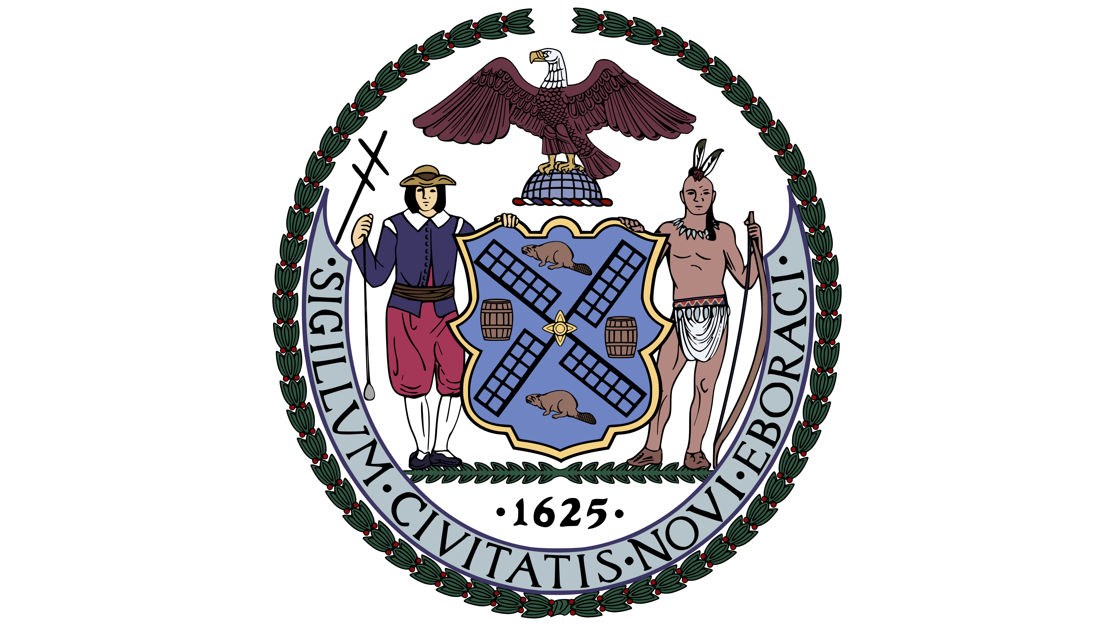
The NYC Seal is used to sign documents and mark the community’s property. The modern version of the stamp does not match the original. The mark underwent several changes as the city transitioned from Dutch to British, and then to American rule. Evidence of stamps is from 1630, 1654, 1669, 1686, 1735, and 1784.
In the modern version (developed in 1915 and added in 1977), the seal depicts a native representative and a sailor-colonizer from Holland. The city’s first land (Manhattan Island) was purchased from the Manahatta tribe.
The Indians were engaged in hunting. That is why the aborigine has a bow in his hand. The settler holds a sinker, and Jacob’s staff rests on his shoulder. The objects are considered sailors’ navigational tools that helped them arrive in America.
Both parties to the treaty are relying on a shield made of animal hide. The dressed hides were used for drawings and messages. In this case, it bears the first goods of the settlement.
In the center is a windmill, reminiscent of Amsterdam, the capital of Holland, after which the city was originally named. Nearby are two barrels of flour. Before the arrival of the colonizers, the natives did not know what bread was. Moreover, in 1674, New York obtained the exclusive right to produce and sell flour in the colonies, a privilege that contributed to its prosperity.
In contrast, beavers sit on the two barrels at the top and bottom of the shield. The first settlers survived by selling their skins. They sent furs to Europe to have them made into hats and to receive other goods. The Indians helped a lot with this. The natives paid in hides rather than money and taught the colonists how to obtain the fur.
After the United States’ founding and the colonies’ liberation from British rule, an eagle was added to the NYC seal, replacing the English crown that had previously appeared on it. The bird became a symbol of strength and freedom. It stands for the Northern Hemisphere, where America is located.
The date below the shield indicates the year New Amsterdam was designated as the colony’s main fort. Across the bottom circumference is an inscription in Latin of the seal’s affiliation with the city. It uses the Latin name of New York, Eboraci.
Font and Colors

The logo’s primary color is black, a shade of reliability and authority. It is fitting for a dynamic metropolis with a rich history, serving as a global center of commerce, fashion, and art, attracting tens of millions of visitors annually.
The typeface style evokes the strict geometry of urban blocks and the silhouettes of modern buildings, setting an energetic tone for the entire composition. Sharp lines and consistent stroke thickness create a stable visual impression. The vertically stretched letters resemble skyscrapers that shape the city’s recognizable skyline. The typeface is similar to known design solutions such as VLNL Brokken, which is distinguished by its angled letter endings, adding uniqueness and expressiveness.