


![]() O2 Logo PNG
O2 Logo PNG
Communication between people is like oxygen, says the O2 logo. It is necessary to maintain life and transmit important information. The emblem shows that the operator unites people and multiplies their connections.
O2 traces its roots to 1983, when British Telecom and Securicor created Telecom Securicor Cellular Radio Limited. On January 7, 1985, the venture launched Cellnet, only six days after Vodafone, making both companies early leaders in the UK mobile market.
Cellnet first served mainly business users, while mobile phones were still expensive. Through the 1980s and 1990s, coverage expanded, and by the late 1990s the company had become one of Britain’s main operators. In 1999, British Telecom bought Securicor’s 40% stake for £3.15 billion, when Cellnet had about 5 million customers. The network became BT Cellnet, and in June 2000, it launched the world’s first commercial GPRS service.
BT later moved to separate its mobile arm after costly international expansion. In 2002, BT Wireless became mmO2 plc, and on June 18, 2002, BT Cellnet was renamed O2. The rebrand covered the UK, Ireland’s Esat Digifone, and Germany’s Viag Interkom. Lambie-Nairn created the identity around the oxygen formula, with bubble imagery by Jonathan Knowles and the slogan “See what you can do.”
O2 competed with Vodafone and Orange while building a more human consumer image. It sponsored Big Brother on Channel 4 and Arsenal shirts in the early 2000s. In 2005, mmO2 became O2 plc, then Telefónica bought it for £17.7 billion, completing the deal in January 2006. The brand stayed in use. In 2007, O2 took naming rights to The O2 arena in London, and in 2021, O2 UK merged with Virgin Media to form Virgin Media O2.
Meaning and History
![]()
The constant changes in this company’s history could not help but affect its identity. This is associated with frequent logo updates – the telecommunications service provider tried to make its style more memorable and chased the current trends, experimenting with graphics and color palettes. However, its last sign is nothing unusual: it looks like standard blue lettering.
What is O2?
O2 is a brand under which the Spanish company Telefónica provides telecommunication services in the United Kingdom, Slovakia, Germany, and the Czech Republic. It was established in 2001. O2 offers mobile connectivity, television, and broadband internet, and actively develops new technologies.
1985 – 1990
![]()
From its inception until 1990, O2 (UK) was known as Cellnet Ltd. and was distinguished by its blue honeycomb logo. The designers have combined seven hexagons, laying them out in a honeycomb pattern: one in the middle and the rest on the sides, spaced equally apart. At the bottom was the word “Cellnet” in a bold, vertically drawn sans-serif font.
Both the lettering and the drawing seemed to be tilted back. A violation of proportion created this impression: the lower elements were larger than the upper ones; therefore, they were perceived as the foreground.
1985 – 1988
![]()
In parallel with the blue emblem, there was another: a black one. She was her exact copy, except for the changed color.
1988 – 1990
![]()
In 1988, the all-black logo was replaced by a three-dimensional black-and-white version. The octagons turned white, and the spaces between them darkened. There is also a small black shadow under the combs.
1990 – 1999
![]()
After 1990, the company updated the logo but retained the “Cellnet” label, as it was still known as “Cellnet”. At the same time, the designers changed the font and converted all letters to lowercase. The graphic sign acquired a violet-blue gradient and took the form of two ovals composed of diagonal lines, superimposed on one another.
1999 – 2002
![]()
In 1999, the telecommunications service provider was partially acquired by the BT Group and renamed BT Cellnet Ltd., a name that remained in use until 2002. During this period, it used an unusual, very colorful logo depicting the upper body. This look was taken from the BT logo designed in 1991 by Wolff Olins. The original character was nicknamed The Piper because he was holding a pipe.
The new company name was written at the bottom in letters of the same height. In this case, the first part (“BT”) was in uppercase, and the second (“cellnet”) was in lowercase. The colors were also different: the developers combined dark blue and a rich red. The font has rounded corners.
2002 – today
![]()
In 2001, BT Cellnet spun off from the BT Group as mmO2 plc. The current name, O2, was adopted in 2002 after the organization’s restart. The brand name became the basis for the new logo. The designers made it dark blue and placed it on a white background.
Font and Colors
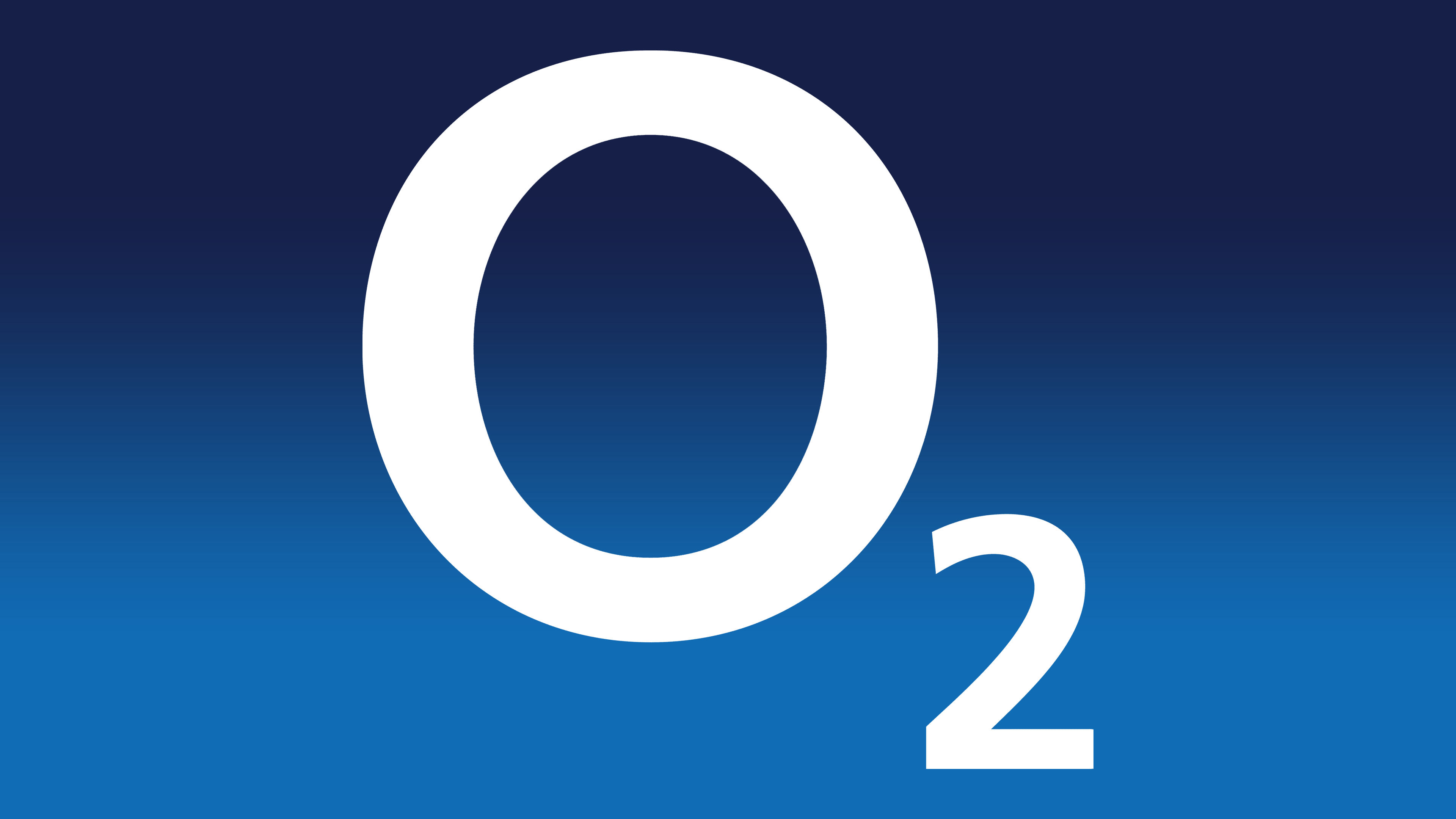
The honeycomb, which was featured in the early emblems of a telecommunications service provider, symbolized the possibility of communication at any time. They were the graphical embodiment of cellular communications. The new badge reflects the company’s trade name and resembles the chemical formula for the oxygen molecule. This is a hint that O2 (UK) is as irreplaceable as air.
To make the inscription visible, the designers chose a bold font. Judging by the number “2”, this is the sans-serif version. The main color is blue, and it can be used for both the logo and the background, alternating with white. It is associated with oxygen.