


![]() OLX Logo PNG
OLX Logo PNG
The OLX logo shows that the marketplace cares about people and wants to please them. After all, that’s exactly what she does. The online store provides services to users by connecting sellers and buyers and taking into account the interests of both parties.
OLX was founded in Buenos Aires in January 2006 by Fabrice Grinda, Alec Oxenford, and Jordi Castello. Grinda had created Aucland and Zingy, while Oxenford had led DeRemate.com, which was later sold to eBay. Their idea was to build a free, mobile-friendly classifieds platform for markets where Craigslist and eBay had little presence.
The name came from “OnLine eXchange”. OLX raised its first venture funding in September 2006, bought Mundoanuncio.com, invested in China’s Edeng.cn in 2007, and raised another $13.5 million in 2008. It added Facebook and Twitter integration, video, maps, and mobile access. In 2009, a partnership with Hi5 gave OLX exposure to about 60 million users. By then, it operated in 90 countries and 39 languages.
In 2010, South African media group Naspers bought a majority stake. Oxenford stayed CEO until 2014, and Grinda remained co-chairman until 2013. Naspers pushed OLX through heavy marketing, including the “OLX Pe Bech De” campaign in India. By 2014, Naspers owned 95 percent of the company. They had renamed several classifieds platforms in Romania, Bulgaria, Kazakhstan, Belarus, Hungary, Poland, Ukraine, and the Philippines under the OLX brand.
By late 2014, OLX reported 11 billion monthly page views, 200 million active users, and 8.5 million monthly transactions. Later, OLX Group launched Tradus in 2016, sold African assets to Jiji.ng in 2019, and transferred OLX Philippines to Carousell. By 2022, under Prosus, the group managed about 20 brands in 30 countries, including Avito, Otodom, Otomoto, Property24, and webuyanycar.com. In October 2024, OLX Group formed a joint venture with Reliance Brands for India and South Asia.
Meaning and History
![]()
OLX was created to provide a universal platform for online trading. Hence, the original name is an abbreviation for “Online Exchange”.
2006 – 2018
![]()
The marketplace was officially launched in March 2016. Alejandro Oxenfordo and Fabrice Grinda worked on its creation. These are two successful French entrepreneurs who sought to improve the trading process and create new opportunities for affordable online shopping. Initially, the site operated in India, and by 2007, the company had already established a presence in the Russian-speaking market.
In 2010, OLX became part of the large Naspers company, after which the popular Russian platform Avito joined the platform. In the future, the service will expand its boundaries. Marketplaces with the specified name appeared in Belarus, Hungary, Kazakhstan, Poland, and Uzbekistan.
The visual concept of such sites was unified. The logo included three letters that make up the brand name. The color scheme was based on a bright variety. The O was purple, the L in green, and the X in orange. They were set against a neutral white background, framed by a thin gray circle.
This coloring looked relaxed and even somewhat cheerful. She demonstrated lightness, simplicity, and joyful emotions. These features reflected the principles of OLX’s operation. The service is distinguished by its simplicity of operation, a clear interface, and a range of offers (including various categories of goods). Another advantage is the ability to buy high-quality goods at low prices. Despite the conditions, shopping is enjoyable.
2018 – today
![]()
For 13 years, the OLX logo remained unchanged, and only in 2018 did the company decide to rebrand. An update to the visual identity concept was necessary because the existing logo no longer aligned with the modern brand style.
The new emblem received an incredibly stylish performance. It was created in the ExtraBold style. Perfect lines and new colors appeared in the picture. The change in design was proof that the service does not stand still but is constantly evolving and improving functionality.
Font and Colors
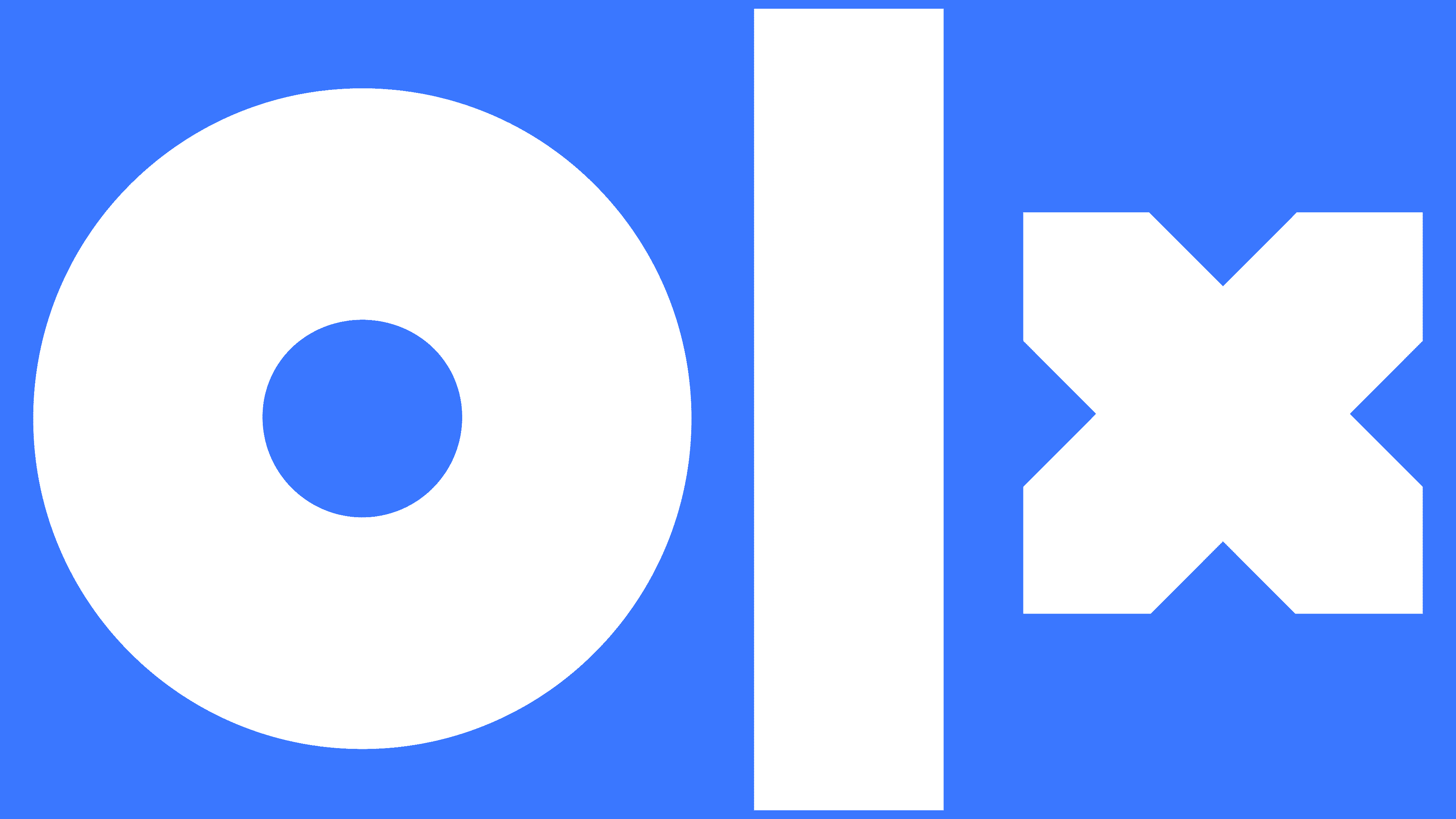
Modern OLX trading platforms feature a stylish, unusual logo. It does not look like the icons of other well-known marketplaces, which demonstrates originality and uniqueness. Another important characteristic is that the icon is completely different from the previous version, which has been in use for over 10 years. It is no longer limited by a gray frame, which symbolizes the company’s expansion.
In addition, the font has changed. It has become larger and more pronounced, and the letters have acquired a new design and different sizes. The letter X is the smallest character drawn with clear lines that give the impression of an invisible square. There is one large strip in the middle that replaces the letter L. At the beginning of the logo is the significantly larger letter O.
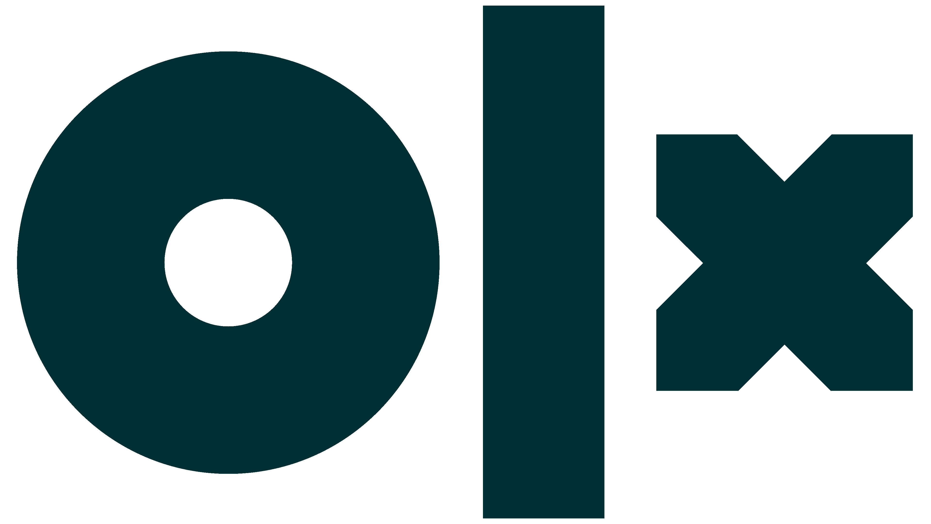
This design is not a designer’s mistake, but the symbolism in the details. Different letters reflect a wide variety of products. Together they create a harmonious picture that favorably represents the brand. The color scheme consists of 2 colors: white and blue. White serves as the background, demonstrating versatility, while the bright blue of the letters conveys lightness and reliability.