


![]() Olympia Logo PNG
Olympia Logo PNG
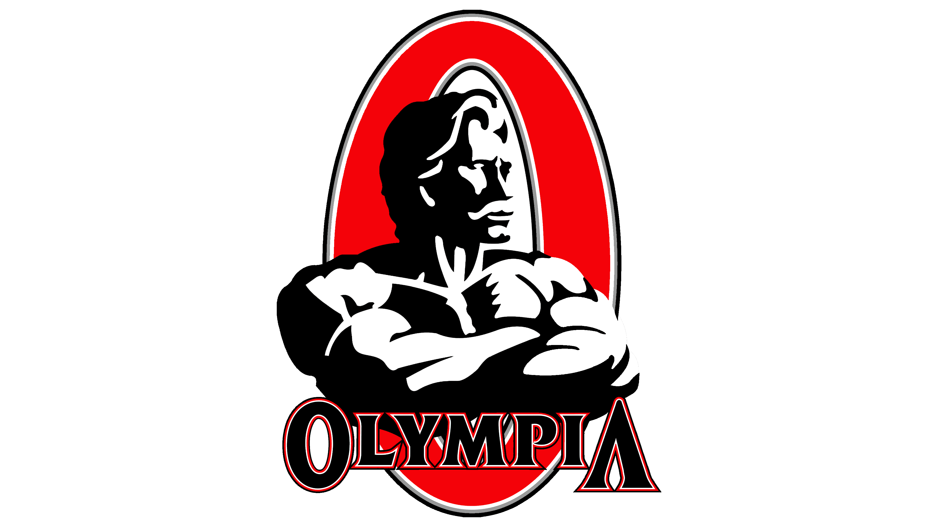
The Olympia logo is a model of perfection and pride. The emblem is filled with the spirit of strength, competition, and the desire to showcase oneself, forming the basis of the contest. The idea of the sign is crowned by the theme of leadership and ascending to the top of Mount Olympus.
Mr. Olympia was created by Joe Weider, born in Montreal in 1919 to Polish Jewish immigrants. He trained with homemade weights, built a sports nutrition and equipment business in 1940, and in 1946 founded the IFBB with his brother Ben. By the mid-1960s, Mr. Universe already existed, but Weider wanted a professional stage for champions who had nowhere higher to compete.
The first Mr. Olympia took place on September 18, 1965, at the Brooklyn Academy of Music in New York. Larry Scott from Idaho won the first title and repeated in 1966 before retiring. The prize was a statue modeled after Eugen Sandow, the early bodybuilding figure Weider viewed as a key source for the sport’s identity.
From 1967 to 1969, Sergio Oliva won three titles, bringing rare size and proportions to the stage. In 1970, Arnold Schwarzenegger defeated him and began a five-year winning run. Pumping Iron, filmed in 1975 and released in 1977, introduced the contest to a far wider public. Schwarzenegger returned in 1980 and won again, though the judging remained disputed for years.
Dorian Yates changed the standard in 1992 with a heavier, high-intensity style and won six straight titles. Ronnie Coleman later won eight from 1998 to 2005, tying Lee Haney’s record, while Phil Heath took seven from 2011 to 2017. Since 1999, the contest has been based in Las Vegas as part of Olympia Fitness & Performance Weekend. In 2020, American Media sold Mr. Olympia LLC to Jake Wood.
Meaning and History
![]()
The sign’s design centers on the figure of the contest’s founder, located on the depicted Olympus, watching over the athletes. The symbol embodies the idea that only the best become titleholders. In nearly 60 years of ‘Olympia”, only 19 athletes have been honored with the award.
What is Olympia?
A championship title awarded to participants of the annual Olympia Fitness & Performance Weekend bodybuilding competition under the auspices of IFBB. The contest counts 19 winners who have received the coveted statuette, including Arnold Schwarzenegger, Sergio Oliva, and Phil Heath.
1965 – today
![]()
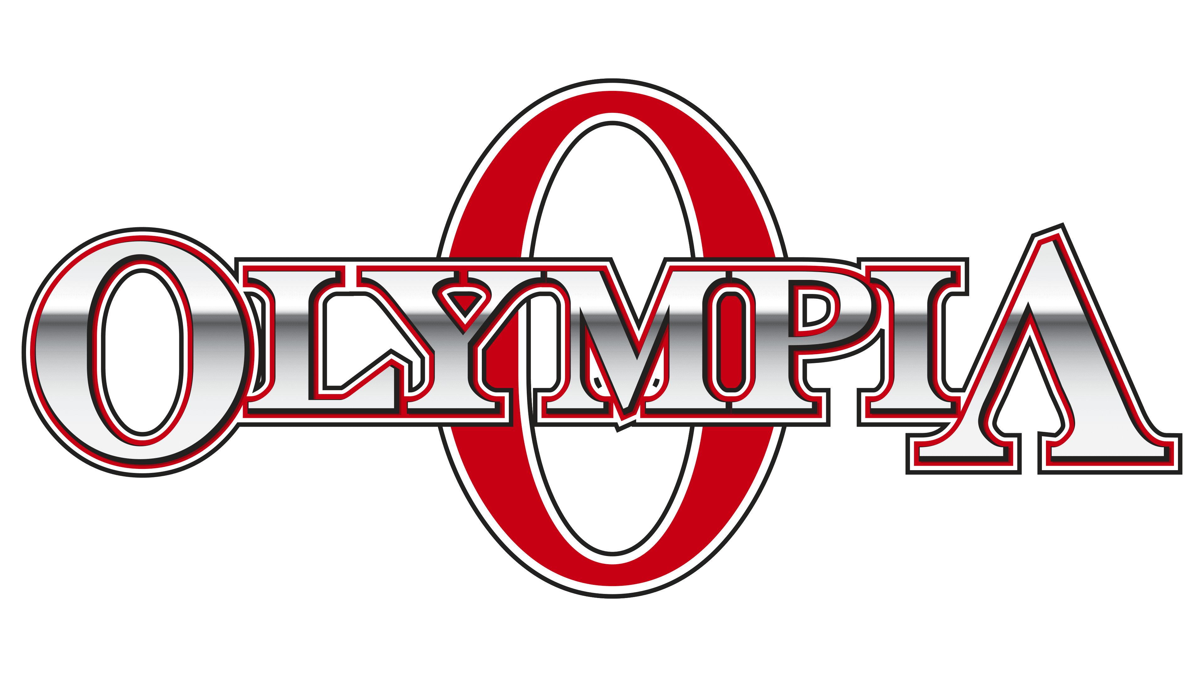
The game’s logo is designed in the style of a barbell, where the first and last letters of the inscription are significantly larger than the rest. The image is reminiscent of the statuette awarded to the winner. It is a figure of Eugen Sandow, the first organizer of the “Beauty and Athletic Physique” competitions- the prototype of modern bodybuilding contests. In the award, the athlete holds a barbell with ball-shaped ends. The Olympia logo alludes precisely to this. The round letter O in the inscription reinforces the resemblance.
The name was chosen after Mount Olympus in Greece, where gods with superpowers and strength reside. Men who won the competitions were likened in beauty and strength to these gods.
Although this is one of the probable origins of the name, it is not the only one. The Washington-based Olympia Brewing Company sponsored the first competition. The contest was likely named in its honor.
Each letter of the inscription is outlined in two lines of red and white, symbolizing strength and fitness.
Above the name is the image and name of the person who founded the contest, Joe Weider. This athlete and entrepreneur played a significant role in bodybuilding, as he also created the IFBB association and the Ms. Olympia contest. He, his brother, and his wife wrote numerous books on bodybuilding and sold clothing and supplements for athletes. Interestingly, the Weider brothers introduced Arnold Schwarzenegger to the world when they brought him to America. Thus, it’s no surprise that the logo immortalizes this legendary collaborator.
The composition is complemented by a large letter O in the background, soaring high and evoking the peak of Olympus and glory.
Font and Colors
The logo’s color palette combines red, black, and white. Red conveys energy and the drive to win, symbolizing the athlete’s physical appeal and strength. White represents honesty and the purity of competition without doping. Black remains the dominant shade, reflecting intense training, daily effort, and the discipline required to achieve results.
A distinctive feature of the logo is its layered color structure: bold black letters are outlined in a thin white border, followed by a red contour. This style presents the final result to the viewer, defines the competitors’ physiques, and conceals the daily work behind every victory.
The red letter “O,” visually elevated above the other characters, represents the vivid but brief moments of triumph experienced by athletes on the Mr. Olympia stage. Victory brings fame but marks only a brief moment amid long and demanding preparation.
The emblem’s typeface follows a traditional style with prominent serifs. The letterforms reflect the power and volume of bodybuilders’ physiques. The absence of a horizontal bar in the enlarged letter “A” symbolizes the athlete’s path to the top, where recognition and success await, but only after a long journey of training and challenge.