The Olympic Air logo conveys the airline’s most important value—the aspiration for leadership. This is a key factor, demonstrating the company’s readiness for competition, growth, and providing the highest quality services.
Olympic Air: Brand overview
Olympic Air has existed since 1957 and has a rich heritage that connects Greece to major global destinations. Originally established as Olympic Airways’ national carrier, it quickly became one of Europe’s leading airlines. However, financial difficulties in the early 2000s led to its privatization.
In 2003, a consortium of Olympic Investors acquired a controlling stake in Olympic Airways, determined to breathe new life into the airline. Renamed Olympic Airlines, the company set its sights on modernization and a promising future.
In 2009, realizing the need for change, the Greek government boldly established a new airline, Olympic Air.
Shifting its focus to regional operations, Olympic Air now serves domestic and international destinations in Greece and neighboring countries.
In 2010, Olympic Air and Aegean Airlines, two prominent Greek carriers, began a strategic merger.
In 2013, the merger of Olympic Air and Aegean Airlines received approval from the European Commission. This merger created a powerful aviation powerhouse.
Meaning and History
What is Olympic Air?
Olympic Air is a significant name in the aviation sector, positioned as a regional airline hailing from the cradle of Western civilization – Greece. As a subsidiary of the renowned Greek carrier Aegean Airlines, it operates under a strong parent brand, which further strengthens its credibility. The airline has a rich history and was established as a separate entity from the parent company to meet regional travel needs in Greece and surrounding regions.
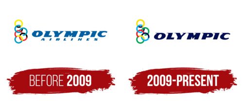
Before 2009
To show the company’s readiness to take the top spot in aviation services, its leadership chose an unconventional logo that was not typical for its industry. This caused confusion among travelers but did not deter them from booking tickets, as the emblem is positive, attractive, and modern. It demonstrates the carrier’s strength, confidence, determination, and readiness to surpass competitors and emerge as a leader.
The Olympic Air logo perfectly reflects the competitive spirit and the drive for fair competition. It elevates the brand image, drawing attention away from traditional symbols with standard wing imagery and other aviation attributes. The minimalist style emphasizes the brand’s persistence and determination to achieve its goals.
The emblem conveys the generational heritage of the cradle of Western civilization and its origins in the homeland of the Olympic Games—Greece. This country is well-recognized by the classic rings, an Olympic symbol. This unique idea aligns well with the regional brand.
The concept and authenticity are reflected in the six closely intertwined rings. To avoid any suggestion of copyright infringement, the company opted for six rings instead of five, arranged them vertically, and colored them differently so they do not symbolize continents but convey the ideas of sky, sun, movement, and healthy competition. Five colors are used: blue, yellow, white, black, and red, which are paired together.
These colors represent the desire to fly, freedom of movement, high speed, and the unique identity of the Greek company. The distinctive inscription in extra-bold, uppercase letters gives the Olympic Air emblem wide recognition. The large, slanted letters are in motion, appearing ready to overcome any obstacles, visualizing the airline’s leadership concept.
Each glyph has a sharp stroke at the top, resembling thorn-like serifs. All are directed to the left, appearing bent by a powerful headwind. The name is presented in a signature design, demonstrating high speed and movement. The lower inscription is grotesque, showing the company’s openness and building customer trust.
2009 – today
The logo reflects the founder’s passion for the Olympic theme. It features six multicolored rings arranged vertically, similar to the Olympic rings. The rings are green, blue, red, yellow, and light blue. “Olympic” is written in capital letters with narrow serifs and a rightward slant. The letters are large, blocky, and have smooth, even edges.
The rightward slant of “Olympic” gives the logo a sense of forward movement and progress, showing the company’s ambition. The block-style letters with smooth edges convey solidity and reliability, which helps build trust.
The logo’s six-ring arrangement and vibrant colors add energy. The colors symbolize diversity and inclusiveness, resonating with the Olympic spirit.
Using capital letters with narrow serifs gives “Olympic” a formal and authoritative look. The large, blocky letters ensure the logo is easily recognizable and memorable.
The design combines multicolored rings and bold typography to represent the brand’s ambition, progress, and reliability values. The thoughtful use of color and form makes the logo visually striking and meaningful. The logo’s design balances legal considerations with recognizable symbolism. The six multicolored rings and the bold, slanted typography create a dynamic and trustworthy image.
