The Oman Air logo demonstrates the airline’s signature style, commitment to luxurious service, and unparalleled comfort it aims to provide every passenger. The emblem conveys the airline’s values and is integral to the brand.
Oman Air: Brand overview
Oman Air, Oman’s flagship airline, began its journey in 1993 and has its base of operations in Muscat. The carrier provides regular services to more than 40 domestic and international destinations in the Middle East, Asia, Europe, and Africa.
Muscat International Airport is the principal hub for the airline’s operations. Its fleet comprises around 50 aircraft from prominent manufacturers such as Airbus and Boeing. The Government of the Sultanate of Oman wholly owns Oman Air, which employs approximately 4,000 staff members.
In 2021, Oman Air made a significant move by joining the Oneworld airline alliance, marking the first addition of a full member to the alliance in six years. Travelers on Oman Air can choose from three distinct classes of service – First Class, Business Class, and Economy Class. Each class encapsulates the essence of Omani hospitality and offers a range of premium amenities.
The airline has received numerous accolades for its exceptional passenger experience and high service standards. Its commitment to quality service is reflected in its policy of serving complimentary meals on all its flights and offering personalized in-flight entertainment across all classes.
Oman Air’s portfolio of services isn’t limited to passenger flights; it includes charter and cargo services. A key part of the airline’s strategic growth plan is expanding its international network to establish Muscat as a major global hub, contributing to Oman’s tourism growth. Despite facing the challenges of a competitive airline industry, Oman Air remains dedicated to enhancing its services and expanding its reach.
Meaning and History
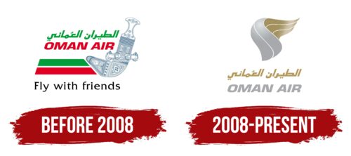
Before 2008
The logo was created due to the merger of two companies that formed the foundation of the new airline. Its highlight is a detail borrowed from the cockpit, showcasing the airline’s high professionalism and excellent technical equipment.
The silver element occupies the entire right side of the logo, indicating the brand’s desire to move forward, adopt innovations, and use modern technologies. This detail signifies the carrier’s dynamic and rich internal energy reserves, sufficient for all services: standard passenger flights, charter flights, private deliveries, and cargo transportation.
The emblem distinctly reflects the company’s identity. This is expressed through the traditional Omani combination of white, green, and red stripes of equal width, as featured on the national flag. Through these colors, the airline conveys several key ideas:
- Authenticity
- National identity
- Pride in the nation
- Connection to traditions
- Desire to make their country widely recognizable
The cultural context of the logo is expressed in its color scheme: green symbolizes the fertility of the land, red represents the aspiration for leadership, and white signifies prosperity and peace. These colors form the basis of the national symbols and reflect the ancient values of the Omani empire.
The company name is presented in Arabic and English and is used in the country’s tourism and international business sectors. Hence, it is essential in the emblem. To harmonize the English letters with the Arabic symbols, the designers made them visually identical, applying uniform typographic techniques: smoothness, absence of serifs, and italics. The slanted glyphs add dynamism to the emblem, illustrating its acceleration toward quickly achieving goals and reaching destinations.
Another significant detail in the Oman Air emblem is the third line, colored in business black. It displays the airline’s slogan, showcasing its positive attitude toward passengers. Simultaneously, it hints to clients that the company is a friend they can trust. The simple phrase “Fly with friends” promises travelers a pleasant atmosphere, a trusting relationship, and psychological comfort.
2008 – today
A key feature of the modern Oman Air logo is the abstract element, which holds many meanings. For the airline, it symbolizes:
- A bird’s wing
- A runway
- A whirlwind
- A torch flame
Each of these symbols holds significant meaning for the brand. For instance, the bird’s wing represents a professional and confident flight. The runway indicates that the airline flies smoothly and quickly while adhering to safety protocols and arrival-departure times. The whirlwind conveys the speed at which the company transports passengers to their destinations and showcases the power of its aircraft fleet. The torch flame embodies the airline’s energy and passion for fulfilling customer service commitments.
All these symbols underscore the importance of reliability, dedication, seriousness, comfort, and high speed during air travel. This unique combination reflects Oman’s culture and history, the carrier’s task approach, and its commitment to enhancing passenger comfort. The original geometric shape allows the company to figuratively express its concept so that clients easily understand its meaning. This style adds increased dynamism to the emblem and balances the static text.
The designers used italics to make the text appear dynamic. It looks good in both fonts, harmonizing well with Arabic glyphs and English letters. The color difference between the upper and lower rows emphasizes the sense of movement. The gold top and silver bottom add prestige, extravagance, and high significance to the image of the Omani airline. Gold represents luxury and leadership, while silver signifies elegance and intelligence. Overall, the two precious metals speak of impeccable comfort and premium service.


