


![]() One Direction Logo PNG
One Direction Logo PNG
The One Direction logo conveys simplicity, openness, and a focus on listeners’ needs. The emblem reflects the group’s youth and originality. In tandem, musicians create a unique, understandable style for the chosen audience.
Meaning and History
![]()
Winning a popular TV show made the group instantly recognizable. She recorded one album each year, topping the charts in most media markets. This brought her a resounding success. As a result, One Direction became the first in US Billboard 200 history to have songs at the top of the charts for four consecutive years. And her 2013 collection, Midnight Memories, was the world’s best-selling.
The musicians quickly became teen idols. Such mega-popularity sparked genuine fan hysteria; the group embarked on four world tours. The most profitable of them was the 2014 tour: it brought in more than 290 million dollars for young people. After a large-scale tour, the team took an indefinite time-out to pursue other projects.
But this does not mean that with the cessation of activities in 2016, the musicians have sunk into obscurity. As of 2020, 1D has sold 70 million records, making it one of the most in-demand boy bands of all time. At the moment, the team has won almost two hundred awards, and its emblem remains widely recognizable among fans around the world. One Direction’s visual identity mark is simple yet memorable. It is compiled in accordance with all the graphic canons of the music industry.
Pop-rockers have two logos. One contains the group’s full name, the second contains the abbreviated one. Their use overlaps at times, although the extended version has more often appeared on albums, while the short version is used for promotions. It can be seen on T-shirts and other paraphernalia. Despite this difference, they share common features: style and color.
The official emblem contains the phrase “One Direction.” It is set on one line and in uppercase. But the letters are uneven; each has its own slope and height. They are written in broad strokes, like a brush, so some have jagged ends. All characters are individual; there is no single identical one, even among the same letters. For example, the first “O” is round, with a stroke at the top, and the second is oval and elongated. The same can be said about “E” and “N”: they are also different from each other.
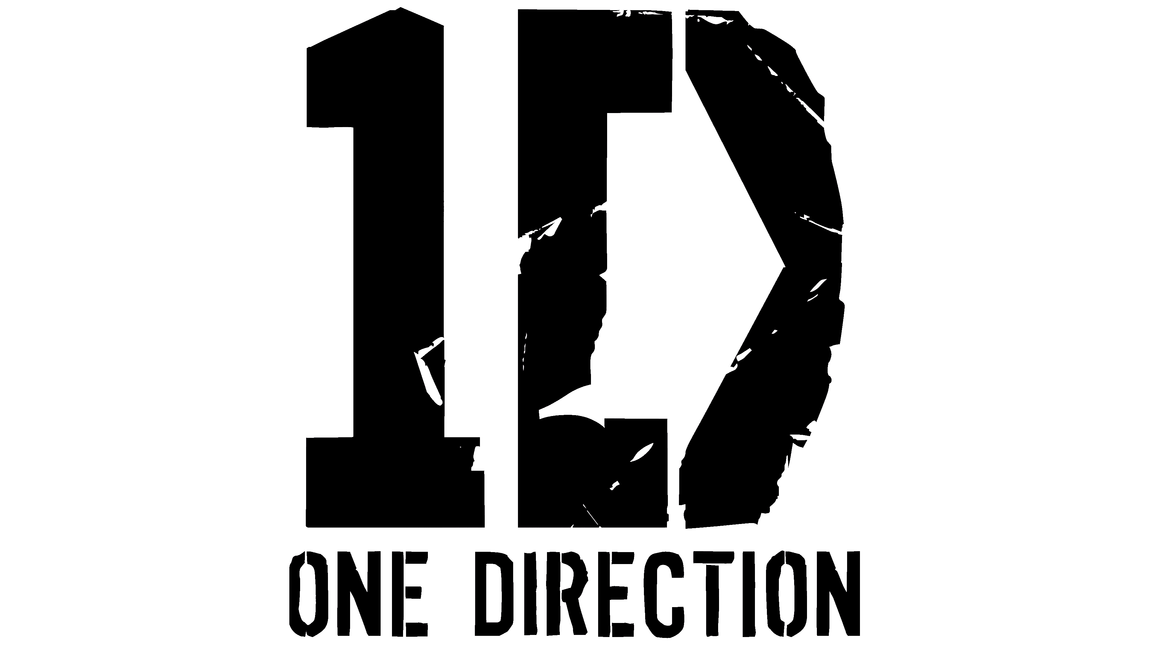
An additional designation of the boy band is an icon consisting of the number one (1), a square bracket ([), and the left half of the letter X. Moreover, they are combined to look like a 1D icon. The lines are wide but not filled in, as each shows chaotic gaps in the form of small stripes, dots, and dents. The presence of the “X” fragment indicates the name of the TV show that started the singing career of young musicians. At the bottom is the phrase “One Direction,” decorated in military style, with a strict stencil typeface whose letters are composed of long stripes.
Font and Colors

The inscription on the pop group’s emblem is set in an individual font. It is based on a typeface designed by “boobearsarse.” These are uneven letters of different heights formed from short strokes with a “torn” beginning. The palette is monochrome, with black characters on a white background. There are also red icons on the album covers.