


![]() One World Observatory Logo PNG
One World Observatory Logo PNG
The landmark stood out throughout the work period with its visual identity. The modern One World Observatory logo is proof of this. It showcases the place’s spectacle and emphasizes its significance to world culture. This is emphasized by an incredibly stylish, even somewhat futuristic figure that symbolizes the building’s top. It is complemented by a solid inscription in the form of the site’s name and a thematic phrase. A harmonious addition is a light color palette that demonstrates the place’s boldness, energy, and entertainment character.
One World Observatory is part of the rebuilding of Lower Manhattan after September 11, 2001, when the original World Trade Center towers were destroyed. In February 2003, Daniel Libeskind’s master plan proposed a new “Freedom Tower” at 1,776 feet, referencing the year of the U.S. Declaration of Independence. The final tower design involved David Childs of Skidmore, Owings & Merrill.
Real construction began on April 27, 2006, after an agreement between developer Larry Silverstein and the Port Authority of New York and New Jersey. Tishman Realty & Construction worked as the contractor. In April 2012, the rising tower passed the Empire State Building in height. On May 10, 2013, the spire was installed, bringing the building to a height of 1,776 feet. One World Trade Center opened to tenants on November 3, 2014, with Condé Nast among its main occupants.
One World Observatory opened on May 29, 2015, across the 100th, 101st, and 102nd floors. It was operated by Legends Hospitality, a company tied to the Dallas Cowboys and the New York Yankees. At launch, admission cost $32. The SkyPod elevators take visitors to the 102nd floor in 47 seconds, while the cabin screens show a time-lapse history of New York.
The observatory entered a competitive market led by the Empire State Building observatory, which has been open since 1931, and Top of the Rock at Rockefeller Center, which reopened in 2005. Its position was different because it belonged to the city’s post-2001 rebuilding story. From 2015 onward, One World Observatory attracted about two to three million visitors a year.
Meaning and History
![]()
Today, One World Observatory is a large observation deck atop a skyscraper that offers a breathtaking view of New York. Incredible beauty impresses visitors so much that they return again and again. But these gorgeous views were unavailable for visiting at that time. The reason was the tragic event of 2001, when the center was destroyed as a result of a terrorist attack. The activity of the unique place resumed only in 2015.
The newly opened observation deck received a new name and a more modern emblem. The logo consisted of an original drawing and a 3-level inscription. The details not only created a harmonious visual image of the famous cultural place but also emphasized its main features. The stylish, modern typeface showed a commitment to innovation, the sharp spire conveyed excitement, and the multi-colored palette conveyed fun, joy, positivity, and reliability.
What is One World Observatory?
One World Observatory is one of the largest observation decks in the world. It is located in New York, atop the huge One World Trade Center. Visitors can visit the top three floors, which offer beautiful scenery. From 1975 to 2001, the site included only two territories: the 107th floor and the South Tower. But on September 11, it was completely destroyed.
1975 – 2001
![]()
The first opening of the famous observation deck took place in 1975. At that time, it occupied two public territories. One was located on the roof of the South Tower, and the second was on the 107th floor. In 2011, the building was destroyed, along with the observation deck called Top of the World. Up to this point, the place’s corporate identity was expressed through a bright, energetic logo associated with delight, energy, and strength.
Its main features were recognizable colors, an unusual design of the text sign, and an expressive graphic figure. The logo’s text element consisted of 2 parts. The upper part was presented as a semicircle and denoted the phrase “I was/a on top of the world.” At the bottom was the name of the place. Both wordmarks were in white, with a purple tangled line over them.
The chosen solution perfectly emphasized the observation deck’s entertaining nature and symbolized the incredible emotions he felt upon seeing it. The central part of the logo was occupied by a neat figure associated with the top of the shopping center. It was decorated in white, with two inscriptions that emphasized reliability. But most of the emblem was occupied by a rich red background. This shade conveyed vivid impressions, strong emotions, and vigor.
2015 – today
![]()
In 2015, the observation deck resumed work under the name One World Observatory. The old emblem no longer matched the essence of the place, so the designers created a more modern, up-to-date version that is still used today. It harmoniously combines the verbal part and a stylized picture reminiscent of the upper floors of a shopping center. Thin, neat forms distinguish the text and occupy most of the drawing.
It is designed in a compact 3-tier format but looks very powerful and stylish. The first two words are consonant with the name, and the bottom inscription indicates the value of the experience of climbing to the top. A range of light neutral hues, a bright accent, and a classic background complement a beautiful picture. In general, such a concept is associated with unforgettable emotions, joy, and pride from overcoming the peak.
Font and Colors
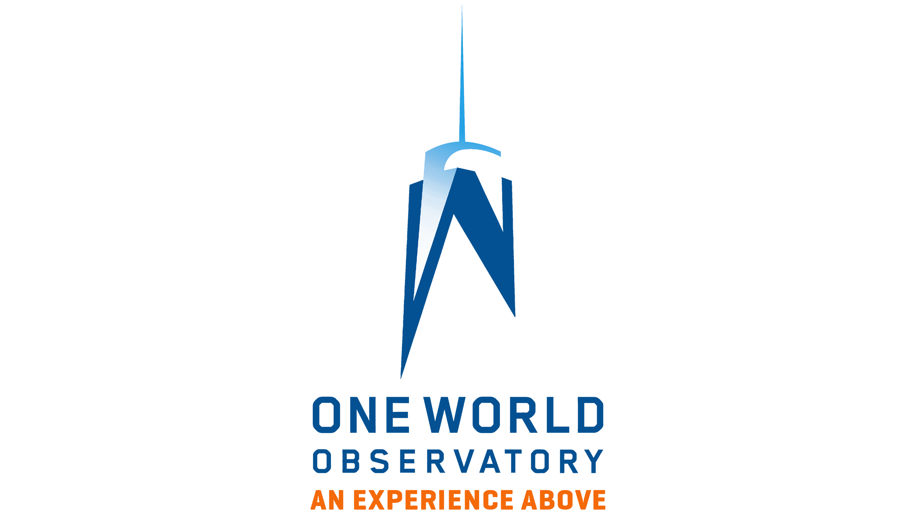
The visual identity of One World Observatory defines several messages at once. This is freedom, dynamism, a sense of carelessness, and joy. At the same time, the color palette emphasizes the observation deck’s key principles: safety, reliability, and comfort. This is evidenced by the many shades of blue that decorate the figure of the top and the two parts of the inscription. Complementing the line is the classic white, which conveys purity and conscientiousness.
A striking touch is also the use of bright orange, which is associated with positivity, energy, and joy. To design the word lettering, the designers used a simple, modern sans-serif typeface in the Grotesque style. Straight lines and expressive spaces make it easy to read, which positively affects the concept.
In addition, the font complements the graphic symbol. The elements share similar geometric shapes, graceful, thin contours, and a futuristic design. The font denotes improvement, growth, and development in terms of semantic load. In general, the harmonious combination of the elements presented contributes to recognition of the One World Observatory. Also, it provides all the advantages of an interesting place in exhaustive detail.