The Optimum logo is an open portal into technology and the digital internet. The emblem invites users to connect to the port and experience a high-speed data flow like a continuous river.
Optimum: Brand overview
| Founded: | 1970s |
| Founder: | Altice USA |
| Headquarters: | Long Island City, New York, United States |
| Website: | optimum.com |
Originally taking shape in the 1970s, Optimum started as a modest cable television service, utilizing copper cable technology to deliver a limited 30-channel lineup. With time, the company underwent numerous transformations, switching to fiber-optic technology to enhance its service offerings. This change allowed Optimum to diversify its capabilities by adding broadband internet, phone services, and an expanded selection of channels.
Between the 1990s and 2000s, the company escalated its market presence through strategic mergers and acquisitions, solidifying its role as a dominant cable provider in the New York tri-state area. A major turning point came in 2016 when Altice, a European telecommunications conglomerate, acquired Cablevision Systems—the corporate entity overseeing Optimum—for a whopping $17.7 billion.
Operating today as a subsidiary of Altice USA, Optimum continues to serve a broad customer base that extends beyond five million across 21 American states. As part of Altice USA’s diversified brand collection, including Suddenlink and Lightpath, Optimum is the country’s fourth-largest cable service provider.
Optimum’s journey from a small-scale cable TV service provider in the 1970s to a national powerhouse in the broadband and cable industry illustrates its remarkable growth. Primarily focused on the northeastern United States, the brand remains committed to serving various customer needs under the Altice USA umbrella.
Meaning and History
The Optimum brand was established in 1994 but became actively used in 1999. The first logo appeared in the mid-to-late ’90s. As the network improved, transitioning to digital technology and fiber optics, the emblems changed to reflect better the new capabilities available to the provider’s customers. The fate and growth of the brand are closely linked to Cablevision, the company that launched the brand and managed its promotion, identity, and content.
What is Optimum?
The fourth-largest internet, mobile communications, and cable TV provider in America. It serves 21 states. The TV package includes 420 channels, and fiber-optic internet speeds can reach up to 8 Gbps. The company is on the Fortune 500 list.
1990s – 2004
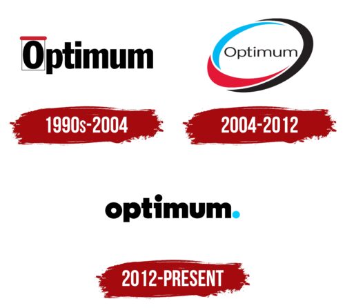
The first emblem consisted of the brand name written in capital letters with a black font. The sharp, angular symbols indicated a working system of copper wires that could transmit up to 30 TV channels.
The first letter, O, was encased in a thin black rectangular frame with a red top. The design resembled:
- A tear-off calendar to emphasize the option for monthly channel subscriptions and the existence of a special weekly TV schedule.
- A television set with the letter O serving as the screen, indicating that cable access was provided under the brand with a premium number of channels.
- A cross-section of a cable as a means of signal transmission.
Much like a gift box, a graphical element emphasized new capabilities with a modern provider.
2004 – 2012
In the early 2000s, Optimum added the internet to its TV services, and in 2004, it introduced telephone services. An Interactive Optimum service emerged, uniting all three directions. These changes resulted in a new logo.
The emblem consisted of an ellipse created by interweaving red, blue, and black crescents. The shape indicated the comprehensiveness of the service, providing access to television channels, phone calls, and the internet through streaming technology.
Three colored elements forming the oval represented three services in one. Black, blue, and red symbolize the speed, accessibility, and reliability of the service. The intertwining of elements resembled the twisting of optical modules and fibers within a large fiber-optic cable.
The ellipse stretched upwards, emphasizing the aspiration for growth and expansion of the network’s capabilities. Under the Optimum brand, more advanced and expensive services were offered, making the brand elite. Hence, the logo’s upward orientation towards the stars.
The brand name was written in a light gray, thin font in the ellipse’s center. The delicate lines reflected the initial steps and the beginning of the implementation of digital package services. The central placement of the word indicated a unified brand, incorporating subdivisions: Optimum TV, Optimum Voice, and Optimum.net.
2012 – today
The brand owner, Cablevision, underwent a global rebranding in 2012. The New York firm COLLINS designed the emblem based on principles of simplicity and ease.
The new logo consisted of the lowercase word Optimum written in black letters. Full, rounded glyphs resembled the bends of a fiber-optic cable through which the signal is transmitted.
At the word’s end was a large blue or orange dot. The symbol demonstrates:
- The best provider with a full package of services. Turning to this provider signifies making the final choice. The dot here represents a settled matter.
- The cable’s cross-section. The viewer receives a stream of internet and television through the symbol, as if through a portal. A continuous connection is formed with the global virtual information bank. Here, the dot functions as a plug for connection, a point of connection to the node.
The dot embodies instant data transmission. The company aimed to create a network made only of fiber-optic cable, which allows for uniform upload and download speeds and 8K streaming video capabilities. Capabilities have gradually increased and, by 2023, reached 8 Gbps, making the brand the fastest.
The logo embodies simple and uninterrupted services that begin to operate as soon as they are plugged into the socket.
Font and Colors
The main part of the emblem is black. The dark color represents the external coating of the fiber-optic cable. It speaks of technology underground tunnels where the main artery is laid. The shade conveys a serious approach, intense work, and thoroughness.
The colorful dot serves as the embellishment of the black inscription. It concentrates attention on itself and brings in bright, joyful emotions, animating the logo. The color of the dot varies depending on the product.
Blue symbolizes information digital data packets flowing through the company’s cables. Sky-blue represents a futuristic hue, the color of advanced technologies and scientific developments.
Sometimes, there is an orange dot. The warm color palette signifies a connection with friends and the surrounding community via the internet. A purple symbol indicates the expansion and development of the virtual world available to customers.
The font of the inscription is clear and harmonious. It embodies the idea of honesty, accessibility, business transparency, and price formation for the company. Ideal glyphs underline service quality.
Optimum color codes
| Black | Hex color: | #000000 |
|---|---|---|
| RGB: | 0 0 0 | |
| CMYK: | 0 0 0 100 | |
| Pantone: | PMS Process Black C |
| Vivid Sky Blue | Hex color: | #04ccff |
|---|---|---|
| RGB: | 4 204 255 | |
| CMYK: | 98 20 0 0 | |
| Pantone: | PMS 312 C |
