The Optus logo conveys a message of joy and vitality. The company tries to create comfortable conditions for customer communication. The emblem promises great deals and modern technologies that make communication easy and affordable.
Optus: Brand overview
Meaning and History
The Australian leader in integrated telecommunications has changed his style many times to keep up with the latest trends. Moreover, the logos’ update was accompanied by a complete reboot of the brand: for example, it could abandon its traditional symbol, as it was in 1999, or rely on a cheerful and friendly design, as in 2013.
However, the biggest change came in 2016 when the company decided to adapt to the Netflix generation. To do this, she had to develop a new business model, go beyond the usual telecommunications services framework, and confirm her status as a digital entertainment provider. During that period, she launched the Optus Sport channel and introduced her set-top box, YesTV. In this case, the emblem change should have symbolized the desire for the future.
What is Optus?
Optus is a telecommunications company from Australia, founded in 1981. Since its inception, it has become the second-largest wireless operator in the country and has over 10.5 million subscribers. It is now a subsidiary of Singtel.
1991 – 1999
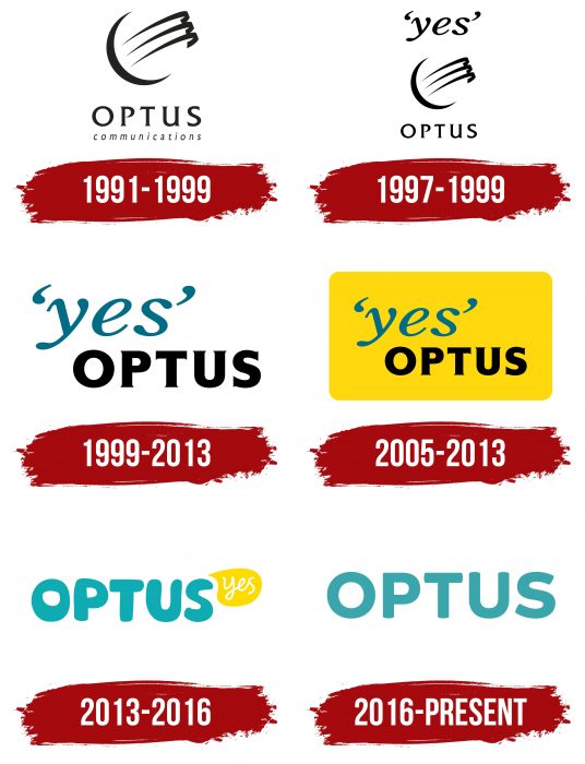
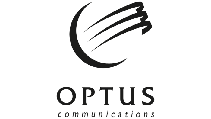
The brand emerged in the place of AUSSAT in the 1990s and offered international telephony services. It had a corresponding logo: three half-rings perpendicular to the fourth half-ring encircling an invisible circle. This image illustrates the connection between cities around the planet. The word “OPTUS” was placed under the geometric pattern, and below it was “communications.” The designers played on the contrast of uppercase and lowercase letters.
1997 – 1999
In the late 1990s, the word “Yes” became integral to the Optus corporate identity. It was perceived as an exclamation of a satisfied customer who found what he wanted. “yes” was written in italics and enclosed in single quotes on the logo. Below it was a symbol consisting of half rings. The place at the very bottom was reserved for the brand name.
1999 – 2013
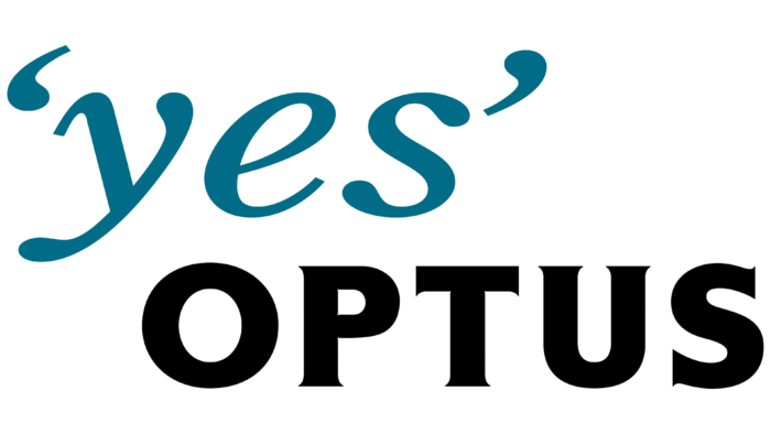
At the millennium turn, the word “yes” became dark blue, and “OPTUS” became bold. The developers have removed the geometric sign as unnecessary because the range of services has long gone beyond international telephone communications.
2005 – 2013
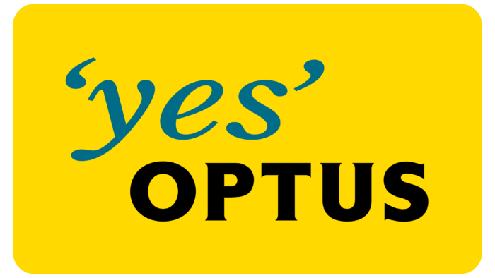
In 2005, the designers placed the company symbol inside a yellow rectangle. This was to show the friendly nature of the brand and its focus on the digital entertainment industry.
2013 – 2016
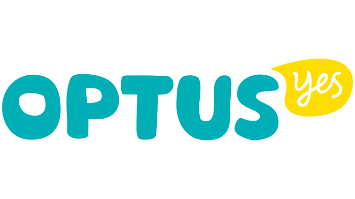
Optus executives turned to Australian agency Re, based in Sydney, to improve the design. Experts helped the telecommunications firm complete a restructuring, part of a new declaration for customers – the “Declaration Yes.” This meant that the word “Yes” was still the main feature of the brand. The emblem was written in calligraphic letters in a yellow speech bubble. By the way, the company’s new character – Olly – also had the shape of a speech bubble and was bright yellow.
The appearance of the word “OPTUS” has changed markedly. The developers chose a bubble font, different from yesteryear’s cool and structured design. The blue-green color emphasized the informality of the style.
2016 – today
The company again entrusted the next transformation of the brand name to the agency Re. The redesign marked a transition to a new level of continuous development in the digital world. The word “Yes” took on a different meaning: the brand owners abandoned the “Declaration Yes” in favor of the concept of “Yes Moments.” Ultimately, this detail was removed from the main logo—only the brand name remained.
The developers have retained the blue-green color and uppercase letters. The font was changed: it acquired a sharper shape, although the corners remained rounded. There is also a yellow OPTUS variant that compensates for the lack of a bright dialogue bubble. The yellow word “Yes” is used separately from the name. It has a new design based on Mariko Elliott’s calligraphy.
Optus: Interesting Facts
Optus is Australia’s second-biggest telecom company, owned by Singapore’s Singtel. They offer phone services, internet, and TV.
- Started in 1981: First known as AUSSAT, Optus began with satellite services for TV and communication. Since being bought by Singtel in 2001, it has grown a lot.
- Breaking Monopolies: By entering the market, Optus challenged Telstra, leading to better services and prices for everyone in Australia.
- Satellite Leader: Optus runs several satellites that support TV, internet, and communication services for businesses and the government.
- Tech Innovator: It was one of the first in Australia to offer 4G and is now working on 5G, aiming to provide faster and more reliable internet.
- Loves Sports and Entertainment: Optus has rights to big sports events like the English Premier League and FIFA World Cup, making it a major name in content.
- Green Efforts: They’re working on reducing their environmental impact through energy-saving and renewable energy projects.
- Helping Communities: Optus supports programs in digital education, mental health, and the environment, using technology to help society.
- Optus Stadium: In 2017, they got the naming rights for Perth’s Optus Stadium, a venue for sports and entertainment, boosting their brand.
- Customer Service: Optus is making it easier for customers to get help and manage their services with apps and online support.
- Global Reach: Being part of Singtel gives Optus access to international networks, helping connect Australia to the world.
From starting as a government satellite operator to becoming a top telecom and entertainment provider, Optus is all about bringing new technology, competitive services, and supporting communities.
Font and Colors
In 2016, the traditional logo disintegrated. The brand has two different signs with their design and meaning. The blue-green inscription “OPTUS” is associated with friendliness and fun, and the word “Yes” expresses the client’s voice, an enthusiastic reaction to media content.
The main logo was created using a custom typeface designed specifically for Optus. It looks like a Taro Extra Bold with rounded corners.
The “Yes” font is semi-connected because the first letter is separated from the second. Australian designer Dave Foster created the Foster Type studio owner. He came up with thousands of versions of Yes, wrote them down on 100 sheets of paper, and then chose 115 versions to present. After the analysis, everyone agreed to leave the base style unchanged.
Two colors can identify the brand: aquamarine (# 39A8AF) and yellow (# FECD03). This vibrant palette was chosen specifically to showcase the entertaining nature of Optus’ services.
FAQ
Who owns Optus?
Optus is an Australian telecommunications company owned by Singapore Telecommunications Limited (Singtel). Singtel, a major player in the telecommunications industry in Singapore and the Asia-Pacific region, acquired Optus in 2001.
The brand has faced several challenges in recent years, including regulatory issues, market competition, and customer service problems. These difficulties have created operational and reputational problems for Singtel. Despite these challenges, Singtel continues to support and invest in Optus as it seeks to strengthen its position in the Australian market and address its current issues.
What is the mission of Optus Australia?
Our mission is to create engaging experiences for customers and employees. The brand aims to improve the space and technology that allow for this experience. Committed to empowering clients to thrive in times of significant digital change, the company ensures customers can navigate and succeed in a rapidly changing digital world by providing support and innovation.
What is the Optus logo?
The logo displays the company name in bold capital letters. Each letter has rounded ends, giving it a modern and friendly look. The design is simple and clean, sans serif, making it easily recognizable and visually appealing.
The logo design supports the company’s mission of creating a great experience for customers and employees. The rounded ends of the letters convey friendliness, a key value for the brand. The lack of serifs gives the logo a modern look, demonstrating the brand’s focus on innovation in the digital world. Consistent use of this logo helps build brand awareness and trust, strengthening the company’s presence in the telecommunications industry.
What color is Optus?
The official color of the telecommunications company is blue with a slight turquoise tint. This shade is used in the letters of the logo, making it distinctive and recognizable. The blue-turquoise color reflects the brand’s modern and innovative approach, conveying reliability and freshness. This color choice aligns with the company’s mission to create a great experience for customers and employees. Consistent use of this color across different platforms and materials helps reinforce the brand’s identity and recognition.
What is the Optus slogan?
The Optus slogan is “Yes!” This simple and short slogan demonstrates the brand’s commitment to improving service quality and expanding its reach throughout Australia. It signifies a positive and proactive approach to meeting customer needs and driving innovation.
This slogan has historical significance as it was originally the motto of the company’s founder, George Patterson Sidney. Advertising agency M&C Saatchi brought it back to convey the spirit of brand affirmation and customer focus. By using “Yes!” the company strives to demonstrate its uniqueness in providing solutions and support, reinforcing its mission of creating a great experience for customers and employees.
Where does the name Optus come from?
The origin of the name is unclear, but there are two common theories. One theory suggests that it is a mixture of the English words “opt” and “us,” implying brand selection and focusing on customer satisfaction. The second theory is that the word comes from the Latin word “optim,” which means “best.” This aligns with the brand’s goal of offering the highest quality services and striving for excellence.
Regardless of its origin, the name conveys a sense of quality and customer focus, helping strengthen its position as a leading telecommunications service provider in Australia.
