The Oral B logo symbolizes the ergonomic shape of toothbrushes that effectively fulfill their task. The elongated geometric figure with rounded corners resembles a stripe of toothpaste. And the blue color is associated with fresh breath, coolness, and tranquility.
Oral B: Brand overview
| Founded: | January 13, 1950 |
| Founder: | Procter & Gamble |
| Headquarters: | United States |
| Website: | oralb.com |
Meaning and History
Dr. Robert W. Hutson, the inventor of a unique toothbrush, founded the company. He patented the unique product and created a brand named “Oral B 60.” The number indicates the number of bristle tufts. The letter “B” stands for “brush.” Later, Dr. Hutson decided to continue his periodontal practice in San Jose, so in 1960, he sold the business. The company then became part of Gillette in 1984 and was acquired by Procter & Gamble in 2006. Each new owner has left their mark on the evolution of the logo.
What is Oral B?
Oral-B is an American brand specializing in the production of oral care products: toothbrushes, dental floss, toothpaste, and mouthwash. Founded in 1950, it has since become one of the leading players in dental hygiene. In 2006, Oral-B was acquired by Procter & Gamble, one of the largest international consumer goods companies. Oral-B is known for its innovations, quality of products, and wide range, including both traditional and electric toothbrushes.
1950 – 1965
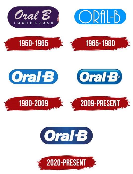
The original version was oval and horizontally elongated. On a purple background, “Oral B” was written in cursive, and below was “TOOTH BRUCH,” with both words written together.
1965 – 1980
Designers removed the bottom phrase and left only the company name. They also changed the color of the oval, made the symbols thin and printed, and changed their style.
1980 – 2009
In 1980, a group of original signs appeared in an entirely new design. The oval turned dark blue, and the letters became thick and italic.
2009 – today
Developers added a 3D effect to the current logo in the form of light glares along the top and bottom edges.
2020 – today
As a result of the redesign, the visual identity sign changed its style, although it retained the original elements. Modernization is mainly concerned with color. The developers removed the dark border, smoothed the three-dimensionality, and presented the logo in 2D. It became much darker, with barely noticeable lighting in the center. This effect is due to the gradient transition from light blue (in the center) to dark blue (closer to the edge). The inscription remained the same.
Oral B: Interesting Facts
Oral-B is a big name in keeping teeth clean and healthy. It started with a simple idea and grew into a brand people worldwide know and trust for their dental care.
- The Name: Oral-B means “Oral-Brush.” It all began with one toothbrush and a goal to focus on keeping mouths clean and healthy.
- The First Toothbrush: In 1950, Dr. Robert W. Hutson in California made the first Oral-B toothbrush. It had soft bristles that were nice to gums and teeth, unlike the hard ones. This new kind of brush was a big deal for dental care.
- Starting Small: Dr. Hutson had a big idea and patented his toothbrush design. He first made and sold them, showing Oral-B’s spirit of creating new things to help with dental health.
- Joining Bigger Teams: In 1984, Gillette bought Oral-B, helping it reach even more people. Later, in 2005, Procter & Gamble took over, adding Oral-B to its family of well-known brands.
- Electric Toothbrushes: Oral-B wasn’t just about regular toothbrushes; it also made one of the first electric toothbrushes for people to use at home in the 1960s. They’ve made new kinds with cool features like Bluetooth and sensors to improve brushing.
- Dentist’s Choice: Dentists worldwide often recommend Oral-B. The brand works closely with dental experts to ensure its products are good and safe for everyone.
- More Than Brushes: In the 1970s, Oral-B also introduced dental floss, making it easier to clean teeth. They continued adding toothpaste and mouthwash to their lineup.
- Teaching the World About Teeth: Oral-B works with dentists and teachers to spread the word about the importance of taking care of teeth.
- Lots to Choose From: Oral-B now offers various products for adults and kids. They want to ensure everyone has what they need for a healthy mouth.
- Smart Brushes: Some Oral-B toothbrushes can even connect to your phone to show you how to brush better, ensuring you take the best care of your teeth.
Oral-B’s journey from a single toothbrush to a world leader in dental care shows how much they care about keeping smiles bright and healthy. They keep coming up with new ways to make dental care better and easier for everyone.
Font and Colors
The brand name has always been associated with the word “Oral B,” and it is written in various styles. A blue horizontal oval serves as its background.
In the early version of the logo, the inscription was done in handwriting, from 1965 to 1980 in print font, and now in text with a slight right tilt. The central protrusion of the “B” is elongated and extends beyond the letter. The emblem’s color includes a combination of several shades of white and blue.
The latest changes did not affect the font – the brand name is done in Neue Haas Grotesk Black Italic font. The blue color transitioned from a light palette to a darker one with a gradient.
Oral B color codes
| Bright Navy Blue | Hex color: | #1574C4 |
|---|---|---|
| RGB: | 21 116 196 | |
| CMYK: | 89 41 0 23 | |
| Pantone: | PMS 2172 C |
