The Orange logo represents a special environment within which there is an open and lively communication. The Operator undertakes to provide quality services to all customers. From the emblem breathes warmth, friendships, and a large amount of useful information.
Orange: Brand overview
| Founded: | 1 January 1988 |
| Founder: | French State, Public float |
| Headquarters: | Issy-les-Moulineaux, France |
| Website: | orange.com |
Meaning and History
The corporation dates its history from the early days of 1988. Only then it was called France Télécom SA and was associated with the Postes state administration unit, Télégraphes et Téléphones. Two years later, the telecommunications provider acquired autonomy, and eight years later, it was privatized, with the government retaining 27 percent of the shares.
The Orange brand appeared in 1994 in the UK and represented Orange Personal Communications Services Ltd., formerly known as Microtel. It then changed owners frequently until France Télécom SA acquired it. This happened in 2000, and in 2006 the parent company underwent a rebranding and became Orange SA to combine all its products under one brand. At the same time, the famous orange square logo was developed, which replaced the same type of word sign.
1975 – 1981
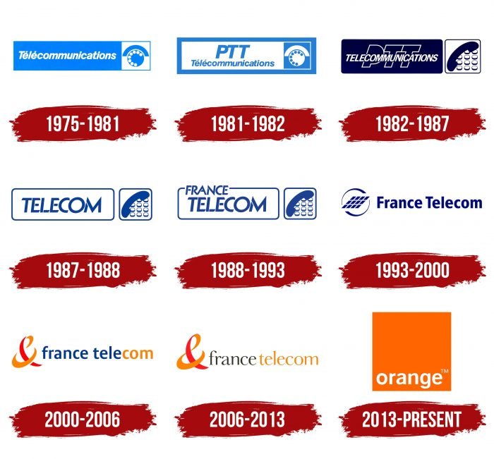
In the 1970s and 1980s. France Télécom did not exist. The telecommunications industry was beginning to develop in France, represented by the General Direction of Telecommunications. It had its logo: white “Télécommunications” inside a blue rectangle (left) and a blue telephone in a white square (right). Moreover, the telephone was shown schematically: one large circle – a rotary dial, eight small circles – numbers, a long arc – a tube.
1981 – 1982
In 1981, the logo’s proportions changed because the abbreviation “PTT” was added to the word “Télécommunications.” It was written in italics and occupied the top line.
1982 – 1987
In connection with the proliferation of push-button telephones, it was decided to change the design, placing the image of eleven buttons and a telephone receiver in a white square. In addition, the modernization affected the inscriptions: the abbreviation became the background for the word “TELECOMMUNICATIONS,” which was transferred to the upper case and aligned to the center. Instead of light blue, dark blue began to be used. A wide indent appeared between the rectangle and the square, making it possible to round the corners of both geometric shapes.
1987 – 1988
Shortly before the change in legal status, the organization updated its logo, making it simple and straightforward. For this, the designers removed the abbreviation “PTT” and reduced the word “TELECOMMUNICATIONS” to “TELECOM.” The interior of the quadrangles has turned white, and all elements have been repainted light blue.
1988 – 1993
In 1988, the most important event in the history of France Télécom SA took place: this company was founded based on Postes, Télégraphes et Téléphones. At the same time, it received its first name and logo, which was very similar to the brand name of its predecessor. The developers added the word “FRANCE” above “TELECOM,” for which they had to break the frame’s integrity around the rectangle.
1993 – 2000
Three years after gaining autonomy, the telecommunications service provider renewed its wordmark. Its name began to be written in one line, and all letters, except for the initial ones, were converted to lower case. The emblem took place on the left side: one large parallelogram, consisting of twelve small parallelograms encircled by two half rings. All elements were dark blue.
2000 – 2006
In 2000, the company entered into a deal with Vodafone to acquire the Orange brand. This step pushed her to change her identity. As a result, the logo began to look like a lowercase “france telecom” lettering with a stylized “&” symbol on the left. Moreover, the second word was divided into two parts using a color palette: blue “tele” plus orange “com.”
2006 – 2013
In 2006, designers used a thin serif typeface with contrasting stroke weight. The spacing between words has decreased, while “france” is black and “telecom” is completely orange. The ampersand has acquired the appearance of a curved ribbon of red-orange color.
2013 – today
In mid-summer 2013, France Télécom SA was renamed Orange SA. Her logo looks like a simple orange square with a white “orange” lettering at the bottom. The only additional element is the trademark mark to the right of the word.
Orange: Interesting Facts
Exploring Orange, the telecommunications giant, unveils a story of growth, innovation, and cultural contribution.
- French Beginnings: Emerging from France Télécom, Orange carved out its identity to stand out in the competitive telecom landscape, with its French origins shaping its approach to business and global outreach.
- Worldwide Reach: From its roots in France, Orange has evolved into a global force, offering telecom services across Europe, Africa, the Middle East, and beyond, demonstrating adaptability and creativity across markets.
- Pioneering Technology: Orange leads tech advancement, embracing 4G and 5G early on. Its investment in research aims to boost connectivity and pioneer new solutions.
- Cultural Engagement: Orange extends its influence to cultural arenas, backing film festivals and art exhibits, showcasing its dedication to societal and cultural progress.
- Silicon Valley Hub: Orange Silicon Valley symbolizes its innovation drive, delving into new technologies, digital health, and cybersecurity to stay at the forefront of tech evolution.
- Expanding into Finance: With Orange Money, it ventures into financial services in Africa and the Middle East, offering mobile payments to foster financial inclusion where traditional banking is scarce.
- Recognized Excellence: Orange’s commitment to quality, innovation, and sustainability has been acknowledged with numerous awards, cementing its status as an industry leader.
- Digital Education Support: It champions digital education, offering tools and training to diminish the digital gap and empower communities with essential digital skills.
- Focus on Customers: Through initiatives like Orange Bank, digital home solutions, and health services, Orange prioritizes innovations that resonate with and enrich the lives of its customers.
Orange’s transformation from a national to a leading digital services provider underscores its dedication to technological progress, societal contribution, and sustainability.
Font and Colors
At first glance, the emblem of the telecommunications corporation seems contradictory because the square does not resemble the orange with which orange is associated. But it is a symbol of a close connection, where each corner can represent services or subsidiaries. In other words, the integrity of everything the company does.
The developers have slightly changed the Helvetica Neue font to make the lettering unique and memorable. All letters are lowercase, streamlined, and sans serif. The main color corresponds to the name Orange. The full version of the logo is used for the square, while the word is left white.
Orange color codes
| Orange | Hex color: | #ff6600 |
|---|---|---|
| RGB: | 227 212 173 | |
| CMYK: | 0 4 20 7 | |
| Pantone: | PMS Bright Orange C |
