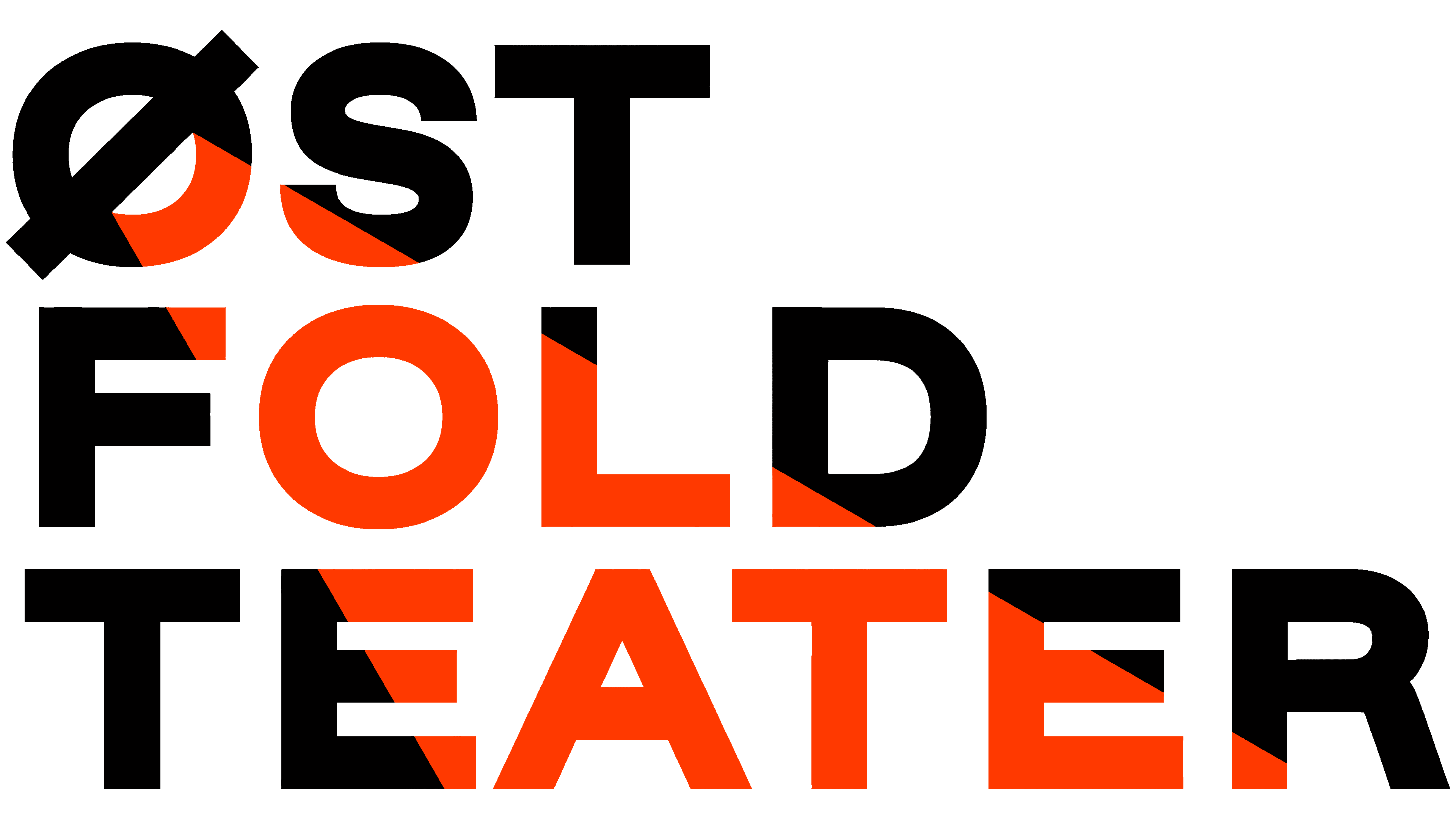
The regional theater in Fredrikstad has restored its historic name, Østfold Teater, and introduced a logo inspired by theatrical lighting. Announced on March 5, 2026, the update by Page Black turns the initial “Ø” into a spotlight whose beam passes through the name, changing the letters’ colors.
The board approved shortening the name from Østfold Internasjonale Teater in fall 2025. The change reflects a return to the theater’s roots and its official recognition as a regional institution serving all of Østfold. Its international connections, including participation in the IN SITU network, remain. The new identity accompanies a development plan running from 2026 through 2030.
Under Artistic Director Thomas Østgaard, the theater works in Fredrikstad and at other locations across the region. Since 2020, its primary focus has been site-specific performances and productions in public spaces. Through artist residencies, visiting performers develop productions with residents. The program includes contemporary Norwegian plays, classics, musical and children’s theater, and projects exploring local history. Performances take place in cultural centers, schools, and other spaces throughout Østfold.
Page Black received the commission following an open competition in fall 2025. The studio needed to create an identity that could accommodate different audiences and productions, working at sizes ranging from 15 mm to a building facade. Light extending beyond the stage connected the project to the theater’s work across the region.
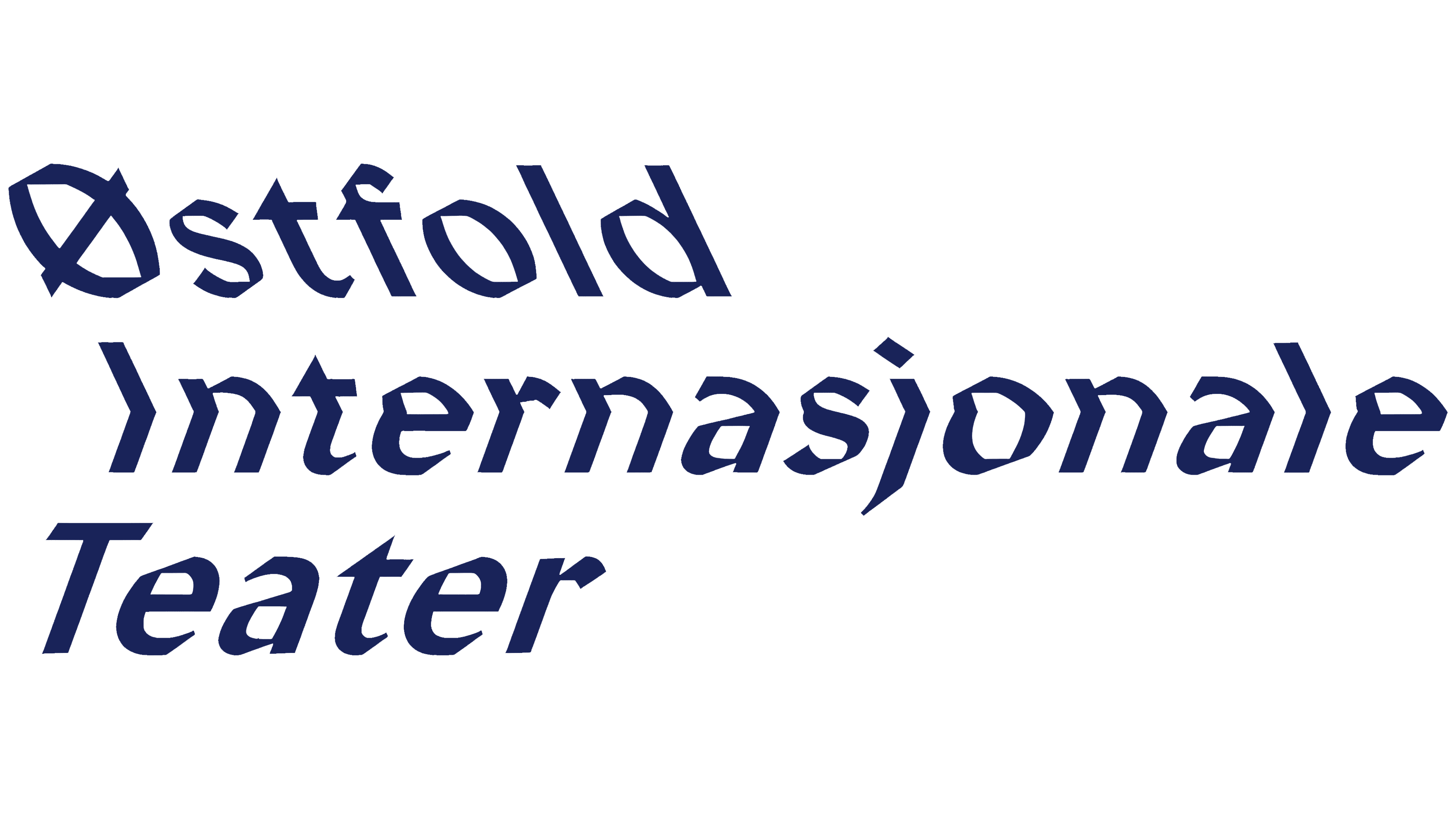
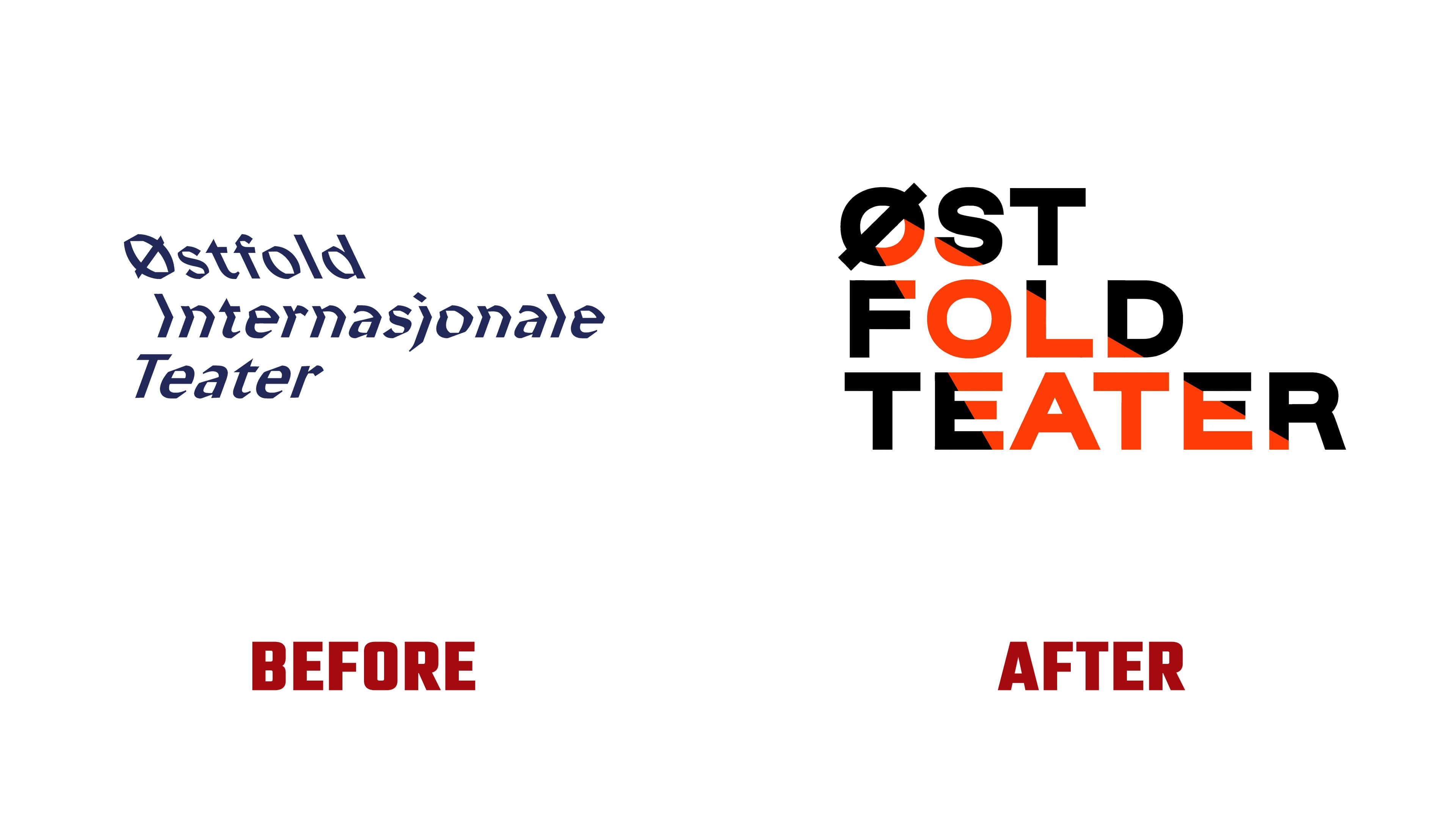
The previous logo placed the full words Østfold, Internasjonale, and Teater on 3 lines. Angular lettering in the top two lines resembled blackletter, while the bottom line used slanted sans-serif letters. Opposing slants created an elongated chevron shape. Following the name change, the wordmark was divided into ØST, FOLD, and TEATER. Bold uppercase letters stand upright, with the lines aligned on the left and widening toward the bottom.
The initial “Ø” determines the logo’s construction. Its diagonal stroke represents a lamp, casting a cone of light down and to the right. The red-orange beam crosses the black wordmark, coloring some letters entirely and passing through portions of others. Some versions show the full cone extending across the background. On a map, it covers Østfold, conveying the regional reach of the theater’s work.
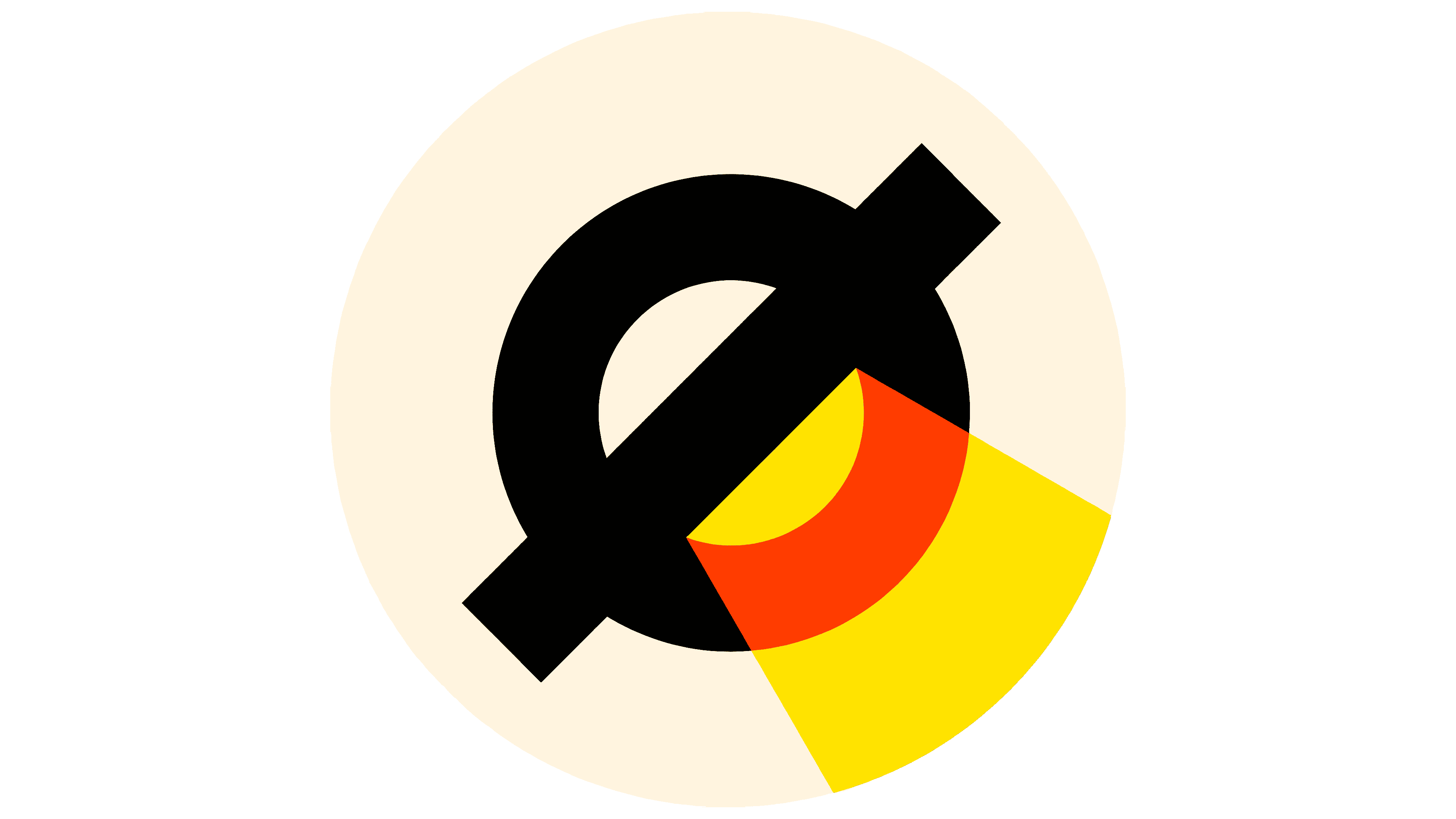
The identity’s geometry is based on the circle of the “O” and angles of 30°, 45°, and 60°. These govern how the logo is positioned and transformed. Alongside the primary three-line version, Page Black developed single-line, compact, and animated versions. The beam treatment comes in 12 color combinations, including single-color versions that alternate between light and dark areas.
Yellow, red-orange, black, white, and beige reference the sun and the region’s natural surroundings. The colors also connect to the theater’s 3 owners, Østfold County and the municipalities of Fredrikstad and Sarpsborg. The cone of light appears on posters and in interiors, uniting materials for different productions.
The studio produced guidelines and templates for programs, posters, retractable banners, presentations, letters, and social media posts. Theater staff used them for materials promoting B16: In Motion. The redesigned website launched on September 1, 2026. Værsågod handled development, with Molberger serving as the design subcontractor. The theater is updating its remaining materials in phases throughout 2026.