 Ovintiv Logo PNG
Oil and gas production involves exploring for deposits, extracting raw materials, and preparing them for further use. These processes supply energy for industry and households. The Ovintiv logo represents an energy company that extracts and processes hydrocarbons and operates in international markets.
Ovintiv began to take shape in the nineteenth century. In 1881, an organization connected with the construction of the Pacific Railway was established in Canada. It obtained the rights to extract natural resources. By 1883, the company discovered the first natural gas fields. In 1958, Pacific Oil and Gas was formed. After merging with Central-Del Rio Oils in 1971, the company became Pan Canadian Petroleum Limited.
In 2002, Pan Canadian merged with Alberta Energy Corporation. As a result, EnCana was formed and became one of Canada’s largest natural gas producers. In 2009, EnCana was split into two entities. The new companies were EnCana Corporation and Cenovus Energy.
In 2019, the company began a large-scale transformation. The company renamed itself Ovintiv. It incorporated in Delaware and moved its headquarters to Denver. Shares under the symbol OVV began trading on the New York and Toronto stock exchanges on January 27, 2020.
By 2021, Ovintiv had oil and gas reserves totaling 2.26 billion barrels of oil equivalent. Its production assets were located in the United States and Canada. Key areas included the Permian Basin, the Anadarko field, and the Montney gas region.
In 2024, the company announced the acquisition of Montney assets from Paramount Resources for $ 2.38 billion. The deal closed on January 31, 2025, for $ 2.31 billion. The new assets increased production by 70 thousand barrels of oil equivalent per day, strengthening the company’s position in the region.
In the second quarter of 2025, Ovintiv reported earnings per share of 1.18 dollars. The result exceeded analysts’ forecasts. Operating cash flow reached $ 1.01 billion. Free cash flow totaled $392 million. Average daily production rose to 615 thousand barrels of oil equivalent. The company intends to maintain growth and continue returning value to shareholders.
The company continued its share repurchase program and paid dividends. It reinforced its position in the North American energy market.
Meaning and History
What is Ovintiv?
It is an American energy company based in Denver, formed after a major Canadian producer transformed and moved its legal address from Calgary to the United States. It primarily explores for and produces oil and gas in key North American shale regions. Production assets are concentrated in the Permian Basin on the Texas-New Mexico border, the Anadarko Basin in Oklahoma, the Montney Formation in British Columbia and Alberta, and the Uinta Basin in Utah.
before 2009
The roots of what would become EnCana trace back to natural gas discovered in 1883 while drilling a water well near Medicine Hat. The drilling took place on Canadian Pacific Railway land. Founded in 1881, the railroad had received land grants that included mineral rights. Its oil and gas assets later became part of PanCanadian. In 2002, PanCanadian Energy and Alberta Energy Company merged to form EnCana. That merger marked the beginning of the logo history of what would become Ovintiv, an oil and natural gas exploration and production company operating in North America.
The new name combined “Energy” and “Canada,” linking the energy industry to the merged business’s Canadian origins. The company gave the opening “en” an additional meaning, associating it with putting words into action. The logo was intended to present EnCana as an established business with extensive experience, even though the shared name had only just emerged from the merger.
In the 2002 version, dark blue-green EnCana lettering with a turquoise tint appeared above a pair of arcs. The letters had serifs, and the capital “E” and “C” rose above the rest of the word, separating the name into 2 parts. Beneath it ran 2 curved bands. The upper band was thin and blue, while the lower one was bright light green. On the right, they converged near the arc’s pointed end, beside a small starburst.
The arc represented the horizon and the company’s future opportunities. The starburst stood for employees’ energy and enthusiasm. Blue and green preserved a connection to the merger’s 2 participants, PanCanadian and Alberta Energy Company. The colors also carried business-related meanings. Blue referred to water, the sky, and offshore production. Green represented land, onshore operations, growth, and environmental care.
2009 – 2019
In the 2010 logo, “encana” appeared entirely in lowercase. Uniform lettering replaced the contrasting sizes of the “E” and “C.” The letters retained their serifs and became dark blue with a turquoise tint. The update aimed to maintain a connection to the previous brand while presenting the company after separating its businesses.
In 2009, Cenovus took the oil sands assets, while Encana focused on unconventional natural gas resources. When introducing the emblem, the company linked its new direction to natural gas production, advanced technology, and improved production methods. The colors and horizon motif remained, linking the company’s changed focus to its earlier identity.
Beneath the lettering were 2 smooth arcs with pointed ends. The upper arc matched the name’s blue, while the lower one was light green. The lines rose toward the middle and curved down toward the edges, suggesting a horizon or a hill’s outline. They ran parallel and tapered at their ends. Removing the starburst simplified the design, leaving 2 separate bands beneath the name.
2019 – today
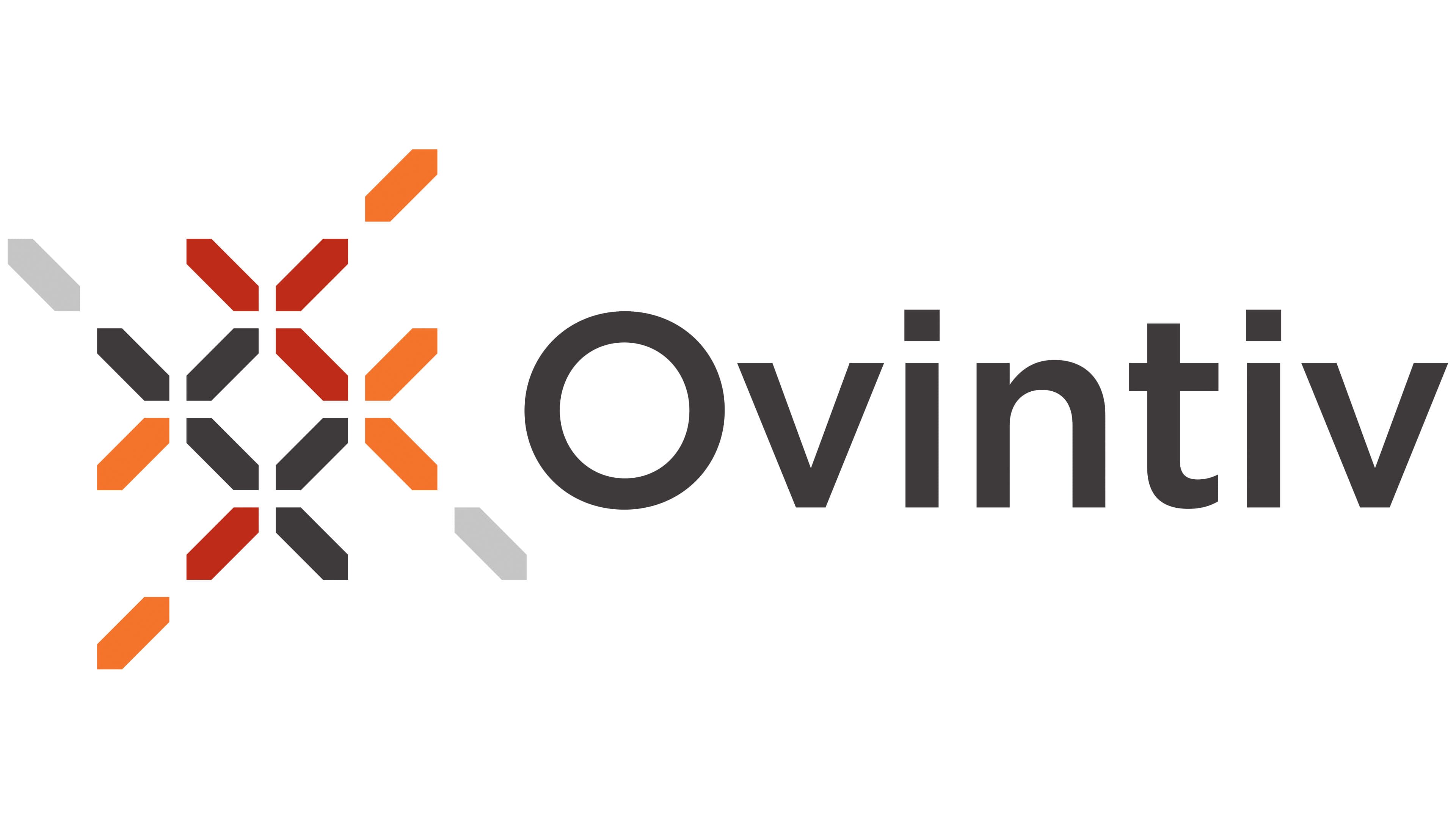
Ovintiv’s new emblem centered on human connections supported by energy. When presenting the brand, the company spoke of the affordable, reliable energy needed for everyday life. The Ovintiv name was associated with continuous innovation. Created specifically for the business, it replaced EnCana and its reference to Canada.
The company announced the name change and new emblem in 2019, along with plans to move its legal domicile to the United States. The changes accompanied the expansion of its U.S. business and a shift in Encana’s production mix, which had previously centered on natural gas. Shareholders approved the rebranding, and the corporate reorganization was completed in 2020. Ovintiv shares began trading under the ticker OVV on the New York and Toronto stock exchanges.
The name appeared to the right of a separate symbol. The dark gray lettering used a regular sans-serif style, with only the opening “O” capitalized. Its letterforms resembled Avenir or Gotham. A compact lattice on the left replaced the elongated arcs beneath the name. The new arrangement also changed the color and typography.
The pattern consisted of short, equal-length segments with 45-degree cut ends. Diagonals formed repeating cross-shaped connections, arranged symmetrically both vertically and horizontally. White gaps separated the segments, leaving open spaces within the lattice. Brick-red and bright orange sections appeared alongside gray and graphite-colored ones. The multicolored interweaving represented human connections. EnCana’s earlier emblem had focused on the natural environment and the geography of energy production.