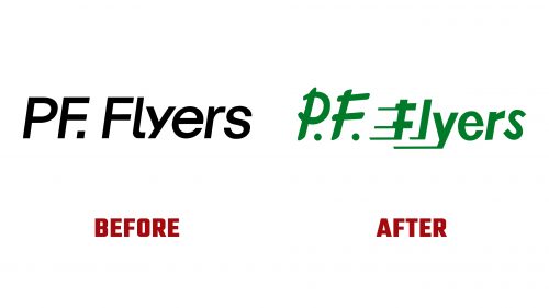
P.F. Flyers, an iconic American shoe brand launched in 1937, has introduced a new logo and identity designed by Bokeh with help from Trackmeet. This rebranding aims to restore the brand’s heritage and appeal to modern consumers.
The previous logo, while maintaining an italic style, lacked visual impact. The new logo is inspired by early advertising and the shoe design in the 1993 film “The Sandlot.” The new “P.F.” lettering uses a bold brush stroke, capturing the brand’s dynamic essence. The intersecting lines add a sense of movement and speed, reflecting the brand’s athletic legacy.
The word “Flyers” uses a vintage sans-serif style with comic-book-like speed lines. This design enhances the retro appeal of the logo. The letters “e,” “r,” and “s” could be refined for better harmony, but the vintage vibe successfully honors the brand’s roots.
Two logo versions have been created: a horizontal layout and a round version. The round version looks striking on the shoes, reinforcing the brand’s connection to its iconic footwear.
The color palette focuses on green, a tone deeply linked to P.F. Flyers’ history. This limited color approach ensures strong brand recognition and consistency. The green hue and other iconic tones from the brand’s past evoke trust and familiarity among loyal customers.
The typographic system in the new identity is functional and expressive. It is designed to be clear and legible while reflecting the brand’s personality. This balance makes the typography an integral part of the visual identity.
The rebranding process included a workshop at P.F. Flyers’ headquarters in Boston. The workshop featured printed materials, stickers, and patches to foster conversation and align the team around a shared vision. This effort ensured the new identity stayed true to the brand’s heritage while appealing to modern consumers.
In 2021, P.F. Flyers tried a rebrand targeting Millennial and Gen Z women, focusing on challenging norms. This strategy alienated the loyal customer base—the latest rebranding returns to the brand’s roots, focusing on comfort, freedom, and fun.
P.F. Flyers has a rich history as one of America’s original sneaker brands. Soldiers wore it during World War II, and it was the first shoe company to endorse a professional athlete. The brand’s slogan, “run faster and jump higher,” became iconic through its association with “The Sandlot.” This nostalgic connection is central to the new branding, targeting Millennials and Gen Z, who seek comfort and authenticity.
The new logo and identity aim to rebuild the brand’s character, trust, and familiarity. The rebranding successfully resonates with its target consumers by tapping into the brand’s heritage. The limited color palette, functional typography, and vintage-inspired logo create a cohesive and memorable brand identity.


