


![]() Pagani Logo PNG
Pagani Logo PNG
The noise of the iron horse motor is heard when looking at the emblem. The Pagani logo conveys the style and rugged fit of the brand’s machines. Their engines are powerful, and their hulls are strong. The perfect combination of design and content allows you to achieve great acceleration.
Meaning and History
![]()
The company reflects its creator’s bold and creative spirit, who was not afraid to experiment. It manufactures carbon fiber supercars in small series or as custom builds. Its first and main project is the Pagani Zonda, introduced in 1999. The car’s design was inspired by jet aircraft. In 2011, the Zonda was replaced by the new Huayra. The ideological successor differs from its predecessor in increased power and improved technical characteristics.
What is Pagani?
This company, founded by Horacio Pagani in San Cesario sul Panaro, near Modena, Italy, produces ultra-exclusive hypercars. The company creates some of the world’s most expensive and intricate cars; each vehicle is a masterpiece of engineering and art, featuring Mercedes-AMG engines, advanced carbon-fiber composites, and refined interiors. Flagship models like the Zonda and Huayra embody automotive perfection, with production intentionally limited to maintain exclusivity and ensure the highest level of attention to detail.
1992 – 2017
![]()
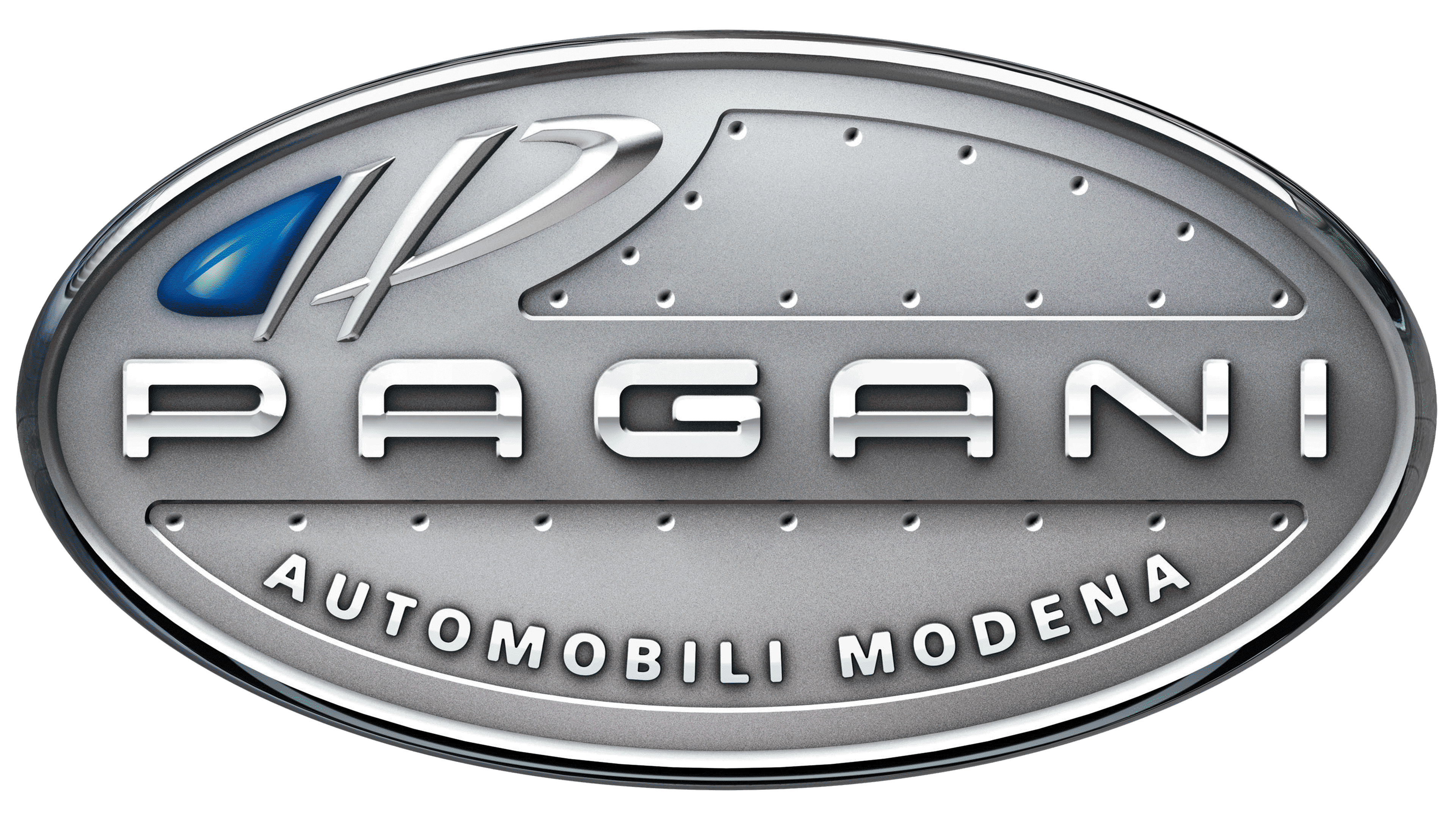
The brand’s emblem is instantly recognizable for its distinctive design. The full name, “PAGANI Automobili Modena,” is prominently featured. “PAGANI,” written in bold capital letters, takes center stage within a sleek, silvery oval. Below, the remaining text is subtly reduced in size and curves gracefully along the oval’s lower edge, forming an inverted arch.
The left half of the logo (just above “PA”) has two letters, “P.” One is turned in the opposite direction and partially painted blue with a gradient. The second “P” has a familiar layout but is written in an unusual stylized font. These “mirrored” letters form another oval that balances the overall geometry.
The symbol appears three-dimensional due to smooth color transitions and lines that form “notches.” The highlighted segments appear to be indentations. They are decorated with small dots along the edges, forming two closed chains. It was in one of these “recesses” that the phrase “Automobili Modena” was located. The large oval has a border. It is separated from the main plane by a wide line gradient from dark gray (left) to almost white (right).
The emblem is adorned with a metal badge that is mounted on cars. Its stylish design represents Pagani as a prestigious hypercar manufacturer and underscores its high profile. The most significant element is the brand name; all other details serve only as background. But the figure stands out, consisting of two mirrored letters “P.” It makes the logo recognizable and balances its geometry.
2005 – today
![]()
This emblem has been used since 2005, coinciding with the evolution of the Pagani brand, which had already established itself as a producer of unique, handcrafted vehicles that blend the best Italian design with cutting-edge technology.
The Pagani logo embodies a fusion of minimalism and advanced technology, perfectly aligning with the brand’s philosophy of crafting some of the world’s most exclusive and expensive supercars. The logo is designed in a modern, precise, and even technological style, highlighting the company’s innovative approach to car manufacturing.
The emblem’s main element is the “PAGANI” inscription, rendered in a font with straight lines and rounded corners. This typeface conveys strength and reliability while suggesting aerodynamics and dynamism, essential qualities for vehicles of this caliber. The letters are sleek and understated, emphasizing the brand’s premium status and pursuit of perfection.
The inscription is enclosed within an oval frame, symbolizing completeness and harmony. The oval shape also evokes an ellipse, one of the most aerodynamically efficient forms, making it ideal for a brand that pays meticulous attention to every detail of its vehicles. This frame, neatly surrounding the brand name, creates a visual connection between speed and elegance, two fundamental aspects of Pagani automobiles.
The color scheme, primarily in black and white, reinforces a sense of precision and sophistication. Black represents power, luxury, and exclusivity, while white symbolizes purity and technology, making the logo visually balanced and aesthetically appealing.
Font and Colors
No exact typeface perfectly matches the design of the word “PAGANI.” An approximate copy is the Arkitech Font, designed by Neogrey Creative. It is characterized by rounded sans-serif letters that echo the emblem’s oval shape. The phrase “Automobili Modena” uses a completely different typeface: also grotesque, but subtler, with clearly defined angles.
The designers chose classic colors for the Pagani logo, which many automakers use. The basis is a silver palette of several shades. It creates a metallic effect and makes the logo three-dimensional with a gradient. The brightest part (half of the flattened “P”) is colored blue to dilute the gray background.