


![]() Palette Logo PNG
Palette Logo PNG
The logo shows an impressive variety of the manufacturer’s palette. Even the most unusual shades can be found on the shelves. The Palette logo represents a company ready to create any combination to achieve a well-groomed appearance and a good mood for the client.
In 1898, in Berlin’s Charlottenburg district, chemist Hans Schwarzkopf opened a small drugstore selling dyes, medicines, and perfumes. That same year, he introduced Germany’s first powdered shampoo, which was dissolved in water, quickly replacing soap in hair washing and laying the foundation for Schwarzkopf’s focus on hair care and color.
In 1927, Martha Schwarzkopf established the Institute for Hair Hygiene, formalizing research into formulas and products. Over the following decades, the company launched Europe’s first liquid shampoo and later the Taft hairspray, building technical expertise in hair treatment and coloring.
In the 1970s, Schwarzkopf introduced Palette, a home-use hair dye line offering a wide range of shades. The concept expanded consumer choice beyond the limited options previously associated with professional salons.
At the time, the market already included strong competitors. L’Oréal had been producing hair dyes since the early 20th century. At the same time, Clairol, owned by Bristol-Myers, promoted home coloring through its campaigns from the 1950s. Palette entered this market with a focus on product range and technical precision.
In 1995, Henkel acquired Schwarzkopf, integrating it into its consumer brands portfolio. The deal enabled production scaling, international expansion, and larger marketing campaigns, pushing Palette beyond Western Europe.
After the collapse of the Soviet Union, Palette expanded into Eastern Europe, the Middle East, and Asia. The line gained traction in markets such as Russia, Ukraine, Poland, and Turkey, where home coloring became widespread.
In the 2000s, Palette added new formats, including toning balms, ammonia-free formulas, and products with care components, while adapting packaging and regional advertising strategies.
Meaning and History
![]()
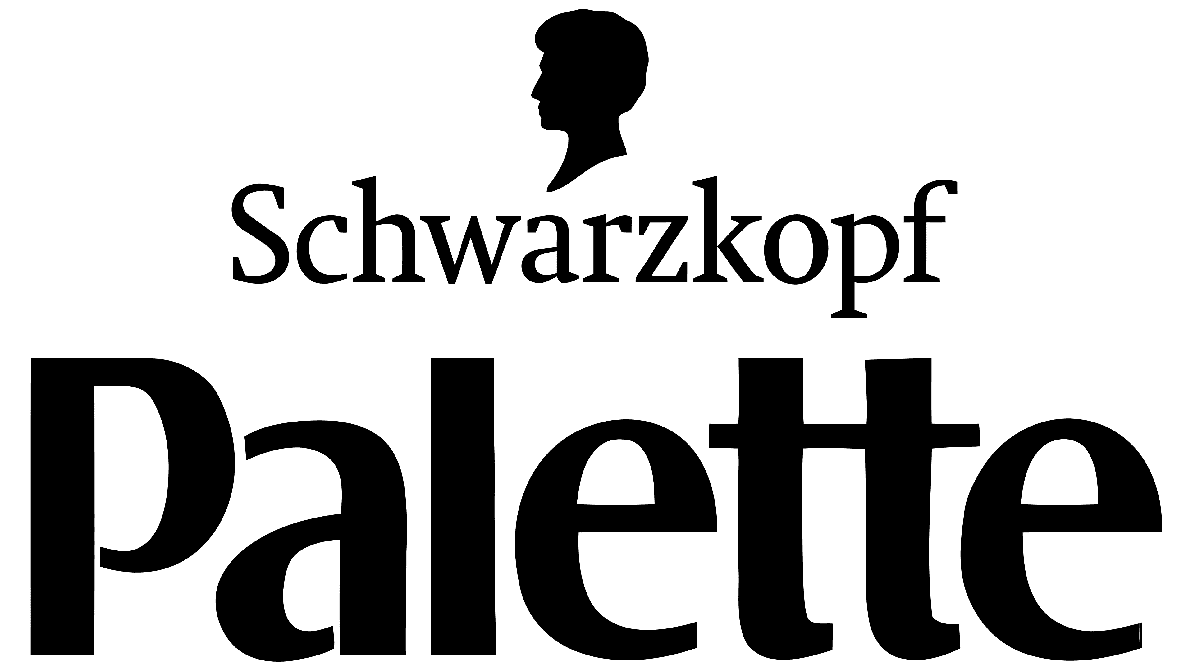
The Palette emblem appeared immediately with the launch of the cream paint, as it was on its packaging. Throughout its existence, it has not undergone any major changes and remains the same as it was at the beginning.
The logo combines graphic and text elements. The name is at the top and has the original spelling of paired letters “e” and “t.” First, the central stroke is diagonal; in the second, it is raised higher than usual. Below is a triangle made up of several colored paint strokes.
What is Palette?
This Henkel hair-color line has gained popularity in Europe and beyond as a home hair-coloring solution. From vibrant fashion shades to classic natural colors, the brand offers a wide range of permanent, semi-permanent, and tinting dyes to meet any need. The unique formulas combine nourishing ingredients with intense pigments to keep hair healthy and shiny after coloring. This line makes salon-quality coloring accessible at home, featuring powerful gray-covering creams, gentle formulas for sensitive scalps, and professional mixing ratios for precise color results.
Old
![]()
Palette’s debut logo is graphic-textual: it consists of the name of a cosmetic company. The original inscription is typed in lowercase. The letters are mostly wide, but some have thin lines. At the same time, they form sharp and miniature serifs. The glyphs are very interestingly colored: the first and last two characters (“p,” “t,” “e”) are golden, and the rest (central) are black. This division emphasizes the primary product: hair dye. The same task is served by a bright color scheme collected in an original triangle. It has several segments: yellow, sand, burgundy, dark brown, and black. The right side of the figure is pointed, and the left side is made wavy. Above the line’s name is the inscription “Schwarzkopf” in bold glyphs. Above is a black head that is turned in profile. It is marked with thin stripes on both sides.
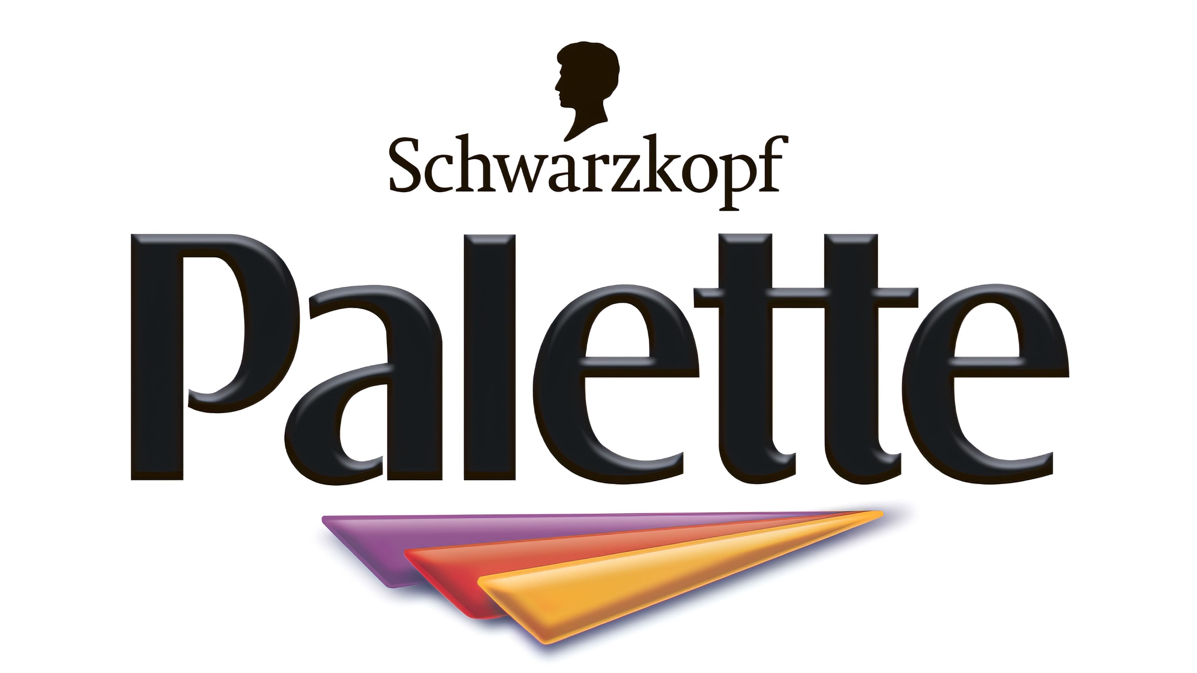
New
![]()
The modern Palette emblem has retained some of the features of the old version. It contains not only the brand name but also a corporate triangle formed from several colored stripes. However, now their number has been reduced to three, and they resemble the elements of a bird’s wing. One of them is golden; the second is red-crimson, and the third is purple. They, as before, are directed with a tip to the right side. The lettering has been repainted in black. The glyphs are more widely spaced and have a distinct shape. The designers removed the serifs and converted the first letter to uppercase.
Font and Colors
The name of the line in the emblem is written in a typeface from the Sans Serif group, smooth, chopped (sans serif). Moreover, a mixture of printed and handwritten signs was used. There are several accented letters: freehand “e,” “P” with a semi-circular stroke underneath, and “t” with a high bar. The logo palette includes black, white, purple, red, and yellow colors.
![]()