![]() Pampered Chef Logo PNG
Pampered Chef Logo PNG
The Logo of Pampered Chef directly reflects the international company’s activities. The designers needed just one image that could tell a lot. This universal object is connected to various spheres around it as constant companions. It’s the axis of everything related to cooking, making it instantly recognizable and easily understood by all.
Pampered Chef began on October 15, 1980, when Doris Christopher, a former home economics teacher from suburban Chicago, held her first cooking demonstration for a small group of guests. After her youngest daughter started school, she wanted work that could begin from home, require little capital, and still leave room for family life. She started with $3,000 taken from an insurance policy.
Christopher used that money to buy about 70 types of kitchen tools from a wholesaler at Chicago’s Merchandise Mart. Her model was based on home cooking shows, where guests prepared food and used professional utensils. She separated the format from Tupperware-style parties by focusing on practical kitchen skills. Sellers were called kitchen consultants rather than sales agents.
By 1982, Pampered Chef had its first dozen independent consultants and more than $100,000 in sales. In the mid-1980s, the company joined the Direct Selling Association and grew through referrals. Sales reached $1 million in 1988. In 1996, Pampered Chef entered the Canadian market. It surpassed $500 million in annual sales, followed by expansions into the United Kingdom in 1999 and Germany in 2000.
In 2002, with annual sales at $740 million, Berkshire Hathaway acquired Pampered Chef from Christopher and her family. Warren Buffett praised the business and noted its 232% revenue growth from 1995 to 2001. Christopher returned as chair and interim CEO in 2014, Tracey Britt Cool became CEO in 2015, and Nevena Srebreva took over in 2024. New markets included Austria in 2019 and France in 2020.
Meaning and History
![]()
Doris Christopher decided to start a business that would bring her income and value. As a result, she decided to experiment with a unique advertising scheme for her pleasure. The fact is, she began to demonstrate kitchen utensils at her home during the cooking process. And she opened her first location in a basement. Naturally, the logo was chosen in a simple style, easy for most customers interested in the products offered. It is also directly related to the culinary theme, so with one glance, it’s clear: one can cook exquisitely even in a simple home setting.
What is Pampered Chef?
Pampered Chef is an American trading company in the Berkshire Hathaway structure. It’s managed by the city of Addison, Illinois. Their additional offices are in France, Austria, Canada, and Germany. The international network offers innovative food preparation solutions for kitchen utensils, including dishes and cutlery. Their wide range of products also includes tools and cookbooks with recipes. The company’s founder and leader is Doris Christopher.
First
![]()
The emblem consists of a contour drawing depicting a plump chicken, either sitting on a nest or fermenting dough. Both represent the essence of simple home cooking since chickens are the most common livestock in household farming. They are considered a source of eggs and dietary meat suitable for most dishes. Below the bird is something resembling yeast dough or a nest in a container, inscribed “The Pampered Chef.” The first and last words are lowercase, and the middle is larger. They are all written in uppercase letters with serifs. The glyphs are staggered.
Second
![]()
The designers shrunk the chicken and the nest below it, but enlarged the company’s name. Now it’s centered and spread across three rows, so the “Pampered Chef” inscription occupies the entire space. Each letter appears like a monogram, and the overall emblem resembles a vignette because the glyphs are highly rounded and embellished with thin, ornate lines. The text is set against a white background and framed to match the lines’ contours. The logo’s color is monochromatic.
Third
![]()
The company, which offers dishes and cutlery, expanded its visual identity by eliminating the image of a chicken sitting in a nest. In its place came a chef’s hat, perfectly representing the direction of work and the range of products offered. There are fewer ornate lines, but they remain.
For instance, elegant twists are found in the capital “P” and “T,” while the combination of the lowercase “p” with the “C” below forms a monogram. Moreover, the curved line from “T” transitions to the chef’s hat and seamlessly forms its contour. The name is typed with thin, rounded, serifed glyphs. Below, there’s another text – the marketing slogan “discover the chef in you…”. The last word is underscored, giving it conceptual significance. The letters vary in size, appear casual, and look handwritten.
Today
![]()
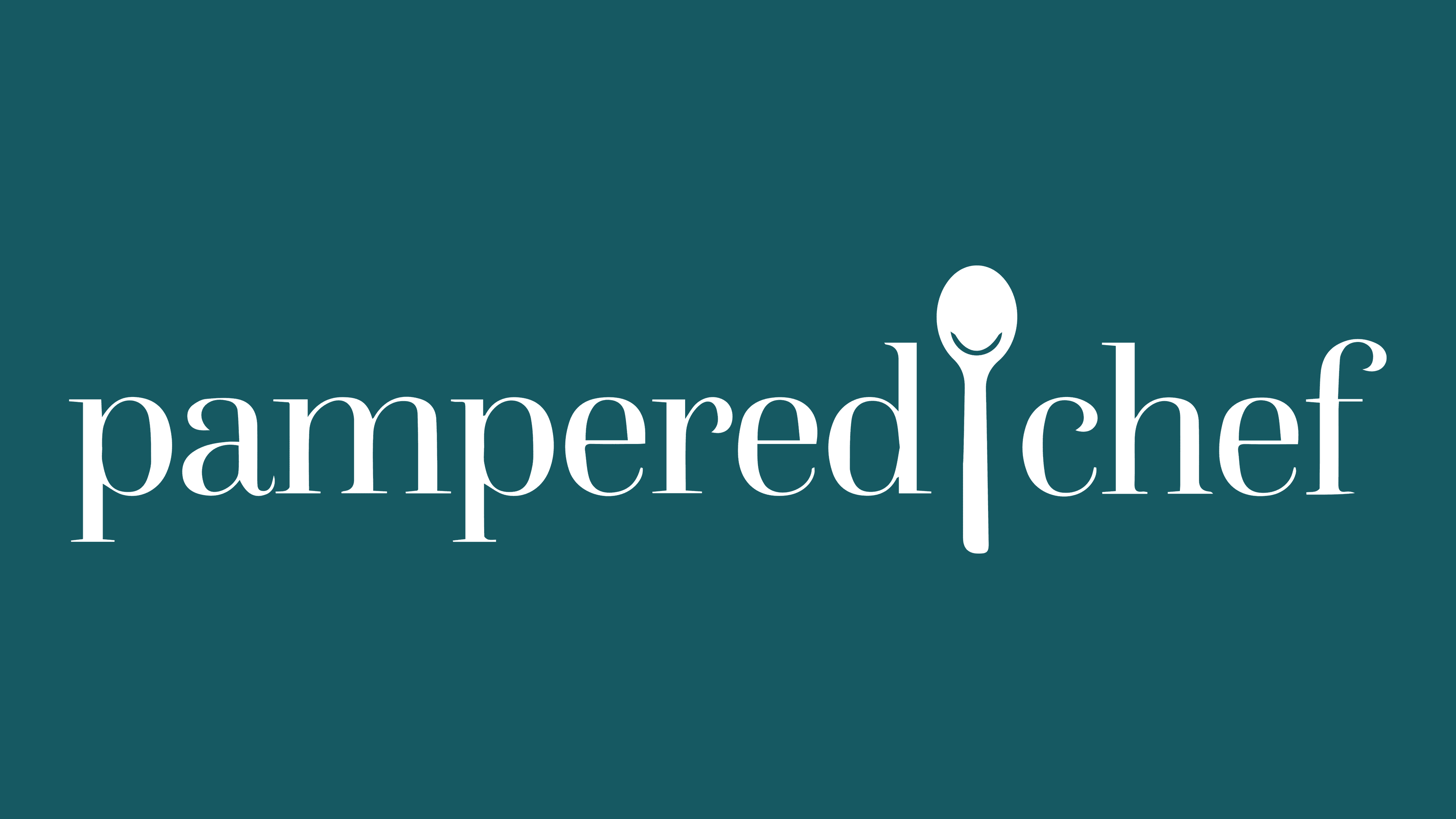
Compactness and modernity are what characterize the Pampered Chef logo. The simple design makes it universal and displays well on any medium. The chef’s hat is a thing of the past. In its place is a spoon. Not only does it hint at the retail chain’s main product range, but it also embodies cuisine as a whole. After all, without this tool, it’s impossible to cook or eat. The designers turned the spoon into a friendly utensil – a smiling one. They represented the smile as a reflection of light.
The inscription is also made in a matching style. Thanks to rounded letters, the name retains its soft features. Elegant glyphs, styled with thin and straight serifs, suggest that the cooking process can be a true art with the right kitchen utensils. The text is elegant, in a single line, and split into two parts, with the spoon as the divider. All letters are in lowercase.
Font and Colors
The inscription is crafted in a very soft typeface with smoothly rounded glyphs. Some of them are adorned with ornate swirls. The most recognizable font is the Questa Grande Regular by The Questa Project, featuring straight serifs on elegant letters. There, thin lines harmoniously alternate with semi-bold ones. The retail chain’s signs use a monochrome color palette. The designer skillfully combines black and white, promoting a sense of simplicity and accessibility.