


![]() Pampers Logo PNG
Pampers Logo PNG
The Pampers logo is a way of expressing yourself. With its help, the American company shows its commitment to caring for children, as indicated by a bright heart and bubble lettering with softened corners. The symbol of love consists of a yellow ribbon from which four rays emanate as if the heart is glowing from within.
Pampers began inside Procter & Gamble in the mid-1950s. In 1956, chemical engineer Victor Mills visited his daughter’s family and faced the routine of changing and washing cloth diapers for his newborn grandson. He asked P&G’s research team in Ohio to develop a disposable diaper that could be made well and sold at a mass-market price.
At the time, disposable diapers accounted for less than 1% of diaper changes in the United States. Mills saw potential in clean absorbent paper from a cellulose plant, and that idea led to Pampers. Early tests took place in Dallas, and in 1959, 37,000 diapers were sewn by hand for a test market in Rochester, New York. The first machine-made version was tested in Peoria, Illinois, in 1961. The name “Pampers” came from Alfred Goldman of Benton & Bowles.
The first reaction was mixed because the diapers cost about 10 cents each, too high for daily use. P&G reduced costs by improving production speed. By the mid-1970s, Pampers held 75% of the U.S. market and was sold in about 75 countries. The brand added adhesive tapes, newborn and toddler sizes, and versions for premature babies.
In 1976, P&G launched a shaped diaper with elastic features under a separate brand, Luvs. In 1978, Kimberly-Clark answered with Huggies, which quickly took 30% of the U.S. market. Pampers then added elastic side gathers and refastenable tapes in 1982, followed by a thinner gel-based diaper in 1986. By 1979, Pampers had become P&G’s first $1 billion annual-sales brand. Victor Mills died on November 1, 1997, after also working on Ivory, Duncan Hines, and Pringles.
Meaning and History
![]()
Alfred Goldman of the advertising agency Benton & Bowles created the original name. As for the logo, it has changed several times, but all versions always contain the word “Pampers.” Designers used different colors and fonts to decorate it until they came up with iconic turquoise letters with rounded corners.
What is Pampers?
Pampers is the manufacturer of the world’s first disposable diaper. Mass production of children’s underwear began in 1961. In the same year, a brand was created that is still owned by the American corporation Procter & Gamble. Over time, wet wipes and other children’s hygiene products appeared in their assortment.
1961 – 1985
![]()
The first logo conveyed the new product’s benefit by featuring the marketing phrase “Instead of a DIAPER” with three dots at the end. The advertising slogan made it clear how profitable it is to use disposable diapers. It was light gray and was in the top row. The first three words were written in cursive, while “DIAPER” was written in bold italics. The lower part of the logo was occupied by the brand name, set in black serif letters. The background could have been anything, but a version with a dark red rectangle has been preserved.
1985 – 2000
![]()
1985 marked a turning point in Pampers’ history, as the company began using a single-word logo. It was light blue and had a white background. The inscription was outlined with a gray stripe, set slightly apart. Narrow letter spacing, combined with vertically-stretched bold type, made the brand name stand out. And the large, rounded serifs added originality.
2000 – 2012
![]()
After redesigning in the early 2000s, the word lost its outline and serifs. And a heart appeared above it, depicted in one bright yellow line and complemented by two uneven horizontal stripes on the sides. Three short orange dashes were drawn on top, simultaneously conveying the energy of light and movement. The Pampers company name was written in custom bubble glyphs in turquoise.
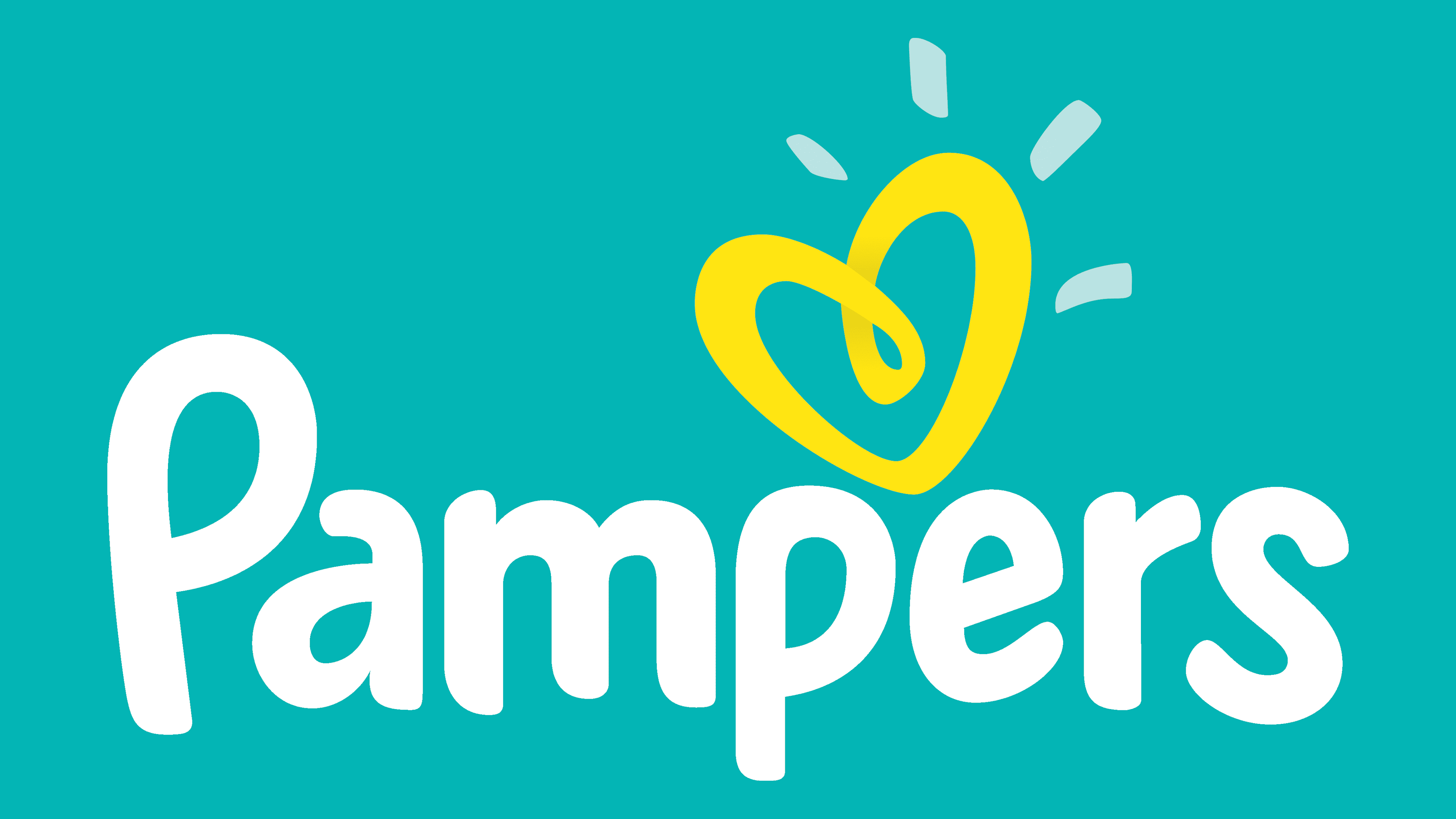
2012 – today
![]()
In 2012, the designers slightly lightened the inscription and smoothed the corners. At the same time, they made the letters seem to jump by changing their lengths at the bottom. In this version, the wordmark looks non-standard and inspires confidence because of its “childishness.” The heart has become lemon yellow; now it is three-dimensional because the ribbon that forms it folds into a three-dimensional loop. The transition of different shades creates the 3D effect. The two long stripes to the heart’s right and left have disappeared. There are four short dashes on top; they are not orange but transparent blue.
Font and Colors
The Pampers symbol expresses tenderness and love towards children. This is suggested by the non-aggressive color scheme, the rounded edges of the letters, and the logo’s main graphic element, the heart. Moreover, the strips emanating from it simultaneously denote light and movement energy. That is, there are dynamics in the emblem. In addition, all of the above hint at the exceptional softness of diapers.
The creators of the Pampers logo have developed a unique inscription that has an individual design. It consists of bold letters of approximately the same thickness. They have an asymmetrical shape and rounded corners in the style of bubble fonts. All glyphs except for the first “P” are lowercase.

The colors are chosen so that there is nothing dark or aggressive in them. The emblem uses gentle but quite bright shades of yellow and turquoise, which, according to the authors’ idea, should inspire confidence, a sense of coziness, and psychological comfort.