


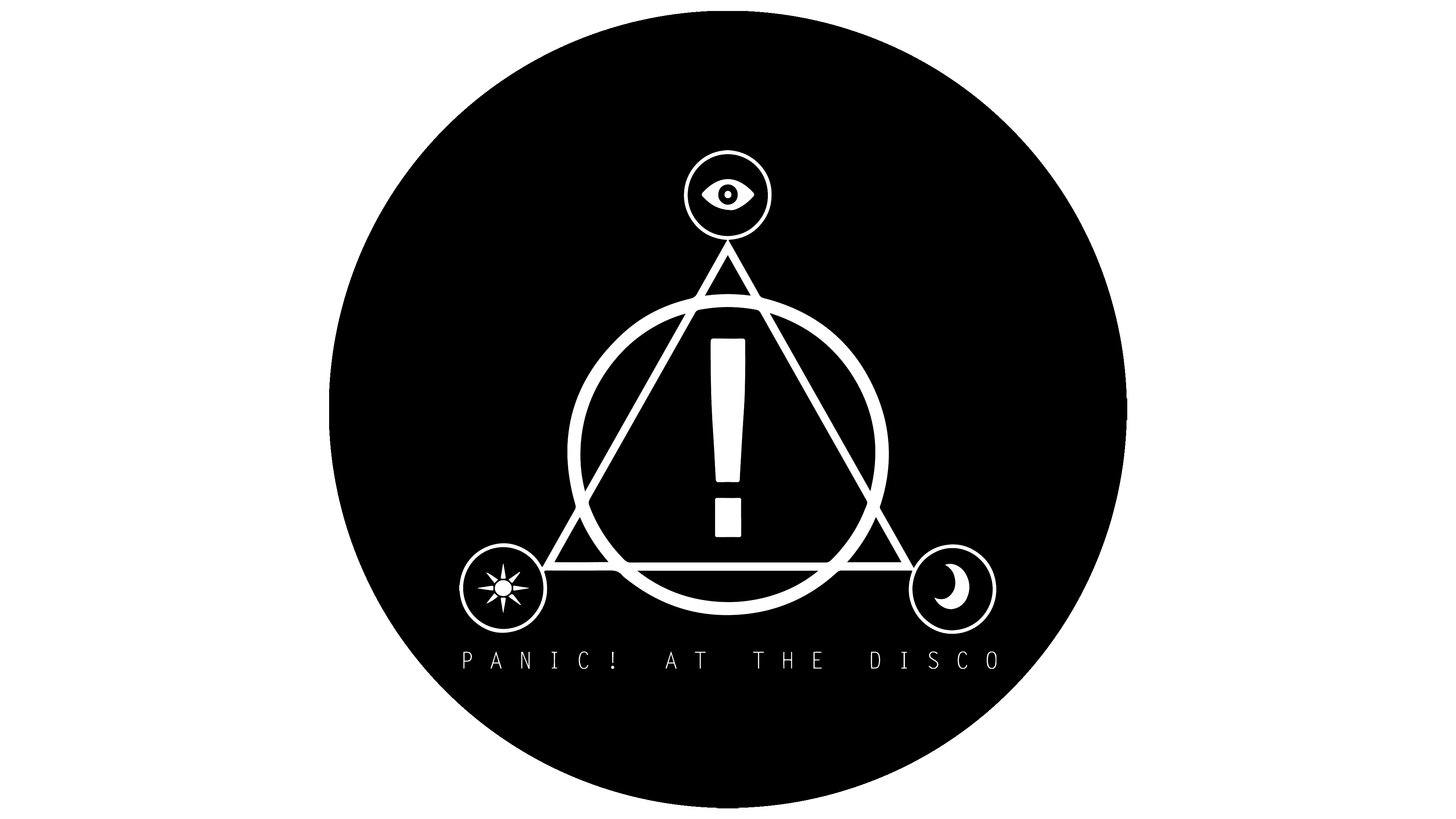
![]() Panic! at the Disco Logo PNG
Panic! at the Disco Logo PNG
The group’s emblem is completely non-standard and unusual. Panic! at the Disco’s logo looks like someone hastily scribbled letters on a wall with paint. The style shows freedom, boundary-transgression, and music loved on the streets, causing a stir in the discotheques.
Panic! at the Disco began in 2004 in Summerlin, near Las Vegas. Ryan Ross and Spencer Smith, school friends from Bishop Gorman High School, first played Blink-182 covers. Brent Wilson joined on bass, and Brendon Urie started as a rhythm guitarist but soon became lead vocalist.
Ross and Urie sent rough demos to Pete Wentz of Fall Out Boy through LiveJournal. Wentz drove from Los Angeles to Las Vegas, heard a few songs, and signed the band to Decaydance Records, a Fueled by Ramen imprint, in December 2004. Panic! signed before playing a single live show.
Their debut album, A Fever You Can’t Sweat Out, came out on September 27, 2005. It mixed pop punk, cabaret, electronics, and vaudeville theater. “I Write Sins Not Tragedies” won Video of the Year at the 2006 MTV Video Music Awards, and the album went triple platinum in the U.S. Brent Wilson was removed in 2006 and replaced by Jon Walker.
Pretty. Odd. followed in March 2008, with a 1960s rock sound in the spirit of The Beatles. In 2009, Ross and Walker left to form The Young Veins. Panic! continued with Urie and Smith, releasing Vices & Virtues in 2011 and Too Weird to Live, Too Rare to Die! in 2013. Smith left in 2015, leaving Panic! as Brendon Urie’s project. Death of a Bachelor reached No. 1 on the Billboard 200 in 2016. Pray for the Wicked arrived in 2018, Viva Las Vengeance in 2022. Urie announced the band’s end on January 24, 2023, with the final show held in Manchester on March 10, 2023.
Meaning and History
![]()
Every Panic! at the Disco studio album has its recognizable logo. However, most of them feature the name of a musical group in different styles from frilly old-English type to modern, futuristic design. Some fans think the phrase “Panic! at the Disco” was inspired by the famous British rock band The Smiths. But in fact, the famous name was taken from the song “Panic” (2004) by the little-known emo band Name Taken (formerly All That’s Left). Brendon Urie himself announced this.
2005 – 2008
![]()
The debut collection, A Fever You Can’t Sweat Out, featured Old English lettering. They were frilly symbols with rounded serifs and thin, vine-like curls. The font used for the title is in uppercase. The double-rounded ends of the letters made them look like gnawed bones. The inscription was stretched into a single line and painted in gold, with a barely noticeable white border in some areas. Such an emblem claimed Gothic elegance and subtlety.
2008 – 2011
![]()
A 2008 compilation called Pretty. Odd was marked with a radically different style. It was something bright, catchy, defiant, but pleasant. The inscription occupied two rows. At the top was the word “Pan!c” with an exclamation point instead of an “i.” The second one contained “at the” in small inconspicuous characters and a large “Disco.” The idea of replacing “i” with “!” comes from their similarity: they look almost identical, just upside down. This brought life to the logo. But the Old English letter style was preserved and even highlighted: the characters featured characteristic mid-line protrusions and a 3D effect. The boring color palette has been replaced with a bright one consisting of gold, white, purple, and grey turquoise.
2011 – 2013
![]()
On the cover of the Vices & Virtues collection, there was a completely different emblem from which only the group’s name remained familiar. The letters were given a Gothic design: sharp, elongated ends, spikes, curls, fine patterns, short single lines, and stars. The phrase differed from Gothic only in color; it was light gold. There was rounding in the center, but it did not close into a solid ring; it diverged into miniature strokes in different directions. The designers put an exclamation point at the end of the line with the word “Panic!” and instead of a dot over the “i,” they used a large star. Words began with capital letters, while all the rest were in lowercase.
2013 – 2016
![]()
The album Too Weird to Live, Too Rare to Die, added a new design to the logo. And since, in the first row, along with “Panic!”, got a fragment with “at the,” the exclamation point was in the middle of the line. Moreover, his point was the same as the letter “i” in the bottom row of the word “Disco.” The inscription adopted a minimalist style: the handwritten text was set diagonally and written in thin, rounded letters. Its design resembled calligraphic handwriting.
2016 – 2018
![]()
In 2016, a music collection called Death of a Bachelor was released. It was complemented by an emblem of a radically different format than before. Monochrome and subtle lines were retained, but they received a different specificity. The words were written in capital letters of various configurations, as if by hand. This was emphasized by the uneven lines that made up the inscriptions. The exclamation point in the middle of the phrase looked harmonious since all the characters were uppercase. In this case, “PANIC!” was perceived as a separate short sentence, followed by the second – “AT THE DISCO.” The white text was on a black rectangle stretched out horizontally.
2018 – 2022
![]()
The release of the Pray for the Wicked album marked the start of another logo redesign. So the musicians received a non-standard wordmark. In this case, the title is again split into two lines, with the first line containing the exclamation “Panic!”. The inscription is composed of careless strokes in black ink or paint. The rows run a little diagonally, with an invisible rise.
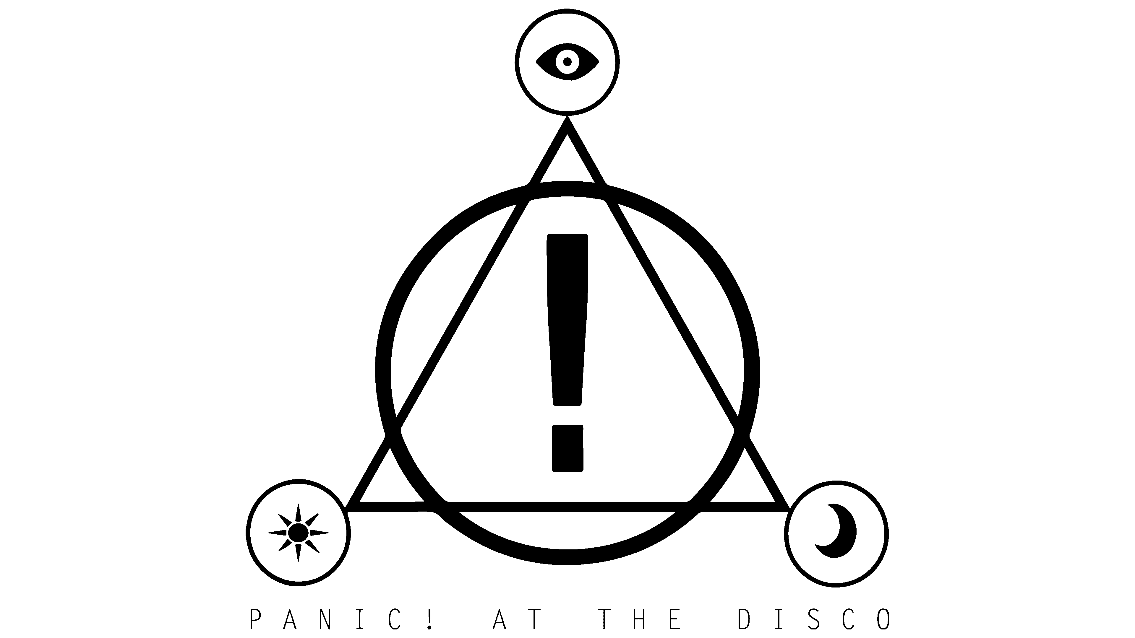
2022 – today
![]()
In 2022, Panic! at the Disco’s seventh studio album was titled Viva Las Vengeance. Its cover was decorated with a line of text in which individual letter fragments were shifted horizontally or vertically. This design resembles interference on a TV screen when the picture jumps due to a bad signal. The “A” line that has slid down, the two asymmetrical “Ts,” the “H” torn in half, and the “ISCO” cut diagonally look like they have been divided into pieces, but not completely, because the parts of the letters are still in contact. In the official version, the logo is black and the letters in the phrase “PANIC! AT THE DISCO” are upper case. The modernized lettering is based on a bold sans-serif typeface, but it isn’t easy to identify in its revised form.
Font and Colors
The evolution of identity has moved from complex and frilly to simple and sloppy. This was a modification of the musical styles in which the group played. If at the beginning, Gothic prevailed, then Frank Rock appeared at the end. All this is reflected in the design of the collections that regularly emerge from the recording studio.
In the Panic! at the Disco emblems, there is no single font; each collection is hand-signed. Handwritten and drawn ones, like inscriptions on gateway walls, replaced the glamorous printed letters. They are not the same in height or thickness, have different slopes and lengths, but they are individual, as are the members of the musical team.
The same can be said about the color scheme. At first, multi-component brilliance prevailed, and then simple monochrome. It serves as a unifying moment, showing that the group is united in its conceptual impulse. Previously, the palette included gold, purple, turquoise, and gray; now it is reduced to a fatal combination of black and white.