


![]() Pantera Logo PNG
Pantera Logo PNG
The expressive Pantera logo is the band’s calling card. It is energetically alive and effectively conveys the spirit of heavy metal, the genre in which its members work. Intensity, drive, and raw nerve are conveyed harmoniously and precisely, allowing fans to feel every emotional note at first glance.
Founded in 1981 in Arlington, Texas, Pantera emerged as a dynamic American metal band known for evolving across multiple metal subgenres, from glam metal roots to a powerful fusion of groove, thrash, and heavy metal. Formed by brothers Vinnie Paul and Dimebag Darrell Abbott, Pantera initially gained attention performing covers of bands like Kiss, Van Halen, and Judas Priest in local clubs, reflecting early influences. With vocalist Phil Anselmo joining later, the band adopted a more aggressive, distinct sound that earned widespread acclaim through breakthrough albums such as Cowboys From Hell and Vulgar Display of Power. The release of Far Beyond Driven, featuring a memorable cover of Black Sabbath’s “Planet Caravan,” further solidified their iconic status despite internal tensions and personal struggles affecting the group’s dynamics. Pantera’s music, characterized by intense rhythms and powerful riffs, profoundly influenced the metal genre, leaving a lasting legacy among fans worldwide.
Meaning and History
![]()
The band’s sound, as well as its fame, grew gradually. Starting with glam-metal, they experimented with their sound, searching for authenticity, ultimately becoming a significant part of the second wave of thrash-metal of the 80s/90s. With each new album, their tunes grew weightier, culminating in a powerful musical protest. They became pioneers of groove metal. Pantera is considered a leader in heavy music and one of the most successful bands, with nearly 20 million records sold. Their emblem has always been a panther, either as an illustration or in text.
What is Pantera?
Pantera is an American heavy metal band that emerged in 1981. They became the most successful in their genre, evolving into a legendary figure in heavy metal history. They boast nearly 20 million records sold. The Abbott brothers founded the globally renowned group, Vinnie Paul (drummer) and Dimebag Darrell (guitarist). The original lineup included Rex Brown (bassist) and Phil Anselmo (vocalist), who joined in 1982 and 1986, respectively.
1981 – 1989
![]()
The menacingly growling predator is Pantera’s unique symbol, and thus, it has always graced album covers released during this period. Metal fans were met with the fierce snarl of a panther on the cover. Four large fangs protruded from its open mouth, and its powerful neck indicated immense strength. Its furrowed brow hinted at evil intent, but its kind eyes spoke of inner positivity. The ears were splayed and slightly flattened.
The animal was depicted with fine strokes, with the band’s name displayed prominently above it in a black font, the unique lettering harmoniously paired with the aggressive panther in the foreground. The letters were bold and slightly shaky, each having its own outline. The “P” and the last “A” were slightly larger due to their extended, pointed legs.
1990 – 2003
![]()
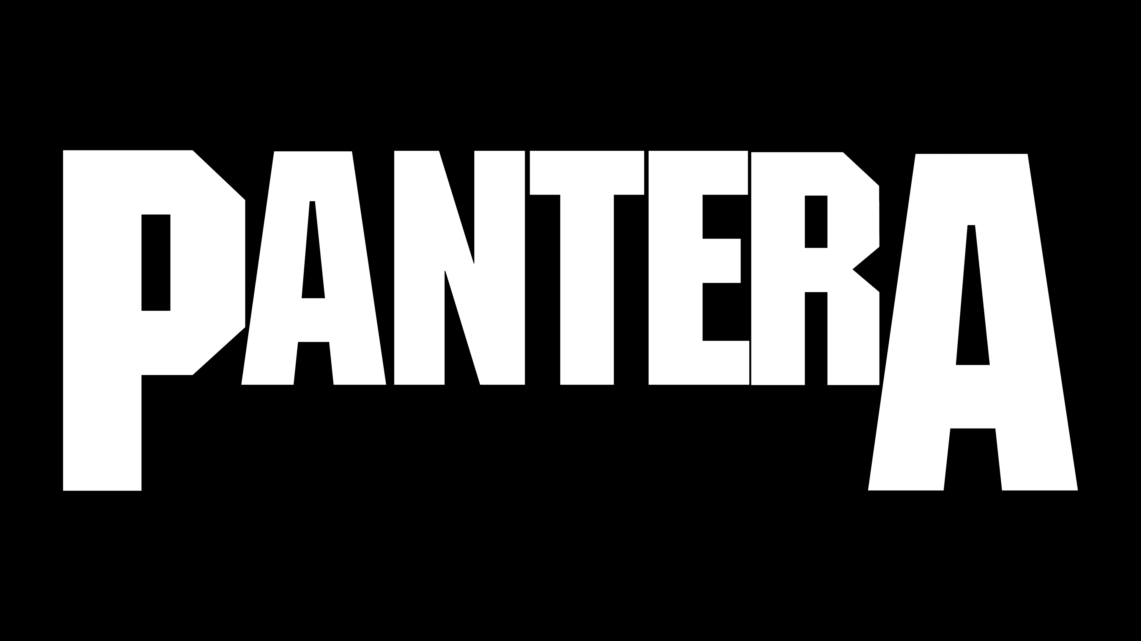
A calm and balanced emblem marked this period. It was primarily textual, but graphics elements were present in the letters themselves, which were unique to accurately convey the mood of the musical tracks. The glyphs remained even but aged, with ragged edges and a worn surface. This gave them a distinctive look. The large “P” and “A” were retained by designers, but the sharpening at the bottom was removed, focusing instead on the wear and tear. Despite this change, the inscription still looked like a row of teeth with fangs. All characters were chiseled, uppercase, and bold.
2022 – today
![]()
The logo for Pantera from the new tour, announced in 2022, has retained its classic, well-recognized style but has acquired a slightly different, more aggressive, and brutal character. The font remains massive and heavy, as before, reflecting the power and toughness of the band’s music. However, the visual design of the letters has changed: they have been made to look torn, battered, or worn over time. Uneven edges and small holes create an effect of wear and destruction, conveying the spirit of Pantera unbroken but having endured hardships.
The logo conveys a sense of aggressiveness and rock-and-roll roughness. This emphasizes the band’s legacy, whose music has always been straightforward, heavy, and without unnecessary polish. The uneven, almost slashed edges of the letters seem to reflect the jagged rhythm and energy of the band’s tracks. They look like they were roughly and forcefully carved out of metal or stone, without perfect lines or symmetry.
Visually, the letters create a sense of chaos, like at the band’s concerts, where the music’s energy tears through the space. The black color adds darkness and brutality, enhancing the contrast between minimalism and boldness in execution.
The revival of the legendary name is accompanied by a design that pays tribute to the band’s history while looking fresh and dynamic. It symbolizes a new chapter that has passed through trials but is still ready to explode on stage with energy.
Font and Colors
The visual identity of the band Pantera is built around custom typefaces that align with the genre they represent. Regardless of the logo’s introduction, the lettering shares key features: all caps, ultra-bold weight, tight letter spacing, and a sans-serif structure. The color palette is monochrome, combining black as the primary color and white as the background or accent.
In 1990, the band adopted a geometric typeface similar to Machine Medium, featuring sharp lines and tightly arranged letters. The original version included non-standard, angular letterforms that closely connected and shifted shape depending on adjacent elements.

In 2022, the Pantera typeface underwent textural updates letters were given a rough, worn finish. The overall proportions and structure remained intact.
The black-and-white color scheme has stayed consistent throughout the band’s history. The dominant black tone gives the logo a heavy, aggressive visual quality that reinforces the band’s musical style.