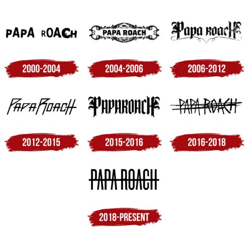
The Papa Roach logo is rebellious and anarchic. The design showcases the musicians’ drive for freedom of expression and their choice of creative styles. Each album brings fans a new version of Papa Roach.
Papa Roach: Brand overview
Since its formation in 1993, the band Papa Roach has mesmerized listeners worldwide with its dynamic rock music. Based out of Vacaville, California, the band has won over many fans by consistently conveying themes of courage, resilience, and determination throughout their musical journey. More than twenty years have passed, and Papa Roach still holds a prominent place in the music industry.
Early on, the band members – Jacoby Shaddix as lead vocalist, Jerry Horton on guitar, Dave Buckner on drums, and Will James on bass – debuted at a quaint coffee shop in Vacaville. From this humble beginning, the band quickly grew to performing on local stages, leaving their mark on the music world.
Along the way, Papa Roach faced difficult financial hardships, lineup changes, and numerous rejections from record labels. However, the band persevered and held on to their dream. Through unwavering dedication to their craft and a positive message, they overcame all odds and realized their aspirations for musical success.
The hard work paid off when Papa Roach signed a recording contract with DreamWorks Records in 1997. The following year, their debut album, “Old Friends from Young Years,” was released to immediate acclaim from fans and critics alike.
Constantly evolving, Papa Roach has woven their personal experiences and those of their fans into their music, creating an eclectic mix of genres and styles close to their hearts. Their music, which touches on a variety of life issues ranging from drug addiction to depression, resonates deeply with listeners around the world.
Today, Papa Roach is one of the most respected representatives of rock music. Their success is undeniable: ten studio albums, over 20 million sales worldwide, and numerous awards. But what truly defines their legacy is their spectacular live performances that leave audiences in awe time and time again.
The band symbolizes hope and resilience, inspiring their fans to fight through adversity. Their emotional lyrics and compelling performances have touched countless people’s lives, giving them the strength to overcome life’s adversities.
Papa Roach’s incredible journey epitomizes the power of unwavering dedication and self-belief. Their easily recognizable and inspiring music has touched millions of hearts worldwide, creating an enduring legacy that continues to inspire.
Meaning and History
What is Papa Roach?
They are an American rock band based in Vacaville, California. Known for their blend of alternative rock, nu-metal, and hard rock with original lyrics, they have achieved commercial success and critical acclaim. The band, formed by high school friends, gained notoriety for their breakthrough album “Infest” and hit single “Last Resort.” Their ability to reinvent themselves by experimenting with different styles has kept them relevant for decades.
2000 – 2004
The logo for the band Papa Roach features the group’s name. The band’s founder chose this name to honor his grandfathers: one had the nickname Papa, and the other’s last name was Roach. The band was initially called Papa Gato, highlighting its history and evolution.
The logo’s letters vary in size and thickness. This design element emphasizes the band’s informal and free-spirited musical style, reflecting their rejection of conventional norms and rules. This design demonstrates their drive for self-expression and originality, a crucial part of their musical identity.
2004 – 2006
The emblem of Papa Roach’s fourth album has an elevated and poetic look. The album title is framed with intricate swirls and patterns, creating the impression of an artistic composition. This imagery contrasts with the album title, “Getting Away with Murder,” adding a sense of mystery and depth.
The ornamentation gives the logo a vintage and elegant appearance. This design style is unusual for Papa Roach, as the album features alternative and hard rock, a departure from their typical sound. The decorative elements in the logo nod to classic rock and metal bands, emphasizing the connection to the traditions of these genres.
The emblem’s artistic design contrasts the roughness and aggression of the musical genre represented in the album. This unique combination of elements gives the emblem a distinctive balance, blending elegance and strength, which reflects the diversity and depth of the band’s creativity during this period.
2006 – 2012
2006, the Papa Roach logo was updated, acquiring a rougher and more masculine appearance. This new mark first appeared on the cover of the album “The Paramour Sessions.” The logo’s font references the knights, battles, and strength era. This design choice is connected to the recording location of the album, the historic Paramour Mansion, which evokes associations with historical significance and power.
The name’s fine, elegant underline adds lightness and poetry to the logo. These romantic notes were included to convey the idea of a lighter sound, characteristic of the funk rock style used in the album. This decorative element of the logo reflects the addition of soft ballads to the band’s musical repertoire.
2012 – 2015
The emblem, resembling raised military flags, stands out with angular triangular shapes. This symbol conveys the essence of the album “The Connection,” which focuses on personal struggles and internal conflicts expressed through music and lyrics. The shape of the emblem represents the sharpness and intensity of the emotions conveyed in the album. Triangular elements create a sense of movement and determination, emphasizing the main message of the work.
2015 – 2016
In 2015, the band returned to an old Germanic style for their logo and fonts, typical of classic metal bands. The new logo was created specifically for their eighth studio album, F.E.A.R. Each element conveys the strength and resilience needed to overcome fears and personal challenges. This album focuses on inner growth, self-development, and personal rebirth.
The inscription on the logo is designed as a single word, emphasizing the concentration and willpower reflected in the album’s content. Heraldic elements of leaves, placed at the edges of the first and last letters, add a touch of softness and elegance to the image.
2016 – 2018
The logo, designed in a style resembling a mistake or failed composition, appears provocative. This symbol consists of the band’s name, repeatedly and energetically crossed out, representing rejection and struggle with various social issues and conflicts. The collection addresses themes of societal rejection and the harsh life mistakes everyone encounters.
The band’s vocalist shares deep emotional experiences, including battles with addictions and depression. The crossing out in the logo symbolizes the desire to erase uncomfortably and failed moments from memory. This visual element highlights the neglect and disregard for socially disadvantaged people, emphasizing the need to recognize and overcome these problems.
2018 – today
In 2017, the cover of the album Crooked Teeth showcased an emblem with the words “PAPA ROACH” crossed by numerous thin stripes. This design inspired a new logo that appeared a year later on the single “Who Do You Trust?” and was featured on the album of the same name. In this updated version, all the letters are connected by a long horizontal line running through the middle, spanning the crossbars of the letters “A,” “R,” and “H.” The simple black color and lack of serifs keep the lettering clean and uncluttered.
The horizontal line linking the letters emphasizes the band’s name, reminiscent of a guitar string. It carries a powerful charge, much like a solid rock riff. The black color makes the name easy to spot and memorable, like a catchy song that lingers in your mind.
The minimalist design brings unity and coherence to the band’s name with its single horizontal line. The connection of the letters through this line creates a sleek and modern appearance. The black color adds to the logo’s boldness and impact, making it stand out.
A long horizontal line links the letters and adds a dynamic element to the design. This line draws the eye across the name, enhancing the visual flow. The absence of serifs and the choice of black color contribute to the logo’s clean and contemporary look.
The design captures the essence of Papa Roach’s music, combining simplicity with a powerful visual impact. The connected letters and the horizontal line symbolize unity and strength. The black color adds a timeless quality, making the logo versatile and memorable.

