


 Paralympic Games Logo PNG
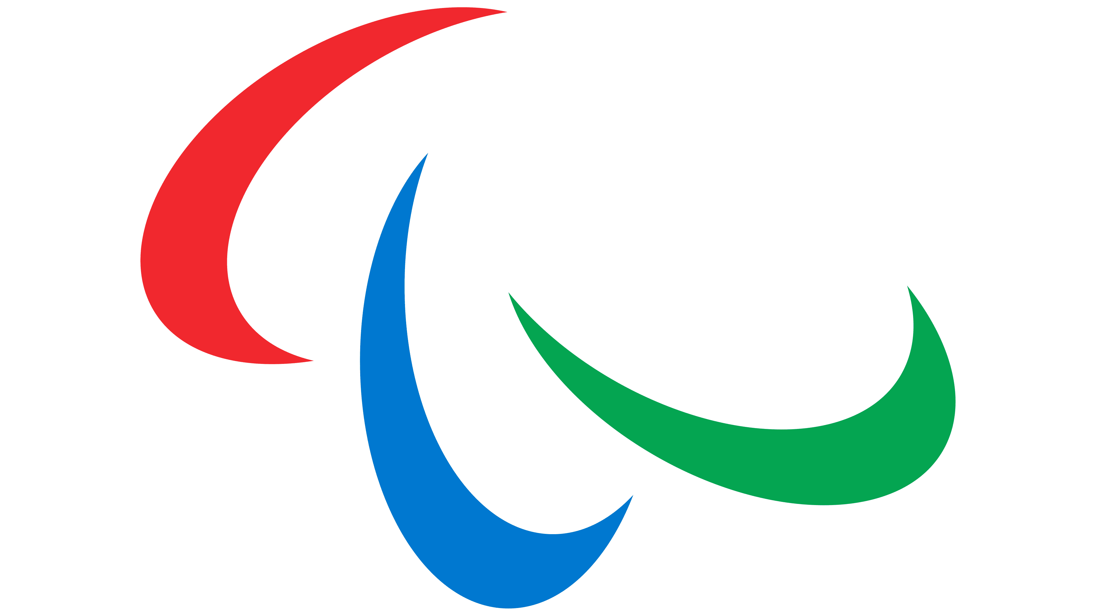
The Paralympic Games logo symbolizes competitions that focus not on loud victories but on overcoming challenges and the strength of spirit. It emphasizes athletes’ dignity, with sport expressing inner determination and personal struggle.
The Paralympic movement began in 1948 at Stoke Mandeville Hospital in Britain. Neurologist Ludwig Guttmann organized an archery competition for World War II veterans with spinal injuries, using sport as part of rehabilitation. Dutch athletes joined the British participants in 1952, turning the Stoke Mandeville Games into an international event.
The first official Paralympic Games were held in Rome in 1960, with about 400 athletes from 23 countries competing in eight sports. The program included athletics, swimming, fencing, and wheelchair basketball. Rome hosted the event in the same city and year as the Summer Games. In 1964, Tokyo formalized the Paralympic name and provided specially adapted sports facilities. Adapted venues became a precedent for later host cities.
The first Winter Paralympic Games took place in Örnsköldsvik, Sweden, in 1976, featuring alpine and cross-country skiing. During the 1970s and 1980s, several organizations managed athletes according to disability type, creating a fragmented administrative system. The International Paralympic Committee was founded in 1989 and assumed full responsibility for organizing the Games by 1994.
A 2001 agreement with the International Olympic Committee established that host cities and venues used for the Olympics would stage the Paralympic Games in the same year. The arrangement provided access to existing infrastructure and wider media coverage. Paris hosted about 4,400 Paralympic athletes from 182 countries in 2024.
Meaning and History
What is Paralympic Games?
It is an international sports competition for athletes with disabilities, held immediately after the Olympics at the same venues. Participants compete in adapted and unique events, showcasing outstanding achievements and setting new records.
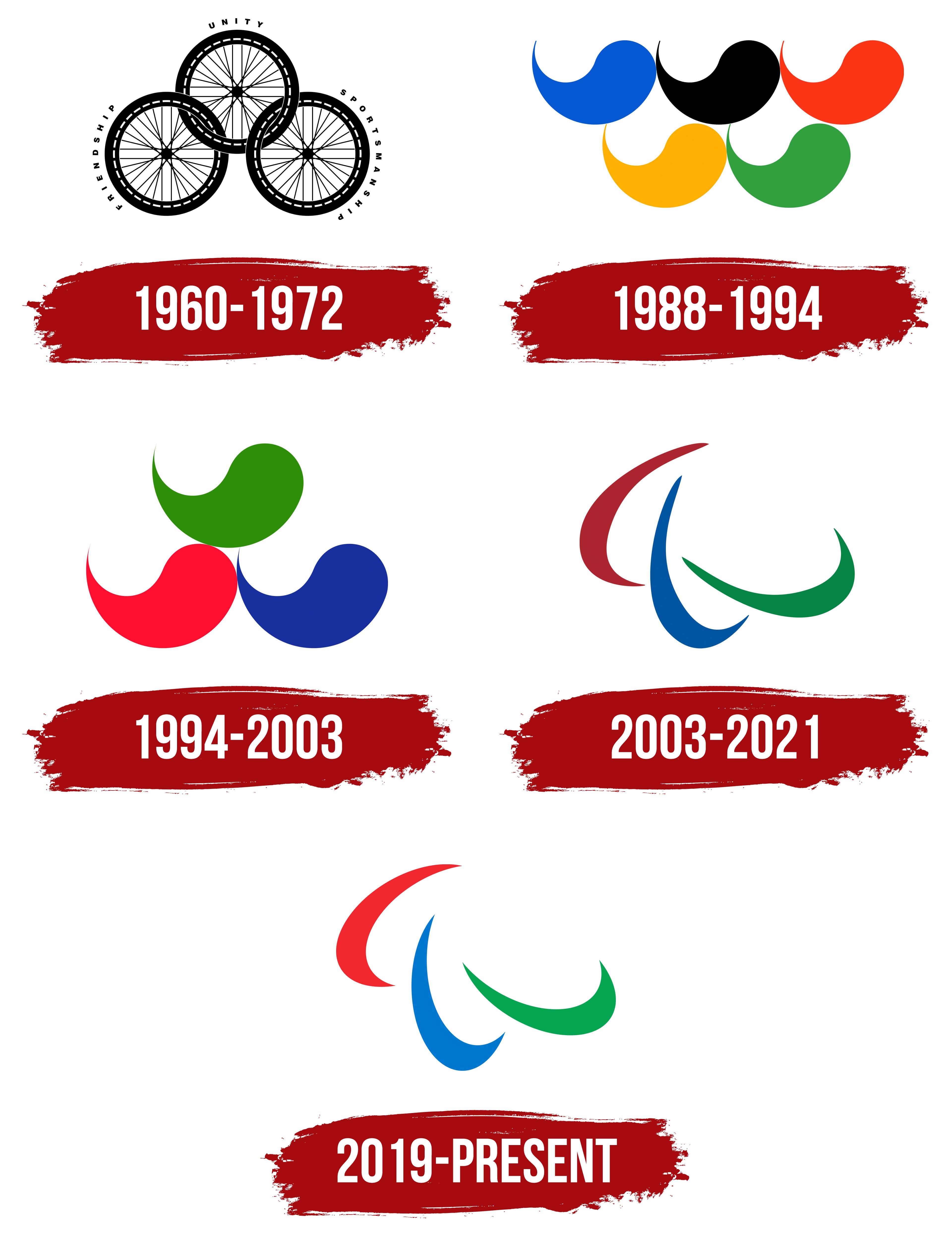
1960 – 1972
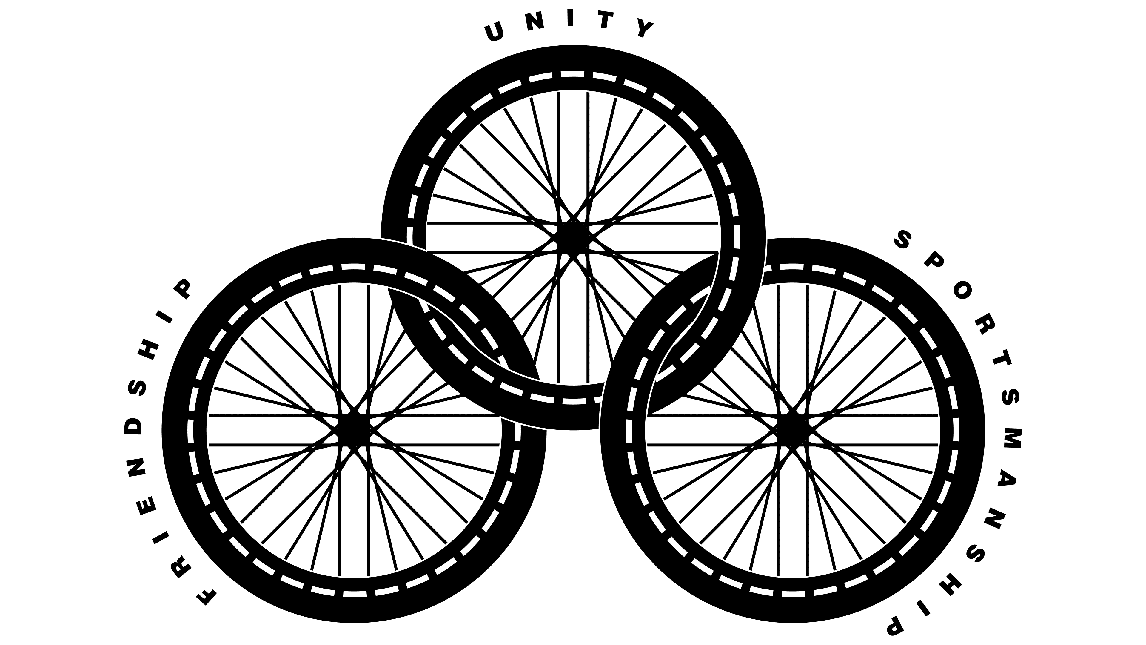
In 1960, the Paralympic Games introduced a symbol to underscore the competition’s uniqueness. Three interlinked wheels arranged in a triangular shape symbolized movement and solidarity. Each wheel featured a motto: “Friendship,” “Unity,” and “Sportsmanship.”
Designer Marianne Balfour chose wheels deliberately to represent the wheelchair, a primary mobility aid for many athletes.
The black-and-white color scheme underscored the concept’s clarity and seriousness, emphasizing equality among all participants. The clean, sans-serif font highlighted the Paralympic movement’s ideals of openness and honesty.
The emblem remained unchanged until 1972, serving as a clear, universally understood visual language.
1988 – 1994
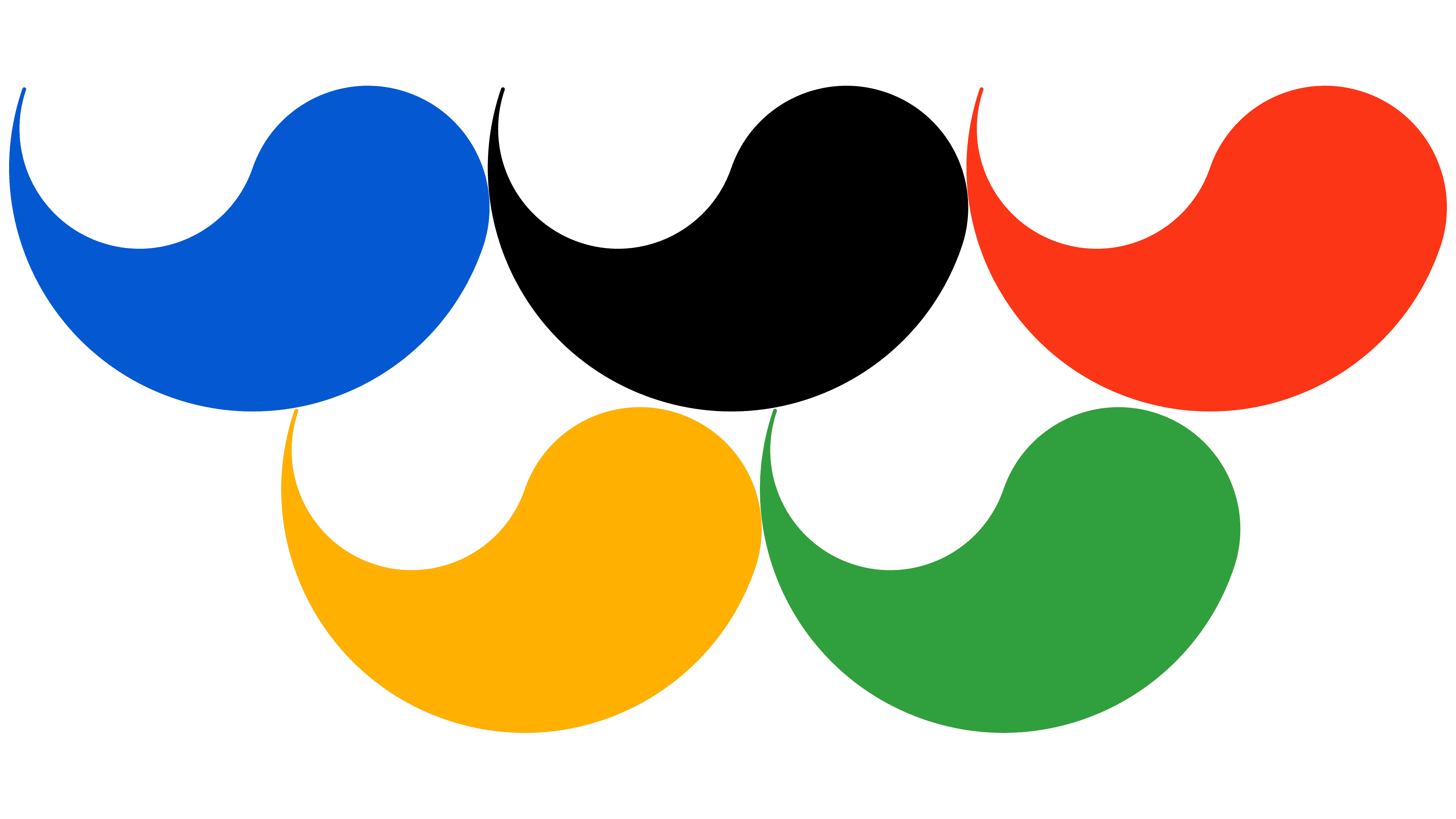
In 1988, the Paralympics adopted a symbol inspired by energy and movement. It featured five vibrant, drop-shaped figures arranged in two rows. The top row included three drops: blue, black, and red. Below were two drops, yellow and green.
These colors echoed the Olympic rings, visually linking the Paralympics to the overall Olympic movement. The design retained originality through its distinctive shape.
South Korean designer Kim Hyun-jun symbolically depicted wheel movements, representing athletes’ speed and activity. The dynamic curves of the drops emphasized participant energy.
1994 – 2003

Following an update, the Paralympic symbol was simplified. Instead of five elements, three drop-shaped figures were chosen. The colors red, green, and blue were selected because they commonly appear on national flags, highlighting the Games’ international nature.
The figures were arranged in a triangular formation, with green on top and blue and red below. The structure symbolized unity, balance, and mutual support, embodying the competition’s core principles.
The concept came from a design team led by Scholz & Friends. The new emblem emphasized contemporary sporting ideals and equality among participants, making the Games more relatable to audiences.
2003 – 2021
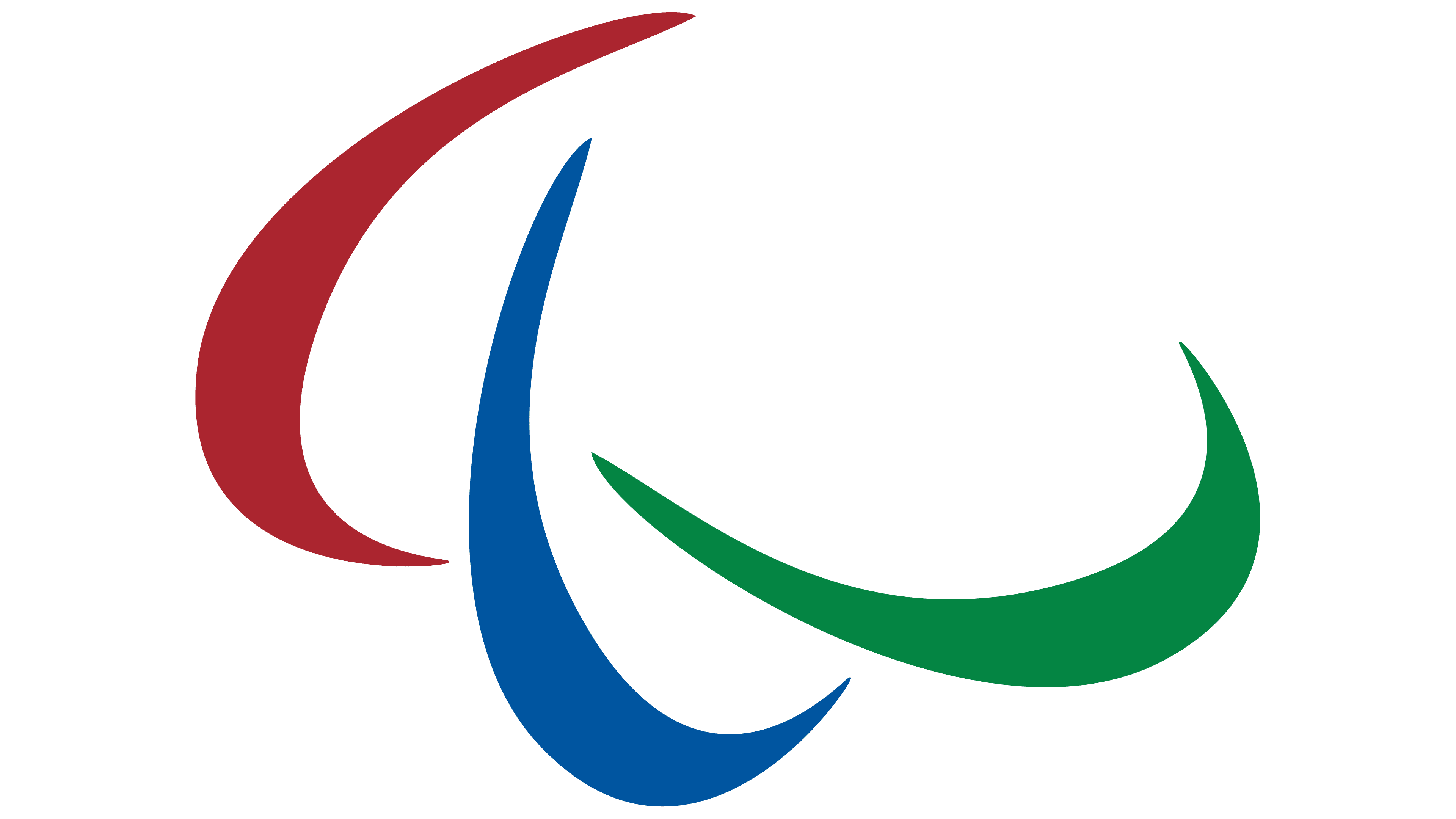
The UK agency Scholz & Friends updated the Paralympic Games logo to convey the competition’s spirit through simple, clear form. The designers were tasked with creating an image that would highlight sporting values and make the symbolism as open to the audience as possible.
The previous structure of droplet-shaped figures was replaced with three curved arcs arranged in a circle, without closing the contour. The symbols are rendered in rich tones: red on the left, blue in the center, and green on the right. The colors of the arcs reflect the diversity of participants and emphasize the international scale of the Games.
Each line took the shape of an elongated comma tapering toward the outer edge. Their configuration visually emphasizes overcoming challenges, the competition’s central theme. Placing the symbols around an invisible center creates harmony and highlights the unity of all athletes competing in the Games.
The logo’s structure conveys the importance of interaction and solidarity that underpin Paralympic sport.
2021 – today
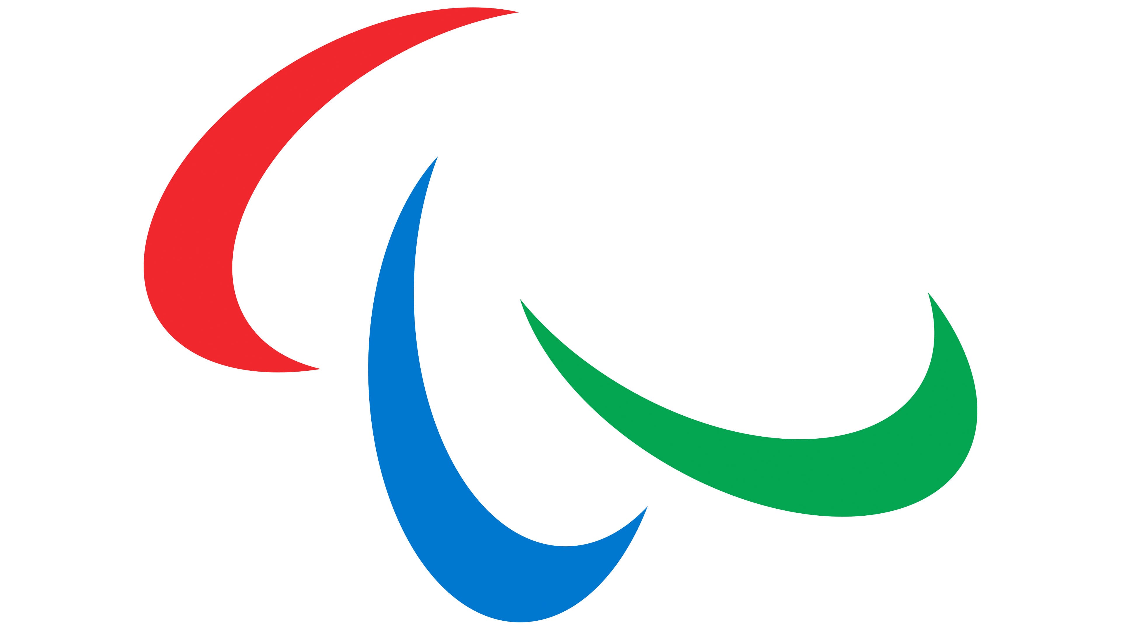
The Paralympic Games logo changed in 2021 at the initiative of the International Paralympic Committee. The organization turned to the agency North, known for its ability to work with precise and balanced forms. The agency team reconsidered the previous symbol.
Visually, the changes may not be immediately noticeable, but the designers expanded the spacing between the elements, giving the image more openness. Each mark grew lighter in appearance while retaining its energy. The designers also adjusted the elements’ colors. The red took on a fire-like hue, the blue shifted toward a sky tone, and the green became richer.
The overall look reflects the International Paralympic Committee’s intention to make the brand and the competitions more understandable and closer to the audience. The update became part of the committee’s global strategy to strengthen the positive perception of the Paralympic competitions.
Font and Colors
Since 1994, the organizing committee has used a color palette of red, blue, and green. The selection emphasizes simplicity and universality, as nearly every participating country’s flag features these colors. Red symbolizes athletic energy, blue conveys trust, and green represents growth and renewal.
The competition’s name appears in a clean, sans-serif font. The International Paralympic Committee recommends using a typeface similar to FF Megano Pro Black. The font is strict and concise, matching the event’s official style.