The Paramore logo embodies the theme of life choices, relationships with people, and emotions that a person can experience or reject. The emblem speaks about feelings and the inner state influenced by the band’s music.
Paramore: Brand overview
| Founded: | 2004 – present |
| Founder: | Hayley Williams, Zac Farro, Taylor York |
| Headquarters: | Franklin, Tennessee, U.S. |
| Website: | paramore.net |
Meaning and History
Typically, musical groups don’t often change their identity. Paramore, however, became the exception, as their emblem changed several times. The changes perfectly reflected the band’s inconstancy and creative search. The focus of their songs is on emotions. The first symbol appeared a year after the quintet was founded.
Further rebranding occurred with the release of albums to better convey their mood. The band’s logos also differ from other rock band symbols in their style—no elements of death, devil, pentagrams, or blood. Light symbols are closer to romance and dreams.
What is Paramore?
The rock quintet, known for their albums All We Know Is Falling, Riot!, Brand New Eyes, Singles Club, Paramore, After Laughter, and singles like Pressure, Hard Times, Misery Business, Decode, Monster, frequently topping the Billboard charts. The last two songs were used for popular films Twilight and Transformers 3.
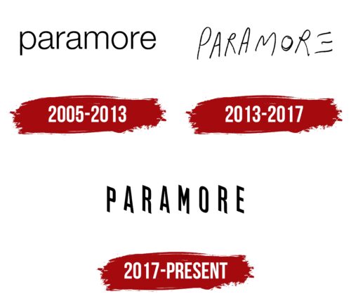
2005 – 2013
The first emblem does not resemble a visual expression of the group. The word Paramore is written in ordinary round lowercase letters without a hint of music and the band’s style. No designers worked on the symbol’s development. The inscription was used somehow to mark the band in the list of performers.
At the time of the band’s foundation, they hadn’t determined their positioning, exact style, and content of songs. Lowercase letters indicated their first steps into the world of music. Round elements hint at femininity, as the vocalist wrote and performed songs.
The theory is supported by the history of the band’s name’s appearance. The word Paramore translates from Italian as “like love.” There was no specific intent in the choice. According to the members, Paramore is the surname of acquaintances, which sounded appealing to the musicians. Only later did they find out that the combination refers to secret lovers. And the band’s lineup was not against their fans perceiving their team in such a key, especially since most songs were about difficult relationships.
2013 – 2017
The band’s lineup has changed. By 2013, only Hayley Williams remained from the initial lineup. Therefore, the visual sign was revised. The rebranding coincided with the band’s eponymous album, Paramore. The delicate, airy symbols of the sign convey the theme of love and self-realization. The words of the album’s songs, such as Now or Still into You, describe inner feelings and emotions more than events.
The final letter, E, is devoid of the main feature and embodies the element of air, indicating the special lightness of melodies. The three lines also represent the three members that formed the group’s backbone by then: Hayley, Taylor, and Jeremy.
Overall, the emblem appears to be long written by hand to indicate the passage of time, fleeting moments of life that only remain in memory. It seems that starting from E, the word gradually flies away and dissolves into the mist.
2017 – today
The band’s logo changed upon the release of After Laughter. The letters of the inscription seem to stand half-turned, lining up in a queue. Each symbol conveys the emotions that arise after laughter. The letters resemble doors you can enter, experience new sensations, and live differently.
The technique probably illustrates the constant changes in the group, as in 2017, Zachary Farro, who had left the band seven years ago, returned, but the permanent bassist Jeremy Davis left.
Font and Colors
Rock music is often associated with black color, and the shades of Paramore’s emblems are no exception. The color reflects the state of melancholy, depression, and confusion, to which many of the group’s songs are dedicated to. Unhappy relationships – the central note of the band’s creativity and black fits perfectly into the overall image.
The font of the inscription is unique due to the rotation of the letters on the plane. Slim chords and rhythmic music are noticeable in the style of the inscription—sharp corners, like the bass notes of the guitar.
Paramore color codes
| Black | Hex color: | #000000 |
|---|---|---|
| RGB: | 0 0 0 | |
| CMYK: | 0 0 0 100 | |
| Pantone: | PMS Process Black C |


