


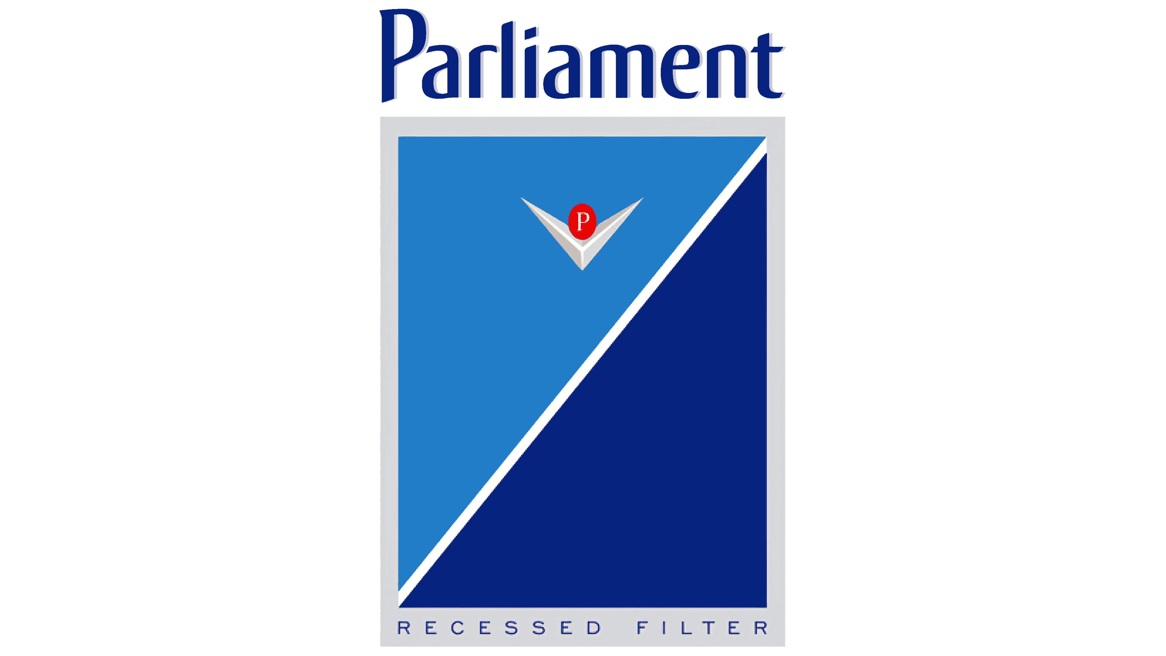
 Parliament Logo PNG
This renowned cigarette maker produces premium-quality products and emphasizes this in its brand identity. The Parliament logo symbolizes the brand’s special status, rich historical heritage, and sophisticated taste. It also embodies a creative approach to design and technology.
Benson & Hedges launched Parliament in 1931 as a premium American cigarette brand. Its early image relied on limited distribution, mainly in large cities such as New York, a more expensive double-layer carton, and a price 8-10 cents above ordinary brands. The main product feature was a recessed paper filter, placed slightly inside the mouthpiece rather than at the edge.
At a time when most cigarettes had no filter, this construction set Parliament apart from competitors. After filtered cigarettes became more common from 1935 onward, the brand reframed the feature as a practical advantage. The slogan “Only the flavor touches your lips” suggested that the recessed filter kept tar away from the smoker’s lips.
A turning point came in 1954, when Philip Morris acquired Benson & Hedges. Parliament gained access to a national distribution network and larger advertising budgets. By the late 1950s, the brand moved to standard paper packaging. At the same time, Benson & Hedges kept the earlier double-layer box. In the 1960s, Philip Morris tested several filter variants, including charcoal versions, but kept the recessed design as Parliament’s main identifier.
After the 1971 U.S. ban on cigarette ads on television and radio, promotion shifted to print and outdoor media. Internationally, Parliament grew in the 1970s and 1980s, including in South Korea after its market opened in 1987 and in Japan in the 1990s through ads featuring Charlie Sheen. Its competitors included Camel (R.J. Reynolds) and Virginia Slims (Philip Morris). After the Soviet collapse, Parliament became one of Russia’s most prestigious Western cigarette brands. Today, it remains in the Philip Morris portfolio alongside Marlboro.
Meaning and History

The brand logo is permanent and stable. Its design varies only slightly by variety. It consists of a name and a large emblem.
Parliament’s visual sign stands out for its originality, rigor, and rich semantic meaning. For most companies, the verbal part of the emblem is located under or to the side of the image. And in this case, the inscription rises above the entire composition. It is a clear, dark blue with smooth curves and a rich shadow.
What is Parliament?
Parliament is a premium American cigarette brand from Philip Morris. It was introduced in 1931. The line features a special filter mouthpiece. It was introduced in 36 countries.
This suggests the brand targets stylish, high-status people. The dark tone symbolizes perseverance, stubbornness, and discipline. Parliament cigarettes are smoked only by wealthy and accomplished men. The brand name also indicates status. The brand is a legislator of style and taste among cigarettes.
Below the inscription, a rectangle with a double gray-and-white border is placed. An oblique white line divides it into two triangles. These triangles represent test strips that indicate the strength of cigarettes in a pack.
The lower triangle is 100% strong tobacco (reference). The upper triangle shows the saturation of cigarettes relative to the reference. Therefore, the color can vary from dark blue, starting with the strongest Parliament Night Blue, to white, with the lowest nicotine and tar values in the series.
Such an invention is intended to improve customer convenience.
White edging suggests honesty and reliable data. The gray backing at the bottom plays a dual role. First, it limits the emblem. Second, the gray color symbolizes the business world, stability, and rigor, intended to impress consumers and emphasize the brand’s status.
The transition from gray to white, then to the triangles of the “tobacco” symbol, symbolizes the purification of smoke upon inhalation and alludes to the special filter in Parliament cigarettes. This idea is confirmed by the recessed inscription (in-depth filter) on the lower, extended part of the gray substrate. Two triangles in different shades can also be interpreted as smoke purification after passing through the filter (separated by the diagonal line).
An additional icon is located in the upper triangle. This is a voluminous platinum tick, with the letter P in a red circle set in its recess.
- P is the first letter of the brand name.
- The red circle depicts a lit cigarette.
- The “birdies” sign indicates approval and compliance with standards.
The drawing conveys the product’s high quality and its increased safety during smoking.
Font and Colors

The logo’s main colors are blue and white.
- White – smoke, purification, filtration.
- Blue – reliability, strength, confidence.
The color scheme and design target men. The logo’s font is also strict and clear. Looks like a slightly modified Conto Compressed Regular.