 Passaredo Linhas Aereas Logo PNG
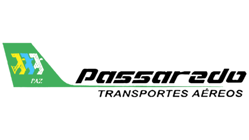
The Passaredo Linhas Aereas logo reflects the company’s authenticity and ambition to soar high while maintaining a grounded identity. The emblem is imbued with the Brazilian national spirit and modern high-tech elements, harmoniously presented in a unified graphic space.
Passaredo Linhas Aereas: Brand overview
Passaredo Linhas Aéreas, a regional-focused airline, originated in the Brazilian city of Ribeirão Preto (São Paulo state) in 1995. Two years later, it began operations. Initially, Passaredo operated mainly on regional routes in southeastern Brazil, using small airplanes. However, after ten years, they began flying all over the country.
In 2010, Passaredo experienced a significant period of growth. Larger aircraft were added to the fleet, and the company began flying to key Brazilian metropolitan areas, including São Paulo, Rio de Janeiro, Brasilia, and Belo Horizonte. By 2015, Passaredo had more than 25 aircraft in its fleet, operating from four hubs in Brazilian cities. The airline carried about 3 million passengers annually.
Unfortunately, 2016 was a difficult year for Passaredo. Brazil was experiencing a recession, which led to a significant drop in demand for air travel. Rising costs and stiff competition from larger and more established airlines made Passaredo’s financial prospects bleak.
In 2018, the airline temporarily ceased operations due to its inability to negotiate debt repayments, resuming only a limited number of flights. A year later, Passaredo’s situation worsened, and the airline, unable to raise additional funding, fell into bankruptcy protection and eventually ceased operations after 24 years in the industry.
Passaredo was Brazil’s fifth-largest domestic airline during its heyday, known for its low-cost regional flights. Unfortunately, difficult economic conditions and an unsustainable development plan led to its eventual collapse.
Meaning and History
What is Passaredo Linhas Aereas?
This is a Brazilian regional airline based in Ribeirão Preto. It offers regular passenger flights to various destinations within the country, focusing on serving the interior regions of São Paulo state and neighboring areas. The company operates a fleet of turboprop aircraft, such as the ATR 72 and Embraer EMB 120 Brasilia, optimized for efficient service on short and regional routes, connecting smaller cities with larger hub airports.
1995 – 2008
The Brazilian airline conveys the most valuable aspect of its concept in its logo—flight. This emphasizes several factors to potential clients: lightness, swiftness, and confident forward movement. These are reflected in simple and clear visual elements, both graphic and typographic. The aviation theme is evident in all components, perfectly expressing the idea of flight.
- The emblem is shaped like an airplane: a wide tail, a narrow strip extending to the right, and a fuselage with a cabin inside formed from a long inscription. The name occupies two levels. The upper row resembles passenger seats.
- The text is set in italic sans-serif. The first line features large glyphs, as it contains only one word, while the second line has smaller glyphs since it consists of a phrase. The difference in letter size gives the emblem optimal balance and dynamism.
The italics suggest swiftness, adding movement and airiness to the logo without making it visually heavy. The wide symbols have rounded corners, conveying a smooth takeoff and landing. The glyphs are bold and open, characterized by cutout segments in the strokes. The white spaces transform the heavy font into something weightless.
In contrast, the second inscription uses a narrow font, adding balance and style to the text. The logo appears to breathe thanks to the thin letters and large internal spaces. All glyphs in the lower line are uppercase, light, and smooth, with a harmonious combination of soft curves and sharp angles.
The emblem’s national character is represented by three shaped elements depicted on the tail of the improvised airplane. Birds are flying in sync with wide-spread wings. This bird is the Rufous-bellied Thrush, a national symbol of Brazil. The songbird is rare and highly valued throughout Latin America. Through it, the airline demonstrates its exclusivity and professionalism.
The thrushes are colored in the Brazilian flag’s white, blue, and yellow colors. They are traditionally placed on a green background, which appears on the country’s flag. This way, the company showcases its authenticity and primary flight region, as its planes initially served only domestic routes.
2008 – 2019
The Passaredo logo features the word “PASSAREDO” in muted gray. This prominent part of the company name is centered in a large, bold sans-serif font with unique curves. Below “PASSAREDO,” the phrase “LINHAS AÉREAS” appears in small, thin letters. Above the main text, orange stripes form three-dimensional waves. A gradient on the longest stripe enhances the 3D effect.
The gray color of “PASSAREDO” provides a neutral backdrop, making the orange stripes stand out. The typography’s distinctive curves add a modern, dynamic look. The gradient on the stripes gives a sense of depth and movement, creating a lively, three-dimensional appearance. The font sizes create a clear visual hierarchy, guiding attention effectively.
The design balances simplicity and sophistication. The muted gray gives a calm, professional tone, while the orange waves add energy and vitality. This combination conveys stability and dynamism, reflecting the airline’s commitment to reliability and innovation.
The orange stripes above the text symbolize motion and progress, aligning with the airline’s core values. The gradient effect suggests continuous advancement and forward momentum. The small “LINHAS AÉREAS” lettering provides clarity without overshadowing “PASSAREDO.”
