


![]() Patagonia Logo PNG
Patagonia Logo PNG
Despite the simplicity of the Patagonia logo, it embodies high-quality standards. The bold letters lend significance and considerable authority, emphasizing the products’ excellent qualities. The inscription, written in lowercase letters, also reflects the availability of the brand’s products across all population groups.
Patagonia dates back to the 1950s, when Yvon Chouinard, a California climber, began forging steel pitons in 1957 to improve gear quality. He sold them directly to other climbers, turning a personal need into a small business.
In 1965, Chouinard partnered with Tom Frost to create Chouinard Equipment, refining climbing hardware and building a mail-order business. By the late 1960s, it became the largest supplier of climbing gear in the United States.
In the early 1970s, Chouinard introduced durable rugby shirts into the catalog, which proved popular among climbers. This shift led to the founding of Patagonia in 1973, which focused on outdoor clothing and is headquartered in Ventura, California.
During the late 1970s, Patagonia worked with Malden Mills to develop Polartec fleece, helping establish fleece as a key material in outdoor apparel. Competition with The North Face intensified as both brands targeted the same audience.
In the 1980s, the company expanded its retail and export operations, but rapid growth strained its finances. In 1991, Patagonia cut about 20 percent of its workforce during a recession, prompting a shift in management approach.
After the crisis, the company focused on product quality and long-term stability. In 1996, it switched entirely to organic cotton for relevant products. Patagonia remained privately owned, avoiding public markets.
In the 2000s and 2010s, the brand expanded globally and broadened its product range. In 2022, Chouinard transferred ownership to a trust and nonprofit structure, with the company valued at around $3 billion.
Meaning and History
![]()
The Patagonia logo fully reflects its name, depicting the profile of Cerro Fitz Roy, located above the town of El Chaltén. Over the years, the trademark has undergone minor changes, but the original idea has remained recognizable.
What is Patagonia?
Legendary climber Yvon Chouinard founded this company, which produces clothing and gear for outdoor activities. It creates technically advanced, reliable equipment that withstands the harshest weather conditions, whether in stormy seas or on snow-covered mountain peaks. The product range includes backpacks, surfing gear, down jackets, and fleece jackets. Popular models include the Snap-T Pullover Fleece Jacket and Nano Puff Insulated Coats. A distinctive feature of the company is its focus on functionality and durability, making its products ideal for any adventure.
Old
![]()
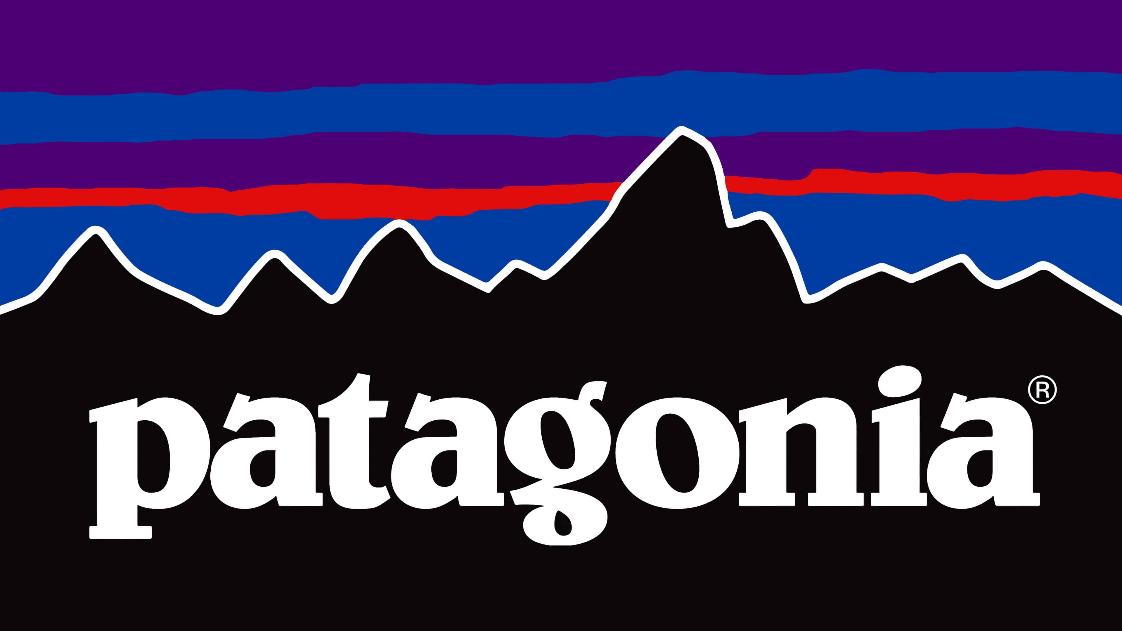
Chouinard Equipment first used the Patagonia brand in 1973, introducing an outerwear line. Two years later, the famous logo appeared. It was created by artists Jocelyn Slack and Yvon Chouinard. They depicted an element of the South American landscape, Mount Fitz Roy, on the map between Chile and Argentina.
The emblem features black-and-gray silhouettes of mountains resembling frozen waves. They perfectly align with the brand’s philosophy and symbolize its connection to the parent company (Chouinard Equipment was founded to produce climbing tools). Against the backdrop of the uneven peaks, multicolored horizontal stripes in shades of red, blue, and light blue stand out. The picture is set within a white ring with a crosshatch pattern in the middle. In the frame are inscriptions “BUILT TO ENDURE,” “Patagonia,” and “SINCE 1973.”
New
![]()
The brand’s black wordmark uses lowercase. Designers used a whimsical serif font that closely resembles Belwe Bold. Thanks to this, the textual logo appears creative and fully aligns with the Belwe Bold clothing style.
Font and Colors
The logo was created in collaboration with Yvon Chouinard and designer-artist Jocelyn Slack. Yvon came up with the idea, and the artist brought it to life as an image. The girl admitted she had never been to Patagonia, but Yvon’s colorful stories made her want to visit this amazing region. She tried to embody all these emotions in the emblem itself. The emblem first appeared on the branded product label in the spring 1976 collection.
![]()
The first emblem was colorful and memorable. It represented a rectangular plate with the profile of the Fitz Roy massif in black, bordered by white. Above it, the sky is painted in blue, purple, and orange stripes. On the black background is the brand name “ratagonia,” and below it on the right is the phrase “There at every step.”
This version remains relevant to this day. In 2011, as new types of products appeared, two more logos were developed:
- One black-and-white image (the mountain profile is black, the sky is white) on a black background features a white inscription reading “Patagonia” in a standard font. Below it, in large letters, is the PREAMBLE.
- The second is white and blue (the background is white, and the mountain profile and inscription are blue). Below the word “Patagonia” is the phrase “On Thames Street” (the name of the hotel chain where climbers stay).
![]()
The Belwe Bold font was used to write the brand name, a style that combines elements of printed and cursive letters and incorporates serifs. The font’s author is Georg Belwe.
The color palette remained the same: white, black, blue, light orange, and purple. Bright, saturated colors symbolize the Patagonian sky at sunset.