


![]() Paulaner Logo PNG
Paulaner Logo PNG
The Paulaner logo represents the inspiration behind the drink with deep reverence. Elements connect the past with the present. An ancient recipe developed by the monks helps the company achieve stability, a strong position, and universal love.
Paulaner began as a monastery, not a brewery. In 1627, the Paulaner order moved from Italy to Bavaria and founded the Neudeck ob der Au monastery near Munich. Their strict fasting rules banned solid food during Lent, so the monks brewed a strong dark beer rich in nutrients. In 1633, they inherited a local brewery, and in 1634 received permission to brew for their own use.
The beer became known outside the monastery as Salvator, named after the nearby Church of the Holy Savior. Local brewers complained to Munich’s council on February 24, 1634. That document is now treated as the starting point of Paulaner’s history. In 1751, Elector Maximilian III Joseph allowed the monks to serve beer to the public on April 2, the feast day of the order’s founder.
A major shift came in 1773, when Valentin Stephan Still, known as Brother Barnabas, became the monastery brewer. His recipe shaped the later Paulaner Salvator. In 1780, the brewery received an unlimited license to sell beer. After secularization in 1799, the monastery closed, and in 1806, brewer Franz Xaver Zacherl leased the brewery, then bought it in 1813. Paulaner later became one of the six Munich breweries allowed to serve beer at Oktoberfest, alongside Augustiner, Hacker-Pschorr, Hofbräu, Löwenbräu, and Spaten.
In 1881, Paulaner installed one of Carl von Linde’s early refrigeration machines. In 1928, it merged with Thomasbräu to form Paulaner-Salvator-Thomasbräu AG. The brewery was bombed in 1944, and rebuilding was completed by 1950. The Schörghuber family took control in 1979. Paulaner launched alcohol-free wheat beer in 1986, opened its first Bräuhaus in 1989, became Paulaner Brauerei AG in 1994, and passed 1 million hectoliters in foreign exports in 2016.
Meaning and History
![]()
Not every brand can boast such an impressive history. This beer brand appeared in the early 17th century. The monks of the Paulaner order started brewing the beer in honor of the beloved Saint Salvatore of Horta (Savior of Horta). That is why customers nicknamed the beer Paulaner Salvator. A century and a half after its founding (from 1806 to 1928), the baton was taken up by the secular brewer Franz Sacherl, who bought the former monastery premises. Under the new owner, the beer was produced under the Salvator brand. It was only in 1994 that it got its final name.
The company adheres to the traditions and values of brand recognition and popularity. Therefore, visual signs have not changed much since the advent of beer. However, each logo contains the maximum historical information about the drink.
What is Paulaner?
Paulaner is an old family company from Germany that produces authentic Bavarian beer. It not only revives the Munich art of brewing but also exports its products abroad: its premium-quality alcohol is known in more than 70 countries worldwide. Founded in 1634, the monastery brewery has come a long way and has become a legend in the food industry.
Old
![]()
In 1928, the brewery’s new owner was Paulaner Brauerei AG, under whom the visual image most likely appeared.
The logo was a circle. This shape is a rather ambiguous symbol in the beer world. It is associated with beer mug stands, keg bottoms, bottle caps, glass legs, and pub signs.
Modern information about the brand was placed on the outer blue strip of the circle. At the top is the modified name of the producing company: PaulanerBrauerei. It comes from the order of monks who first brewed the beer, Paulaner. The servants of God were so-called because of Paola, the birthplace of Francis, the order’s founding monk. The elder lived in Italy in the 15th century and is recognized by Catholics as a saintly hermit.
At the bottom of the logo was the city’s name, Munich, where the brewery was located.
The inner part of the logo contains information about the brand’s history. At the center of the circle, a picture of Francis himself in a monk’s robe was displayed. In his hands, the friar holds a stick with the name of another saint, Salvator, who was revered in Calabria, where Francis was born. The Paulaner order revered the healer Salvator and named their beer after him. This is indicated on the logo below the image of the monk.
The circle’s background is a red flag with a white cross, reminiscent of the flag of the Holy Roman Empire, where the first Paulaner beer was brewed, and also of the coat of arms of Cagliari, Italy, where St. Salvator ended his days.
On the monk’s back is an image of Munich and the old monastery brewery. The inscription “Schutz Marke” is on the sides; it’s a registered brand.
before 2020
![]()
The visual mark was renewed towards the end of the 20th century, after the brewery became Paulaner GmbH & Co. KG, and the beer was named Paulaner. A reminder of the previous owner and St. Salvatore was removed from the old emblem.
The new logo is a round design, with the brand name in capital letters with serifs and a thin, elegant gold inscription with the year of foundation on either side of the logo.
The image of Francis has been updated to look more modern. The saint is drawn in profile, looking forward. It is as if he is blessing the beer to move into the future and watching its development. Overall, the visual sign resembles an old Bavarian commemorative coin, on which the king’s image was usually minted in the center. This is particularly symbolic, since the monk served as an advisor to the country’s three monarchs. The saint’s profile is made in gold, further strengthening the association.
The circle has a dark red background, which was omitted from the last logo’s flag. The color has darkened and become closer to a noble red. Therefore, it is associated not only with the flag but also with the times of kings.
On the edge of the circle is still a wide dark blue band, but already with a gold border. Germans associate the color blue with tradition. In addition, Francis was considered the patron saint of sailors.
In white letters on the blue band are the brand name and the city of production, Munich. White is a symbol of purity. The brewery still adheres to the 16th-century purity law, limiting the list of real beer ingredients. The company has an impeccable past. In addition, the purest artesian water from 10,000 years ago is used in the production process. The brewery also has its “Paulaner engagiert” program, which cares about environmental protection. White is also associated with coolness. In 1881, Paulainer was the first to install an ice machine and produce year-round foam. The company also owns the first recipe for a non-alcoholic light beer.
The emblem shows 1634, the founding year. However, this is an approximate date. It is based on a written complaint by the Munich brewers about the monastery’s competition. This means the beer was already known and popular. The inscription is made in elegant monogram letters. The gold color and antique font indicate the drink’s venerable age.
The brand name beneath the round emblem is written in large antique-blue letters with serifs and gold edging. This shows a premium beer with a rich history. Like the first P, the center letter A is capitalized and has an unusual serif. This divides the word into two parts. The first part in German is the name of the city of Paola, Paula, and the word “aner” is translated as “record” and forms the root of the word “heir”. This division in the name emphasizes that the beer recipe was inherited from Paola and brewed by the saint’s followers (his heirs).
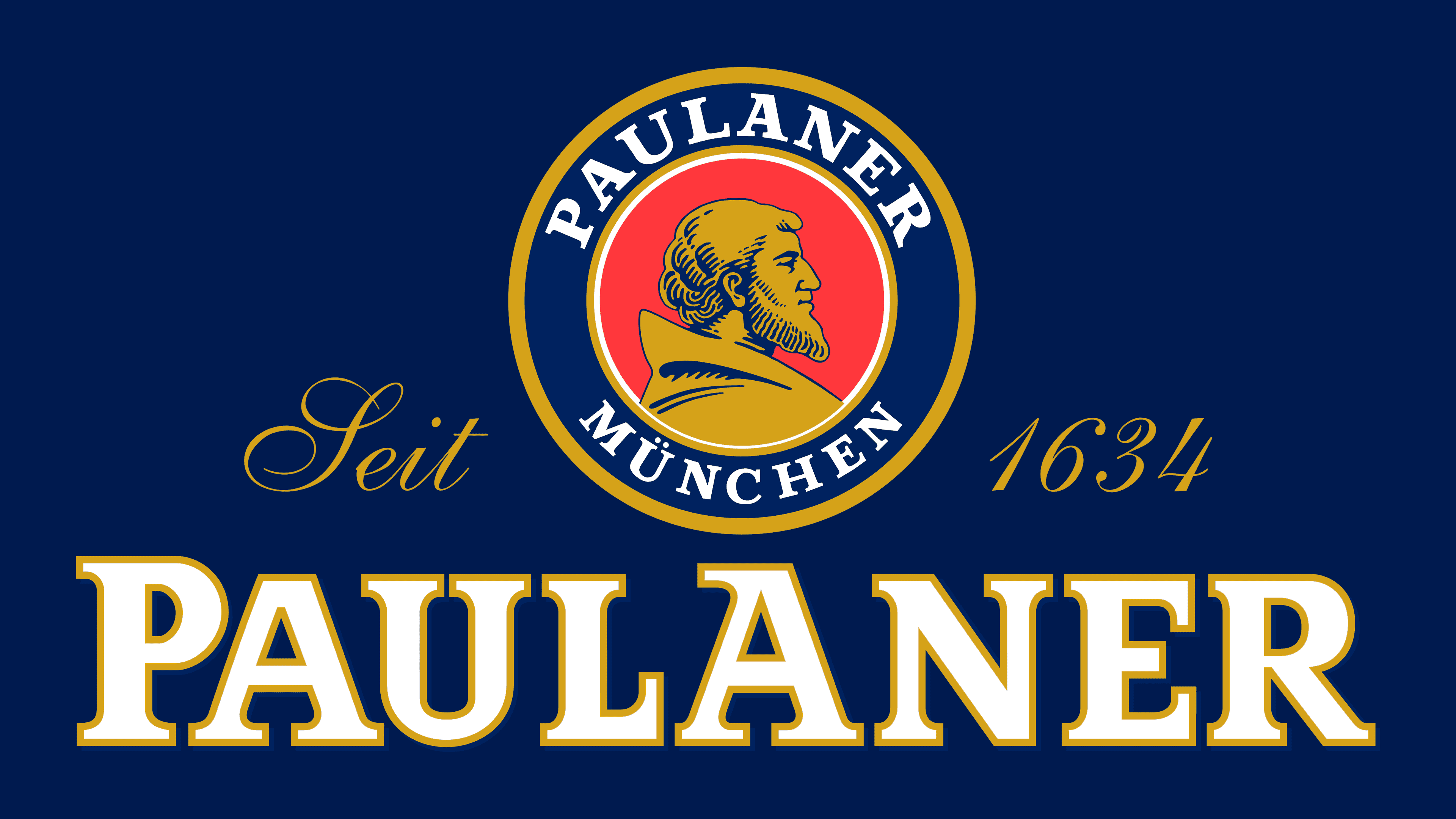
2020 – today
![]()
In January 2020, it was reported that the German design studio Higgins Design GmbH had redesigned the Paulaner logo to make the company more attractive to younger generations. As a result, the colors took on a darker hue. However, they may vary depending on the label’s design and the emblem’s location.
All elements are in the same locations as before the redesign. At the center of the red circle is a stylized portrait of Francis of Paola, the founder of the Order of the Paolani monks. The blue ring contains the brand’s name and hometown. The word “PAULANER” is duplicated at the bottom, and the year the brewery was founded is 1634. The company is proud of its centuries-old history and continues to use it as a marketing tool.
Font and Colors
The brand’s main colors are royal blue, red, and gold.
- Blue is the water element, the depth of centuries, and faithfulness to tradition.
- Red – country flag, people’s love, the triumph of Oktoberfest, where the beer deserved everybody’s approval.
- Gold – premium, golden color of beer, antiquity, value.

The font of the main inscription is Accolade EF Bold. To indicate the year the beer appeared, the old English font English 111 Std Vivace was chosen.