


![]() PBR (Pabst Blue Ribbon) Logo PNG
PBR (Pabst Blue Ribbon) Logo PNG
The PBR logo is a testament to the brewery’s uniqueness. It speaks of its deep historical roots and commitment to tradition. Although the emblem is not heraldic, it is perceived as a personal sign of the dynasty. In its early days, the company was a family business that achieved international recognition, so it needed a strong visual identity to showcase its achievements. It is associated with everyday life, a free spirit, and a relaxed atmosphere that is recognized worldwide.
The history of Pabst Blue Ribbon began in 1844 when Jacob Best and his sons opened a small brewery in Milwaukee. In 1862, the family business was taken over by Best’s son-in-law, former steamboat captain Frederick Pabst, who transformed it into America’s largest beer producer.
The Blue Ribbon name first appeared in 1882, when bottles were decorated with a blue silk ribbon. In 1899, the brand officially became Pabst Blue Ribbon. During Prohibition, the brewery produced cheese under the Pabstett label, resuming beer production only in 1933.
By the late 1970s, the brand had reached peak popularity, but a decline followed. In 1985, businessman Paul Kalmanovitz purchased Pabst. The production facilities in Milwaukee closed in 1996, with brewing operations outsourced to other companies.
In the early 2000s, the brand experienced renewed popularity among American youth due to its affordability and retro image. In 2020, Pabst moved its headquarters from Los Angeles to San Antonio, where it opened the Pabst Blue Ribbon Studios art gallery in 2021.
Meaning and History
![]()
This American lager is commonly abbreviated as PBR. The name originates from the numerous awards the beer won at fairs and exhibitions between 1882 and 1916. During that time, the product won so many awards that the producer began wrapping each bottle in silk ribbons, as its high status demanded. However, this proved costly, prompting the owner to devise a cost-effective marketing move: he began printing ribbons on the labels and molding stickers onto the bottles. Thus, the expression of pride in their beer turned into a commercial savvy.
It all began in Milwaukee, Wisconsin, after Frederick Pabst, who came to the USA with his parents in 1848, married the daughter of brewery owner Philip Best. The young man took control and initiated several significant marketing moves. The tragic event further aided the beer’s popularity: the Great Chicago Fire, which destroyed numerous factories in Chicago. This later brought fame to Milwaukee as the country’s primary brewing center.
What is PBR?
It is an iconic American lager popular among young people and blue-collar workers for its mild taste and affordable price. The brand’s symbol is a blue ribbon awarded at an international fair. The beer features distinctive packaging with colors of the American flag.
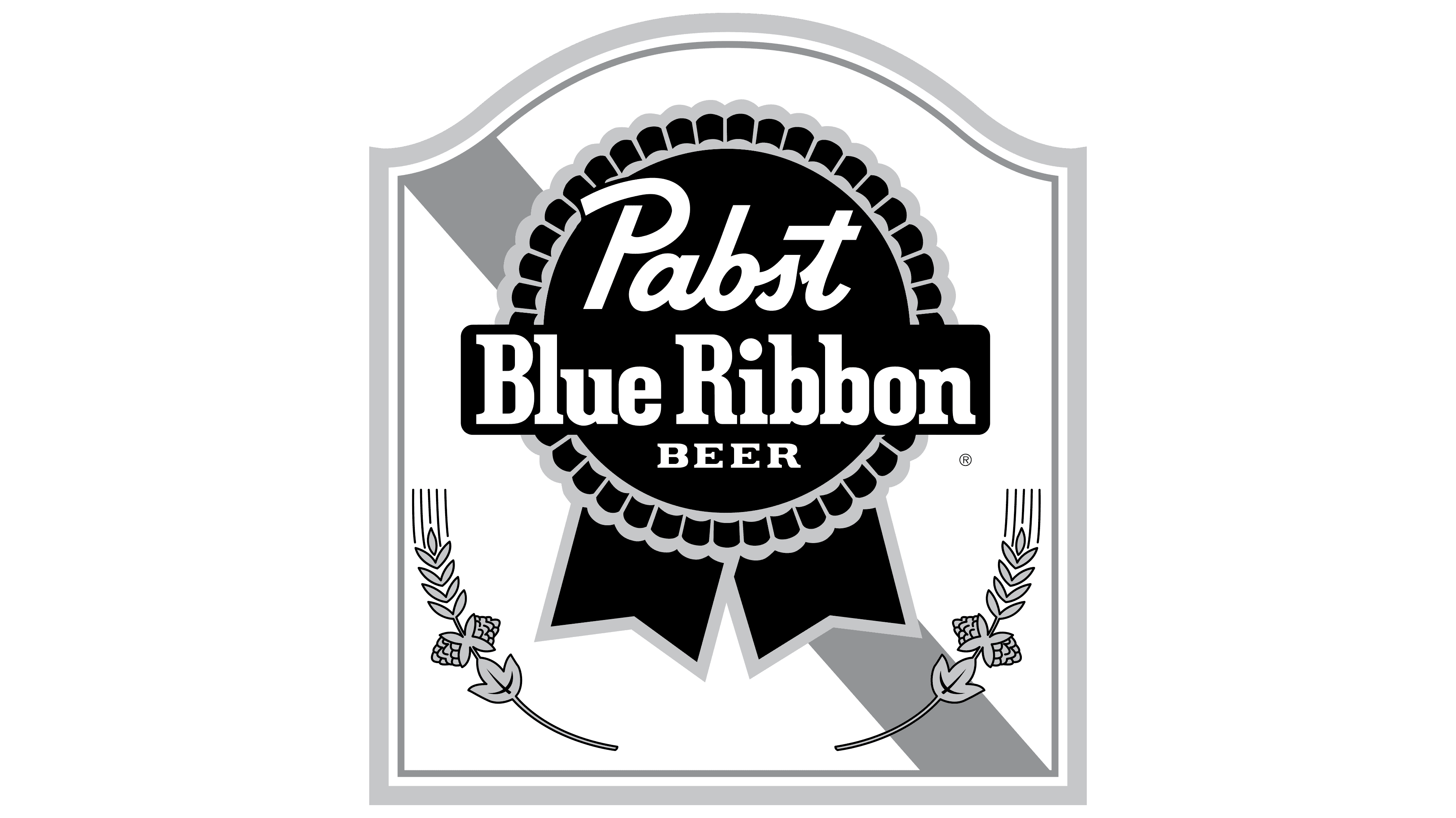
Old
![]()
The Pabst Blue Ribbon logo originated in the late 19th century, tracing its roots to the tradition of tying real blue ribbons around the necks of bottles of Best Select beer, introduced in 1882. By 1899, this symbol was firmly integrated into the brand’s name, as the beer officially became known as Pabst Blue Ribbon, and the ribbon gradually transformed from a physical element into an iconic emblem.
The emblem is a stylized medal shape with a vibrant blue ribbon outlined in silver-gray. The central part of the medal features a round base with wavy edges, reminiscent of a traditional award rosette, and is finished at the bottom with two flowing ribbon ends. Its form is intentionally softened and crafted in a loose, informal manner, giving the design an approachable and relaxed feel.
The typography consists of two visually contrasting font styles. The upper inscription “Pabst” is written in a cursive font resembling Yellowtail Regular or a similar handwritten style, highlighting the brand’s authenticity and historical roots. Below this, on a rectangular insert, the inscription “Blue Ribbon” is set in a bold typeface with pronounced rectangular serifs, similar in style to Stymie ExtraBold Condensed or Geared Slab Bold. This creates visual contrast and clearly emphasizes the brand name.
The chosen color palette of deep blue, silver, and white carries symbolic meaning. Blue traditionally symbolizes victory, quality, and reliability, while the silver outline highlights the award’s prestige. White lettering ensures readability, visually highlighting the brand name and conveying a sense of simplicity.
Historically, the emblem was long believed to be connected to the beer’s victory at the 1893 Chicago World’s Fair. However, later research revealed that ribbons were used on bottles even earlier, before the formal recognition. Nevertheless, due to the company’s marketing efforts, the image of the blue ribbon became fixed in consumers’ minds as a symbol of high quality and the heritage of American brewing.
The Pabst Blue Ribbon design effectively captures the brand’s core ideas of American authenticity, historical legacy, and quality, successfully conveying these through the simple yet memorable symbol of the blue award ribbon.
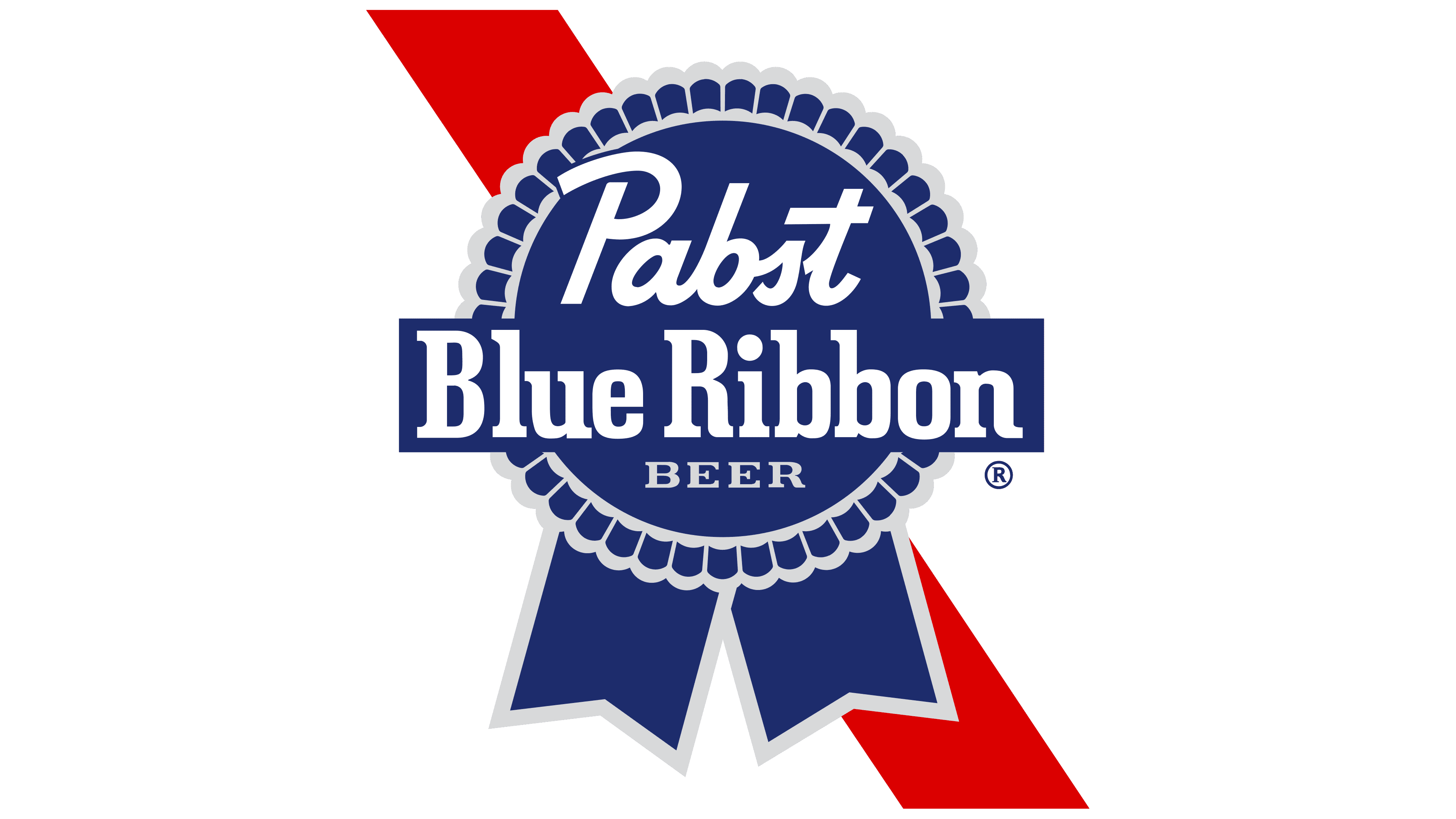
New
![]()
The updated visual identity for Pabst Blue Ribbon was implemented as part of a major rebranding effort led by the design agency Jones Knowles Ritchie (JKR) from New York. This project aimed to harmonize the brand’s iconic features, preserving recognizability while enhancing their expressiveness and versatility across various media formats.
The primary symbol remains the blue medal, now interpreted more simply and graphically. Instead of the previous jagged edges, the medal features smooth, wave-like decorative elements resembling a neat ornamental border. The outlines defining the medal appear thinner and sharper than in earlier versions. The two ribbon tails have grown longer, giving the overall composition a more streamlined, proportionate appearance that emphasizes the brand’s premium status.
The cursive word “Pabst” was redesigned while preserving its historical handwritten style, resulting in smoother lines and more dynamic strokes that enhance its association with hand lettering. The inscription “Blue Ribbon,” set in a heavy slab serif font, was meticulously customized to become more compact while maintaining the strong, robust letter shapes and squared serifs reminiscent of the Clarendon typeface. For the first time, the word “BEER,” displayed in small capitals in a geometric sans-serif typeface, was added beneath the main inscription, clearly indicating the product category.
The blue and gray color palette was revised in favor of a deeper, more refined shade of blue approaching a classic dark ultramarine tone. The silver-gray outline became cooler, cleaner, and less textured, creating a striking contrast with the rich blue background. These adjustments reinforce the brand’s premium, confident image, conveying a modern, elegant tone.
The arrangement of elements became more balanced: the central rectangular area is now fully integrated into the medal’s circular shape without disrupting its integrity. This new design emphasizes both structural and visual completeness, thereby enhancing the clarity of the emblem at various scales.
JKR’s designers paid close attention not only to the logo itself but also to the broader identity system, developing a flexible typographic and color palette capable of distinctly representing the brand even without the medal itself. This transformation is designed to appeal to a younger audience while preserving the historical identity and traditional image of Pabst Blue Ribbon.
Font and Colors
The inscriptions are crafted using custom typefaces of various types. One of them is a modification from Linotype, named Pabst Old Style Condensed. The foundry Schriftguss AG introduced two styles (Ohio-Schrift and Ohio-Kursiv) and later added a third, Ohio-Kraft. The renowned type designer Frederic W. Goudy also contributed by designing letterforms for the Pabst Brewing Company lager label.
The brand palette consists of two primary colors and two secondary colors. The main group comprises a rich red and a deep shade of blue. At the same time, the secondary group features a silvery color with a blue undertone, used for outlining, and a white background color, which is also the color of the primary inscription.