Pearl Jam’s logo attracts attention with its softness and ease of lines and then pierces the heart with its songs’ heat, uniqueness, and truthfulness. The emblem is like a sound wave running across the screen. The symbol tells of the cult group of the 90s.
Pearl Jam: Brand overview
| Founded: | 1990 – present |
| Founder: | Jeff Ament, Stone Gossard, Mike McCready and Eddie Vedder |
| Headquarters: | Seattle, Washington, U.S. |
| Website: | pearljam.com |
Meaning and History
The musicians started playing together long before the name and emblem PJ appeared. In 4 years, in 1987, they took the name Mother Love Bone and were quite popular under it. However, the real birth of the band took place in the early 90s when Eddie Vedder replaced the deceased Andrew Wood. The musicians changed their name to Mookie Blaylock and later, under the influence of Epic Records, to Pearl Jam. That’s when the ensemble’s first logo appeared.
The band’s emblem has changed several times but always consisted of the group’s name. The reason for rebranding was often the design of the upcoming album. Frequently, an image was placed alongside the verbal symbol. The most famous is a child’s drawing of a male figure, arms raised as if attempting to frighten viewers. Guitarist Jeff Ament conceived the drawing for the band’s first single. According to the artist’s idea, the little man is trying to embrace the sky. Other known images include a wing and a skull in a crown.
What is Pearl Jam?
A rock quintet playing in the grunge genre is part of the style’s key five. Grammy nominations accompanied the musicians’ creativity in geometric progression from the first album until the single “Spin the Black Circle” finally received the well-deserved statuette. The band has five American Music Awards and ranks 207th in the 500 greatest albums ever.
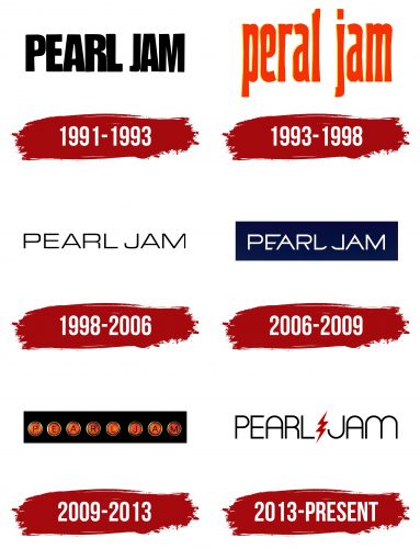
1991 – 1993
The first logo – smooth, tapered, black capital letters.
The group was named after vocalist Eddie Vedder’s grandmother. The addition of “Jam” points to collective improvisations and aptly describes the creative process of making music. In jest, Vedder explained the name by saying that his great-grandmother knew how to cook special narcotic jam from a cactus containing psychedelics.
However, according to some fans, there is a connection between the name and a slang expression meaning sperm. This choice emphasizes a desire to shock society and disregard moral norms and traditions.
1993 – 1998
For the second album, the band’s logo was changed to a bright red inscription, conveying the expressiveness of the text. The album’s songs touch on burning social issues, including child abuse, the proliferation of weapons, and police brutality. The emblem lacks capital letters, symbolizing understanding and compassion for human suffering.
The songs were so fiery that the album received a platinum certificate in the first week of sales.
1998 – 2006
The emblem of light, thin capital letters adorned the cover of the fifth album, “Yield.” The symbols conveyed simplicity and ease of sound, which the musicians aspired to. The slender glyphs embody structured and comprehensible songs with a positive and calm view of the world.
2006 – 2009
For the 8th album, eponymous with the group’s name, a symbol was created in which the letters are closely located, leading to E’s transformation. This method hints at people’s influence on each other. Society often hurts and maims, leading to the emergence of criminals, drug addicts, and terrorists.
The emphasis on L and J, written in mirror image, hints at the album’s label – J Records. The shape of the letters resembles scythes, symbolizing radical problem-solving, cleansing from negativity and evil.
2009 – 2013
The emblem with pearls appeared on the cover of the album “Backspacer.” The design was worked on by Tom Tomorrow. Round spheres, in which the letters of the band’s name are inscribed, embody the album’s songs. Each track is like a pearl, crafted by the band members and distinguished by its uniqueness and splendid sound. Together, the beads form an unforgettable necklace of the album, marked by many critics as Pearl Jam’s best creation.
2013 – today
The modern symbol of the group first appeared on the 10th album, “Lightning Bolt.” The image corresponds to the name. A red lightning bolt is placed between the two parts of the group’s name, akin to the emblem of the superhero Flash. The inscription’s free and soft lines convey the psychedelic blues’ rhythm. The lightning bolt embodies invigorating guitar parts and militant words in some compositions.
Font and Colors
Red and black are the primary shades in PJ’s emblems. The colors convey stability and expressiveness. The band has been playing for over 30 years, and throughout this period, their songs are full of fire and lively rhythms.
The font is in tune with the album’s name – Circula Light. The letters are like bent rods, from which smooth semicircular symbols have been formed. When lightning strikes, their twisted springs will fly away, disrupting stability and tranquility.
Pearl Jam color codes
| Turkey Red | Hex color: | #ba0000 |
|---|---|---|
| RGB: | 186 0 0 | |
| CMYK: | 0 100 100 27 | |
| Pantone: | PMS 485 C |
| Black | Hex color: | #000000 |
|---|---|---|
| RGB: | 0 0 0 | |
| CMYK: | 0 0 0 100 | |
| Pantone: | PMS Process Black C |

