


![]() Pearl Milling Logo PNG
Pearl Milling Logo PNG
A food industry member needs to attract attention, so the Pearl Milling logo looks bright and appetizing, even though it doesn’t make obvious food references. It also references the brand’s long history, which dates back to the Aunt Jemima brand.
Pearl Milling is an American brand of pancake and breakfast mix. It appeared in 1889 and was known as Aunt Jemima until recently. The company with the current name appeared in 2020 after a demand to change its identity due to the humiliation of the representatives of the Negroid race, since an African-American woman was depicted on its emblem. The firm’s founders are friends of Chris L. Rutt and Charles G. Underwood. Its current owner is PepsiCo Corporation (Quaker Oats). The main region of product distribution is the USA and Canada. The headquarters is located in St. Joseph, Missouri.
The work of the legendary food company began with an ordinary mill, which in 1888 was bought by two friends, Chris Rutt and Charles Underwood, for their business. They called it Pearl Milling and introduced a new grain-grinding technology. Faced with a glut of wheat and corn flour in the food market, aspiring entrepreneurs began experimenting with blends. As a result, they combined various ingredients to immediately get a composition suitable for making fluffy pancakes.
Meaning and History
![]()
At first, the product was sold in bags labeled “Self-Rising Pancake Flour”. The same inscription served as a label. And to make his signature blend stand out from the rest, Rutt borrowed a portrait of Aunt Jemima from a vaudeville poster he saw in his hometown of St. Joseph. This logo was introduced in 1889 and used in various forms until 2021.
In 1890, the businesspeople sold the mill to Randolph Truett Davis Milling. She improved the composition of pancake flour, and in 1914, the company was renamed Aunt Jemima Mills. In 1926, the mill was taken over by Quaker Oats, which registered it as a trademark. By the way, the trademark logo featuring Aunt Jemima is considered the longest-used in American advertising history. In 2021, PepsiCo Corporation renamed the brand. She returned to the original name she had received in 1889: Pearl Milling Company.
The famous black woman character on a pancake mix package has been preserved, but has changed once again. Its author was Haddon Sundblom. Commissioned by Quaker Oats, the cartoonist drew actress Anna Robinson, and Aunt Jemima’s packaging was radically updated. At another time, designer James J. Jaffee from the Bronx (New York) worked on the image from the emblem. His version was used in the middle of the 20th century. In total, there are nine versions of the logo.
What is Pearl Milling?
Pearl Milling is the new brand name for Aunt Jemima, which was founded in 1889. It manufactures pancake syrups and flour mixes for customers in the United States and Canada. The company’s founders are Chris L. Rutt and Charles G. Underwood, and the current owner is Quaker Oats, a subsidiary of PepsiCo Corporation.
1889 – 1912
![]()
The debut logo features a cartoon character from vaudeville. The woman’s name is Aunt Jemima. She was chosen as the central image in the pancake brand’s logo because, earlier in American life, such aunts worked as cooks and kind nannies, and prepared delicious food. This is a symbol of home, warmth, and comfort. The portrait is in full face. The black woman in it smiles warmly. She wears a striped cape and a large polka-dot shawl. The background is a wicker mat. At the bottom, in three lines, there are inscriptions made in thin sans-serif: “Use,” “Aunt Jemima,” and “Pancake Flour.” The phrase in the middle row is the largest.
1912 – 1925
![]()
The designers have changed the Pearl Milling logo to red. The vertical rectangle depicts a dark-skinned woman with a wide smile. She looks ahead kindly. A scarf with small white dots is thrown over her shoulders, and a turban with a black pattern is tied around her head. At the top, the developers placed the brand name, adding an “s” followed by an apostrophe. The inscription has an arched shape. Beneath it is the single word “Brand” in bold sans-serif. At the bottom of the portrait is a variety of information about the pancake mixture manufacturer, including a line reading “Pancake Flour.” All letters are curly, graceful, and decorated with elongated ends.
1925 – 1950
![]()
The image of the aunt is redrawn. Now, the portrait is made in a realistic style. The woman has other facial features characteristic of the Negroid race. On the head is a patterned scarf tied at the back. The designers removed the cape and instead depicted just white clothes. Against a smiling aunt’s background, the brand name and advertising information about the manufacturer and product are written. The developers changed the font by choosing vertically elongated letters in a grotesque style.
1950 – 1968
![]()
The artists proposed a new version of the character to modernize the Pearl Milling logo. Cheerful Aunt Jemima looks friendlier than before: her smile is more natural. The skin is not black but brown, closer to a natural color. A scarf is tied around the head, decorated with red and yellow rhombuses separated by oblique stripes. The brand name is on the right. It is made in slightly curved blue letters.
1968 – 1989
![]()
Designers have changed the proportions of the aunt’s face, making it smaller. A thin young woman in a circle is looking at the picture. As before, she smiles kindly. But instead of a headscarf, she wears a geometric-print headband that does not fully cover her hair. Also clearly visible is the white collar that replaced the cape. The emblem’s color palette is restrained: pastel red, brown, black, and white. The inscription is left in the same place but changed. Now, the font is much sleeker. It is bold and rounded, with serifs and tight lettering.
1989 – 1993
![]()
The authors of the Pearl Milling logo added color to the previous image, so all colors are bright. A background has also appeared, a horizontal rectangle with a gradient. At the top left is a circle with the face of a smiling black woman. She has neither a scarf nor a bandage on her head; only curly hair is visible. The collar became a lace collar, and the woman’s ears were adorned with pearl earrings. The inscription’s style is preserved, but it is now white rather than black. This option was adopted for the 100th anniversary of the trademark.
1993 – 2020
![]()
The rectangle disappeared from the Aunt Jemima brand logo again, revealing a circle with a smiling black woman’s face. All the details are the same. The exceptions are the tilt of the head (it has become less diagonal), the background (recolored from red to yellow), and the font (bold italics used). In addition, instead of the classic crossbar, the letter “A” has a graceful triangular stroke with a dot at the end.
2020 – 2021
![]()
In mid-2020, Quaker (a subsidiary of PepsiCo) announced a redesign of the Pearl Milling logo in response to societal demands. At that time, the fight against racism in advertising and marketing began, so the African-American woman was removed from the logo. All that remains is the name in italics.
2021 – today
![]()
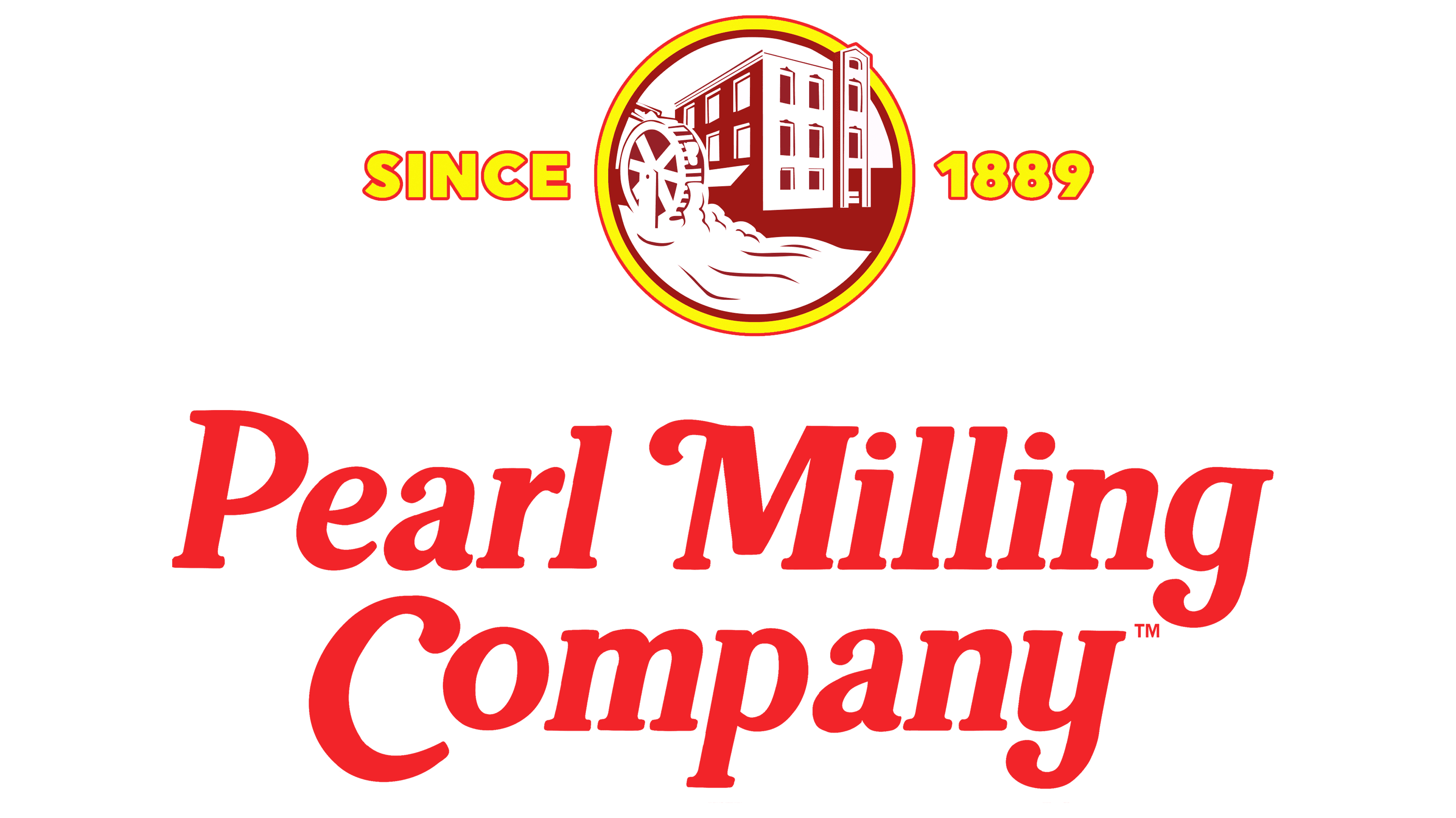
After redesigning the logo, the company rebranded and returned to its original name, the one used in 1889. This measure was a continuation of protests against racism, so the trademark owner abandoned the Aunt Jemima image. The visual identity sign now features the building of the first flour mill. It is taken in the yellow ring and placed in the upper part of the horizontal rectangle. The year the company was founded is to the right and left of the circle “Since 1889”. At the bottom is a two-line inscription with the current name. The letters are padded with shadows, so they look three-dimensional.
Font and Colors
Throughout Pearl Milling’s evolving identity, the image of Aunt Jemima has continually changed. At first, he was comical and caricatured, modeled after a vaudeville poster. Then the artists created a more understandable character: smiling, kind, and attractive. Despite the change in facial features, he remained attractive. The company’s management ordered a different logo for the brand’s centenary: a beautiful modern woman with a lace collar, pearl earrings with gold trim, and no headscarf. It remained this way on products until the beginning of 2021. Then came the text emblem.
Many fonts have been used for the Pearl Milling logos. Early versions did not repeat; later ones, by contrast, looked the same. As a result, the font from the inscription “Aunt Jemima” was borrowed for the new emblem. The letters in it are graceful, curly, and almost identical to the glyphs from Classic Round Bold Italic. The color palette is very bright, with a range of red shades. It is complemented by yellow, white, brown-bronze, and black.