Sports teams at the University of Pennsylvania want to look solid, so the Penn Quakers logo is not overloaded with extraneous elements. Their emblem does not reflect the historical past – its modern design indicates that the athletes are focused on the future and confidently striving to conquer new heights.
Penn Quakers: Brand overview
| Founded: | 1956 |
| Headquarters: | Philadelphia, Pennsylvania, U.S. |
| Website: | pennathletics.com |
Meaning and History
The choice of the name for the Penn Quakers was influenced by the fact that William Penn, who founded the Province of Pennsylvania, supported the Protestant Quaker movement. Moreover, he not only adopted this religion but also spread it in his colony so that, in his opinion, free-thinking people could live there. However, the logo currently in use does not reflect the original concept. It lacks the word “Quakers” and references a religious theme.
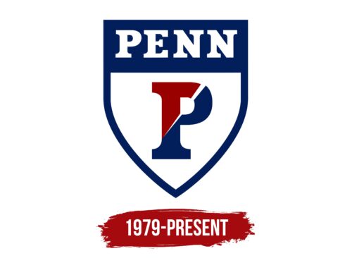
The symbol of the UPenn sports teams contains a quadrangular heraldic shield with a sharp base. In its upper part, there is a wide horizontal stripe of dark blue color. The word “PENN” is written there, for which the designers chose a bold capital font with rectangular serifs. Large white letters cast red shadows that spread evenly across the base.
What is Penn Quakers?
The Penn Quakers is the collective name for over 30 sports teams representing the University of Pennsylvania in intercollegiate competitions. They are listed in the NCAA Division I and are part of the Ivy League. Their informal pseudonym, “The Red and the Blue,” refers to the color scheme adopted in 1910.
The rest of the shield inside is painted white and outlined in dark blue around the edges. This area is occupied by a huge “P,” divided into two fragments: blue and red. A white stripe is drawn between them: it starts at the vertical part of the letter and goes diagonally, gradually expanding.
The Penn Quakers logo looks just like the symbols of many other sports teams that American universities own. The heraldic shield is often found in sports identity, and this tradition originates from jousting tournaments. To somehow differ from each other, the participants in the competition used armorial shields with different content. As for the Penn Quakers, they chose the first word of their name and its initial letter, “P,” as an identifying element.
Font and Colors
Both the word “PENN” and the stand-alone letter “P” have one common font – more precisely, not a font, but an individual set of glyphs. A bold style, a large difference between the thickness of the main and additional strokes, and expressive rectangular serifs characterize it.
In addition to white, the logo palette includes two more colors: red and blue. No wonder the sports teams of the Quakers are informally called The Red and the Blue. According to one version, this combination of colors was borrowed from the arms of William Penn and Benjamin Franklin. One played a decisive role in creating the Province of Pennsylvania, and the second founded UPenn.
Others believe that George Washington is “to blame” for everything. Allegedly, he visited the university, dressed up in red and blue clothes, and then all the students began to imitate him. It is also believed that the sports teams of the Penn Quakers decided to take on the colors of the opponents they would beat. They turned out to be Harvard Crimson and Yale Blue.
Penn Quakers color codes
| Crimson Red | Hex color: | #990000 |
|---|---|---|
| RGB: | 153 0 0 | |
| CMYK: | 0 100 100 40 | |
| Pantone: | PMS 7626 C |
| Royal Blued | Hex color: | #011f5b |
|---|---|---|
| RGB: | 1 31 91 | |
| CMYK: | 99 66 0 64 | |
| Pantone: | PMS 2758 C |


