


![]()
Perkins Restaurant & Bakery, a classic name in American dining since 1958, has introduced a fresh new look with an updated logo and branding, developed alongside Aria Group and Dunn & Co. Rebrand reflects a shift toward a more modern image while staying true to the roots of the brand’s warm, traditional hospitality.
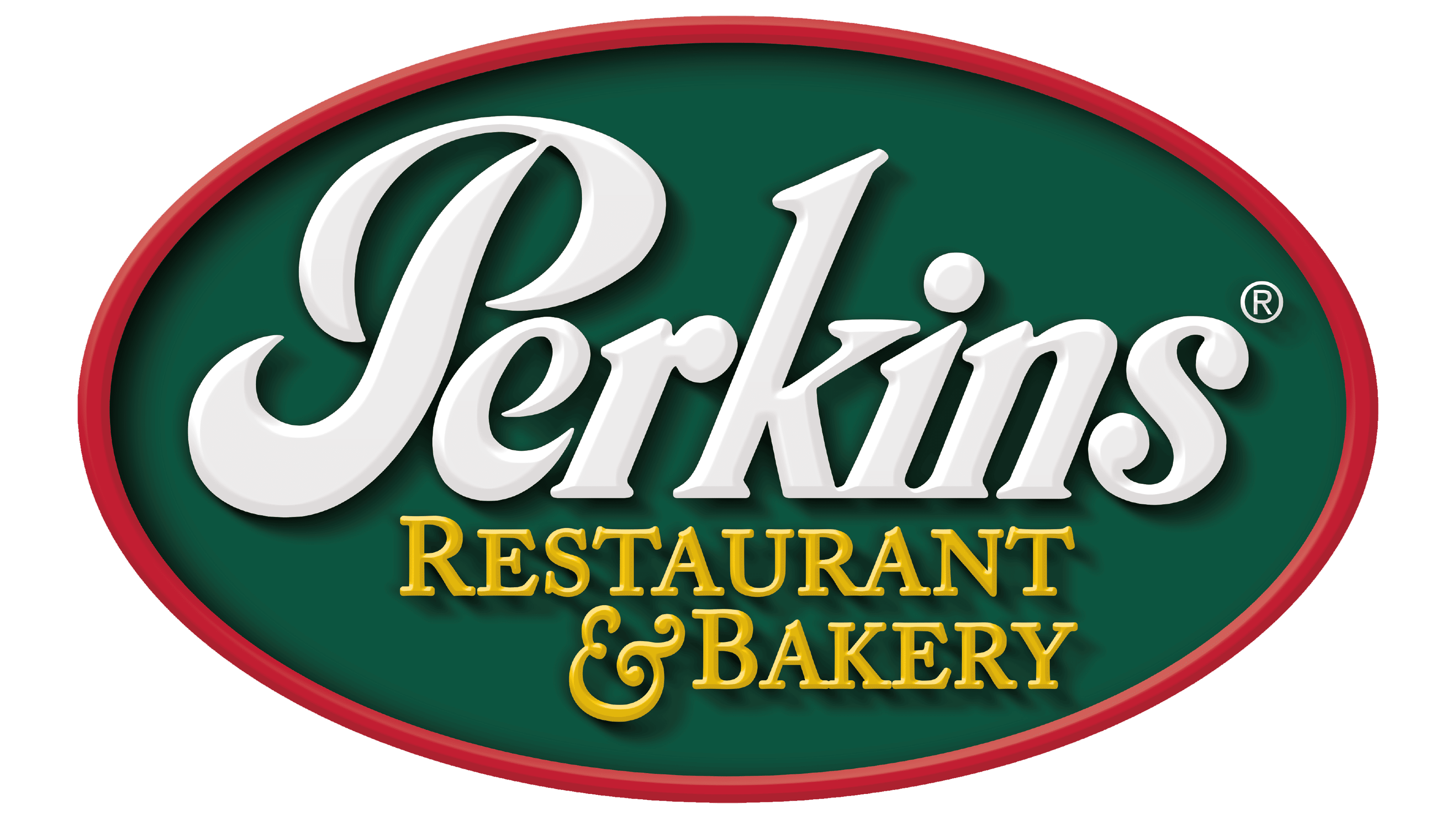
The new logo is a noticeable change from the old one, which featured a green oval with a red outline and vintage-style “Perkins” lettering paired with the yellow tagline “Restaurant & Bakery.” That design had a nostalgic feel, reminiscent of old-school diners and family spots. But as dining trends evolve, Perkins has opted for a cleaner, updated look that better suits today’s restaurant scene.
![]()
While the refreshed logo keeps the familiar cursive “Perkins” script, the font has been refined for a sleeker, more polished appearance. The heavy oval background and bold colors are replaced by a minimalist design that lets the name stand confidently. A subtle brushstroke-like underline adds a dynamic, stylish touch without overpowering the logo.
A new addition under the logo reads “AMERICAN FOOD CO.” Small change signals a broader focus, showing Perkins as more than a traditional diner. It reflects the brand’s growth into a modern eatery that offers timeless American dishes with a fresh twist. The font for this line is clean and simple, creating a nice contrast with the flowing script above.

The rich greens, reds, and yellows of the past have been swapped for softer shades of green with gray undertones. The muted palette feels modern and sophisticated while respecting the brand’s heritage. It’s versatile enough to work across everything from digital platforms to menus and signage.
The old version used a vintage-inspired font with decorative flourishes, but the new typeface is smoother and more contemporary. The rounded letters and soft transitions give off a friendly, welcoming vibe. The new typeface is designed for clarity on large storefronts or small digital screens.
Beyond the logo, the rebranding touches all of the Perkins experience—from the menu to the restaurant interiors. The updated layouts feature clean lines, modern décor, and cozy touches that create an inviting atmosphere. The menu still offers classic favorites but now includes new dishes designed to appeal to today’s diners, focusing on fresh ingredients, generous portions, and bold flavors.
Transformation is part of a larger effort to enhance the dining experience with improved services, including takeout, delivery through third-party apps, and an upcoming loyalty program. Perkins is expanding, and new locations are planned. The company will start with a remodeled restaurant in Orlando and debut the updated look later this year.
With this rebrand, Perkins is ready to connect with new diners while continuing to be a favorite spot for families and food lovers across the U.S. and Canada.