The Perrier logo belongs to the record-breaking drink. Mineral water wins in the fight against thirst and fatigue. The elements show that the basis of success is the balanced mineral composition and the purity of the natural source.
Perrier: Brand overview
| Founded: | 1863 |
| Founder: | Nestlé Waters |
| Headquarters: | France |
| Website: | perrier.com |
Meaning and History
Le Bouyen’s spring in the Occitania region of southern France opened in 1863 at the insistence of Alphonse Garnier, a local landowner. Since 1898, Louis Périer, who headed the hospital, studied the water. He invented a method of natural carbonization. English businessman John Harmsworth saw a future in selling such mineral water. The tycoon purchased a pump, named the product after the doctor, and began exporting the water to England, advertising it as champagne table water. The business was going well until the death of the entrepreneur. As a result of a series of troubles concerning the purity of the water, the business of Harmsworth’s successors went into decline. Nestlé bought the rights to the Perrier brand in 1992.
During its existence, the brand logo was renewed only once. This is because, for 159 years, nothing has changed in the production and composition of the water.
1863 – 2003
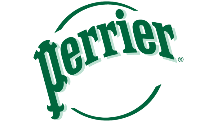
The first Perrier logo was distinguished by a single color palette (only green), the unusual writing with volumetric effect, and a long lifespan of 140 years.
The brand’s visual representation is based on the naturalness and natural carbonation of mineral water. Natural, purified in rocks, rainwater is saturated with volcanic carbon dioxide and comes to the surface.
One of the bubbles is depicted on the emblem as the outline of an almost invisible white schematic ball. It is enveloped by a curved brand name rising above the bubble, casting a pale green shadow. The name seems to float up with the gas.
What distinguishes the logo is the unusual shape of the first P in Perrier. Green spikes seem to come off of it. They are a symbol of the “sharp” sparkling bubbles and emphasize the natural gasification of the water. All the other letters also look angular and sharp.
2003 – today
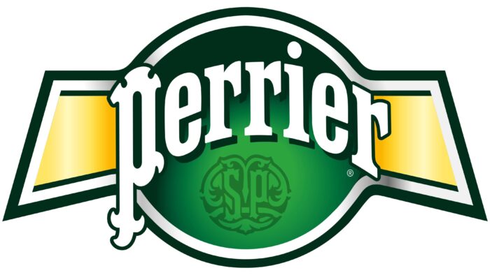
Before bottling, the mineral water began to be further purified and gassed artificially. Therefore, the image of a bubble ceased to be relevant. On the new logo, it was “modernized” into a dark-green ball with two straps running down the sides. This image reminds the belt of a boxing champion. And also a tennis ball, because the company sponsors a tennis tournament. The figure symbolizes victory, the popularity of the brand—support for a healthy lifestyle. The logo’s shape is also an allusion to the royal warrant the mineral water received from the king of Great Britain in the early 20th century. The royalty of the country, especially Edward the 7th, liked the taste of this water.
The curved arc white inscription with the brand name is located right in the center of the ball. It evokes the association between water saturation with gas and rising bubbles. The white color is a symbol of purity and clear water. The letters have a dark shadow that lifts the inscription above the background, making it float.
Beneath the name is a monogram with monograms and the letters SP, which stand for “Perrier Society.” The company positions its product as recreational water for all occasions. It can be used to make cocktails for parties, breaks during the day, and evening relaxing meals. The Societe Perrier online project was created to share recreation and social events information. The site has pages for each participating city, where bloggers post information about important events.
The entire logo has a thick white outer border and the same dark green band over it. These stripes symbolize protection. The white one means naturalness and purity. Water is pre-filtered during production. That is why the mineral water is pure and safe. Nestlé modernizes its plants to minimize the impact on the environment. The dark green stripe represents the brand’s long history and ancient source. It is believed that the fusion of water and volcanic gas began as early as 120 million years ago.
Font and Colors
Green and dark green are the main colors of the brand. They symbolize life. They point to the natural soda created by nature itself. They are the colors of the good health that comes from drinking water. To enhance the impression, the brand bottle is also made in green.
In the latest version of the logo, white and yellow are added to the green shades. White is the color of purity and coolness. Yellow symbolizes joy, fun, a good mood, and well-being. Its appearance is connected with the brand’s support of various parties and parties.
The font resembles Jozef Heavy Italic with a modified P.
Perrier color codes
| Pigment Green | Hex color: | #2ba43f |
|---|---|---|
| RGB: | 43 164 63 | |
| CMYK: | 74 0 62 36 | |
| Pantone: | PMS 354 C |
| Phthalo Green | Hex color: | #002e1a |
|---|---|---|
| RGB: | 0 46 26 | |
| CMYK: | 100 0 43 82 | |
| Pantone: | PMS 3308 C |
| Pale Goldenrod | Hex color: | #fff7b3 |
|---|---|---|
| RGB: | 255 247 179 | |
| CMYK: | 0 3 30 0 | |
| Pantone: | PMS Yellow 0131 C |
| Yellow | Hex color: | #ffe564 |
|---|---|---|
| RGB: | 255 229 100 | |
| CMYK: | 0 10 61 0 | |
| Pantone: | PMS 113 C |
| Fluorescent Orange | Hex color: | #fdbd0c |
|---|---|---|
| RGB: | 253 189 12 | |
| CMYK: | 0 25 95 1 | |
| Pantone: | PMS 7549 C |

