


![]() Persil Logo PNG
Persil Logo PNG
The Persil logo demonstrates active action against any stains and dirt. This is due to strong adhesion to foreign compounds. The emblem is a symbol of universality. The tool works equally well with white and colored linen.
In 1876, in Aachen, Friedrich Karl Henkel founded a company focused on sodium silicate-based detergents. At the time, laundry required manual scrubbing and sun bleaching, a labor-intensive process common across households.
On June 6, 1907, Persil was introduced through an ad in Düsseldorfer Zeitung. Its name combines perborate and silicate, reflecting a formula that releases active oxygen during washing. The product removed stains without scrubbing and eliminated the need for outdoor bleaching. By 1912, Persil accounted for about 40 percent of Henkel’s production.
In 1909, Joseph Crosfield and Sons acquired the rights to Persil in the UK and several territories. They began producing it in Warrington under the name “The Amazing Oxygen Washer.” In 1919, the company became part of Lever Brothers, which later merged into Unilever, creating two parallel versions of Persil in different markets.
In 1922, the “White Lady” image designed by Kurt Heiligenstaedt became the brand’s long-term symbol across Germany. During World War II, Persil production was halted, and after the war, most available stock sold out quickly.
In 1959, Henkel launched Persil 59, the first synthetic universal detergent in Germany, and supported it with campaigns across print, radio, and television. By the late 1960s and 1970s, the brand faced competition from Tide and Ariel, both from Procter & Gamble, prompting the introduction of enzyme-based formulas and washing machine products.
In 2007, Henkel marked 100 years of Persil with a global rebranding. In 2015, Persil ProClean entered the US via Walmart. In 2016, Henkel acquired Sun Products and replaced Wisk with Persil.
Meaning and History
![]()
The series’ launch almost immediately made its trademark recognizable, as crushed soap had been used for washing up to that point. And this tool contains special ingredients that “push” the dirt from the inside. It was the main components that formed the basis for the brand name incorporated into the logo. It is sodium perborate and sodium silicate: per + sil. Over the years, there have been 10 types of emblems (distributor: Unilever).
What is Persil?
Persil is a German brand of cleaning products. It was launched by Henkel in 1907 as a laundry detergent. The brand is now owned by Henkel and conglomerate Unilever, which has the right to sell the product in New Zealand, Australia, China, France, Ireland, the United Kingdom, and almost all of Latin America.
the 1910s – 1930s
![]()
The debut logo was simple black lettering on a white background. The letters were in a rounded serif font.
the 1930s – 1955
![]()
During this period, a red circle appeared, on which the line’s name was written in grotesque white characters.
1955 – the 1960s
![]()
The word “Persil” expanded beyond the circle. A green background appears.
the 1960s – 1992
![]()
The designers removed the circle and changed the lettering color. Since then, it has become red.
1992 – 1998
![]()
The brand name was placed diagonally from bottom to top.
1998 – 2002
![]()
A new version was approved: a horizontal arrangement of the word “Persil” in muted red.
2002 – 2011
![]()
The developers changed the shape of the letter “r,” separating it from the “s.”
2011 – 2016
![]()
During this period, the brand name consisted of a 3D brand name and a blue-green spot.
2016 – 2020
![]()
Between the “i” and “l,” we increased the glare and made the spot more voluminous by adding contours, a gradient, and shadows.
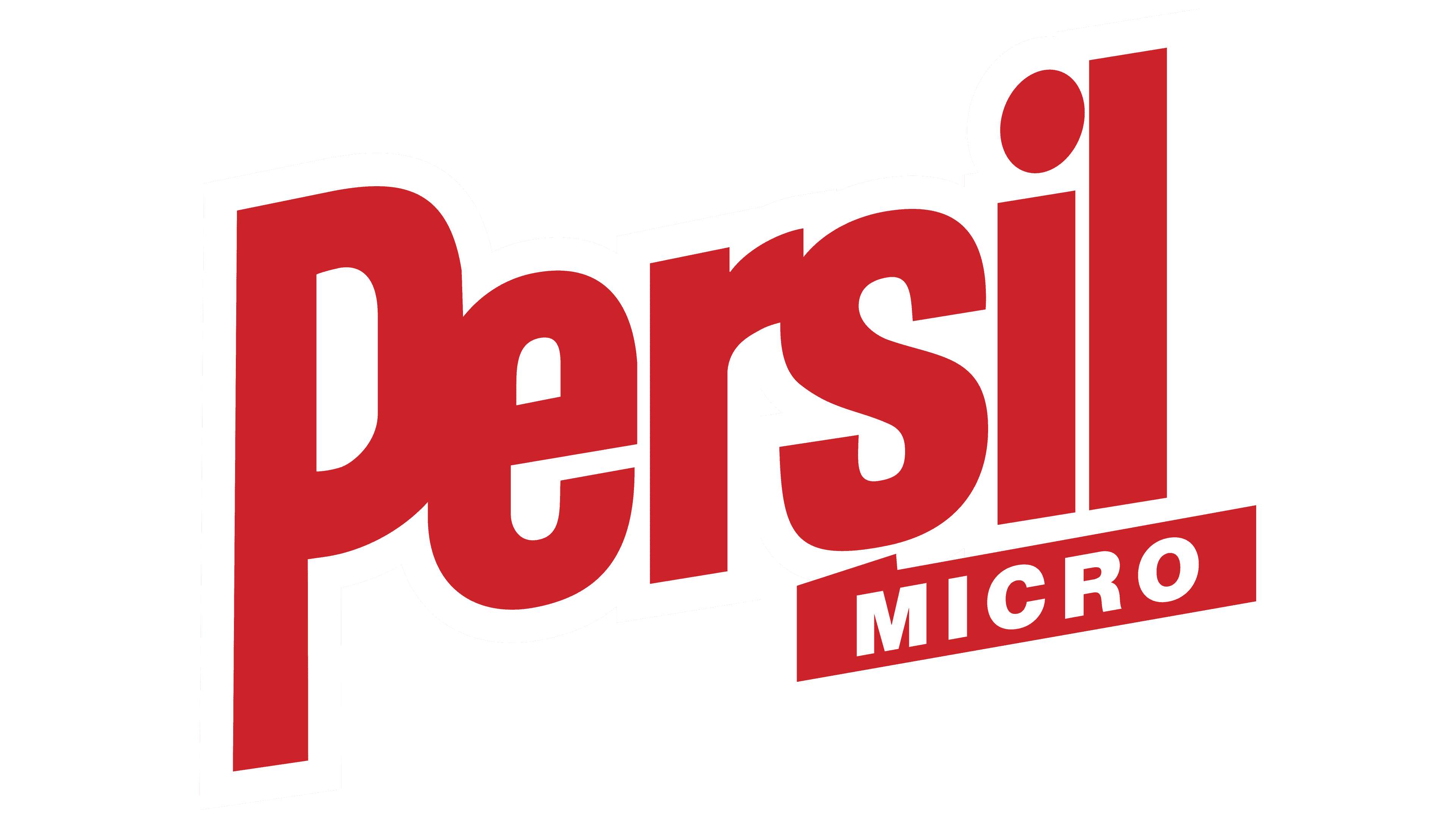
2020 – today
![]()
The designers reduced the spot and moved it to the left. In the word “Persil,” all the letters were separated and then reassembled into a simple spelling reminiscent of the 2002 format.
Font and Colors
From the 1960s to 2002, the name combined the letters “P,” “e,” “r,” and “s.” Since 2002, only the first two characters have a bunch. Now they are written separately.
The typeface has hardly changed: the text in the logo is a chopped version with an elongated “P” leg. In another emblem, the marks are wide and even, with inter-letter connections. In most variants, the color is kept red. Then blue and green were added to it.