The Peterbilt logo is textual and neat, despite the heavy-duty products it represents. This badge adorns trucks and looks great on any powerful vehicle. It reduces their aggressiveness while demonstrating utility, ease of use, and easy adaptability to user needs.
Peterbilt: Brand overview
| Founded: | 1939 |
| Founder: | T.A. Peterman |
| Headquarters: | Denton, Texas, U.S. |
| Website: | peterbilt.com |
This is an American company for the manufacture of heavy and medium-duty vehicles. It originated in 1939 due to the purchase of Fageol Truck and Motor by businessman T. A. “Al” Peterman. At the same time, the first Peterbilt logo appeared. In 1958, the company was taken over by the PACCAR Corporation and had since been working in conjunction with its subsidiary Kenworth Truck. Now she marks her cars with an oval sign, which she has used since 1965. Its production sites are concentrated in several locations: Sainte-Thérèse (Quebec, Canada) and Mexicali (Mexico). The headquarters is located in Denton, Texas.
Peterbilt’s heavy-duty specialty is history because its founder, Peterman, used to work as a lumberjack in Tacoma and knew the ins and outs of transporting logs. He tried to improve the process of transporting cut trees in order to abandon horse teams and steam tractors. His idea was to deliver timber quickly and conveniently to sawing sites.
To do this, in 1934, he bought several thousand acres of forest, laid roads, purchased military trucks from the White Motor Company, and modernized them. In 1938, the businessman learned that Fageol Truck and Motor would be put up for sale. So he bought it from the Sterling Motor Company, becoming the owner of a large plant in Oakland, California. The official part of the procedure ended in 1939, which is considered the time of the appearance of Peterbilt.
Meaning and History
After the companies’ merger, the enterprise began rebranding so that it could confidently gain a foothold in the market. For naming, the businessman took his own surname – Peterman. He separated part of it and added the thematic verb “built.” Initially, the concept of “built by Peter” was laid in the name, which means “Peter builds cars.” But the “u” disappeared by mistake, so the remaining form is used. It serves as the basis for the text logo, and this brand has two of them.
What is Peterbilt?
Peterbilt is an American company that manufactures large and medium-sized trucks. It has existed since 1939 when T. A. “Al” Peterman was officially registered. Since 1958, the company has been part of the PACCAR structure. Its factories are located in the USA, Canada, and Mexico. The head office is located in Denton, Texas.
1939 – 1953
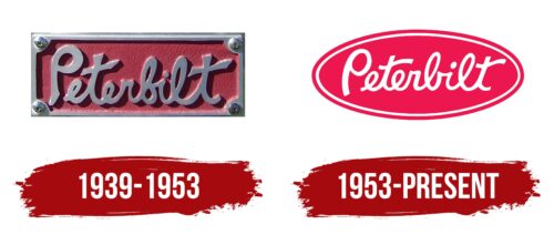
The designer opted for a cursive font with no slant for Peterbilt’s visual identity. Although the text is sloppy, the letters in it are not italics – they are vertical. The only diagonal is present in both “t”: the crossbar is located at a slight angle and directed upwards. At the same time, the inscription is semi-connected because the “P” is separated from the rest of the word. The lines are smooth, harmoniously moving from character to character. The background for the text is a red rectangle with cut corners because, in their place, there are four fixing screws.
1953 – today
The sloppy font, inspired by individual handwriting, is retained in this version. Only the three-dimensionality of the inscription has disappeared – now it is flat. The letters in the modern logo are arranged with a large breakdown, so the inscription has become distinct and well-readable. The developers managed to achieve this effect by reducing the thickness of the glyphs. The background has also changed: the rectangle is no longer there. Instead, an ellipse with a double border appeared.
Font and Colors
In the course of evolution, the Peterbilt identity has hardly changed. The designers tried to keep her style and make both logos as similar as possible. The modernization was undertaken at a very important time for the company: when it received the 351 truck model, which continued for many years. The main change touched the background where the text is located: at first, it was a rectangle, but now it is an oval.
The logo uses italics – a cursory inscription as if made by hand. In the second emblem, the word “Peterbilt” is read more clearly, because its right half is elongated. Now the “b” is further away from the “i,” and the “l” is connected to the “t” at the bottom instead of the top. In both cases, the font is individual. The key color in the corporate palette is red. It is complemented by dark gray and white: they color the text.
Peterbilt color codes
| Amaranth | Hex color: | #ed174f |
|---|---|---|
| RGB: | 237 23 79 | |
| CMYK: | 0 90 67 7 | |
| Pantone: | PMS 1787 C |
