


![]() Philip Morris Logo PNG
Philip Morris Logo PNG
The Philip Morris logo shows that the cigarette maker values its century-and-a-half history. The powerful symbolism shows just how unique the brand is, and the sophisticated design further proves the quality of its products.
Philip Morris is an international American company that produces six world-famous cigarette brands, including Marlboro, L&M, Chesterfield, Parliament, and HEETS tobacco sticks. The company’s cigarettes are sold in 200 countries. The Philip Morris logo is associated with royalty and wealth. The corporation’s income is more than $ 76 billion (2020), ranking 101st in the world according to Fortune.
Philip Morris began in 1847, not just as a shop in London but as a seed that would grow into a global tobacco empire. Founded by the man himself, Philip Morris, this small venture laid the groundwork for an industrial revolution. A few years later, in 1854, seeking broader horizons, the company crossed the ocean to New York, planting its roots in new soil.
By 1872, innovation kicked in. Philip Morris began producing its cigarettes, setting the stage for a future in which its brands, including the iconic Marlboro, would become household names. These brands captured the market and shaped the culture of smoking in the early 20th century.
Post-World War II marked a period of aggressive expansion for Philip Morris. The company expanded production and strategically acquired other tobacco brands, casting a wider net across the tobacco ocean. The ’50s and ’60s saw another pioneering effort as Philip Morris ventured into television advertising, a bold move that paid dividends in brand recognition.
Philip Morris diversified in the ’70s and ’80s, acquiring food companies like General Foods and Kraft Foods. This expansion, however, didn’t distract from its core. By the 2000s, tobacco became the company’s focal point.
The ’90s and early 2000s brought a storm of legal challenges over smoking’s health risks. These battles cost Philip Morris dearly, both financially and in restrictions on cigarette advertising.
Having spun off from Altria Group in 2008, Philip Morris International is a titan in the tobacco world. Yet it’s a company looking to the future with its pivot toward less harmful nicotine delivery methods, such as the IQOS tobacco heating system.
Meaning and History
![]()
Philip Morris International went through multiple owners before becoming an international company. The founder’s name remained in the name. The history of the tobacco giant began in the middle of the 19th century (1847). Still, it was only in 1919, after a group of American investors purchased the company, that the company’s real heyday began, with a new logo, the release of Marlboro (1924), and its entry into the international market (1955). In 2003, the management tried to change the company’s name to Altria Group, but after five years, it reverted to its former world-famous name. This moment was a turning point in the corporation’s history. The updated giant is focused on the release of smoke-free products.
The company’s logo changed as its owners changed. However, the royal regalia reflected in it has remained constant for more than 130 years.
What is Philip Morris?
An international concern that produces and sells popular cigarette brands. Owned by a group of American investors. Production facilities in 30 states provide consumers in 200 countries.
1885 – 1919
![]()
The first visual sign emerged when the founder’s brother took over the company. Before this, four years of management were joined by a business partner. Leopold Morris crossed out the name Gruenebaum, who had left the common cause, and changed it to Philip Morris & Co Ltd, which was reflected in the logo.
Beautiful, graceful serif lettering is located in an arc above the emblem, forming a protective dome. The family fully owns their business and will protect and develop it. At the same time, the rising sun symbolizes the company’s desire to reach new heights.
The company values its history very much. The logo was created in the Victorian era. At that time, every self-respecting noble house and company had a coat of arms. Philip Morris was no exception. The coat of arms was placed under the name. It depicts important values for the company, encrypted in heraldic signs.
- The English crown crowns the coat of arms. The company was founded in England and worked with the authority’s permission.
- In the center is an oval mirror with a wide border. It means public power and an honestly performed duty. Philip Morris cigarettes gained increasing weight in society. Now, 150 million people smoke them. In addition, women’s heraldic shields were oval (after her husband’s death, the tobacco shop passed into the possession of Morris’s wife).
- Special heraldic animals hold the mirror: a horse and a dog. The horse is a multifaceted symbol. It means courage, strength, skill, and speed. The dog is devoted. The company is dedicated to its work and performs it with sufficient strength and agility.
- On the bottom ribbon is the phrase of Julius Caesar: I came, I saw, I conquered.
All picture elements speak of the desire to develop and conquer new markets.
The logo is designed so that the inscription at the top appears to protect the company’s values, which are at the heart of the composition.
1919 – 1954
![]()
In 1919, the company moved to Virginia, America. The investors who bought Philip Morris were determined to prosper and make a good income. Therefore, the new owners worked to improve the company’s image and modernize the logo.
First, they added color, which increased the emblem’s attractiveness. Second, the image was placed at the top, and the company name at the bottom. The lettering has been straightened out. Third, all unnecessary details were removed from the emblem, making it more schematic.
The center of the coat of arms composition is no longer a mirror but a medallion with the company’s name in capital letters. It is surrounded by symbols of power: a crown, royal animals, and a victory inscription. The image has become the personification of prosperity and aristocracy, associated with high-end cigarettes and excellent tobacco taste. It makes users want to try what rich people smoke.
On the sides of the emblem, to enhance the impression, they added the inscription “finest selection” – the best choice.
1954 – 1987
![]()
The period is characterized by international expansion. The opening of the first foreign branch was marked by rebranding.
The company name was removed from the logo, and the inscription has become less informative since cigarette buyers now speak different languages. Forming an association with an image is much more promising, which is what they relied on in the new design.
All elements of the updated emblem are filled with a single color, red-gold. The white initials of the company’s name are centered in the red “cushion” of the medallion. Crowned animals seem to present them to the observer. The logo looks precious and luxurious, and the red oval echoes the red pads serving as valuable jewelry.
1987 – 2008
![]()
In 1987, Philip Morris International was registered for international operations. The logo placed maximum emphasis on the name to ensure it would be well remembered. The inscription is located under the emblem and is reduced in size. Large letters and black font immediately attract attention. The name is also on the ribbon, instead of Caesar’s motto, and on the inside of the medallion.
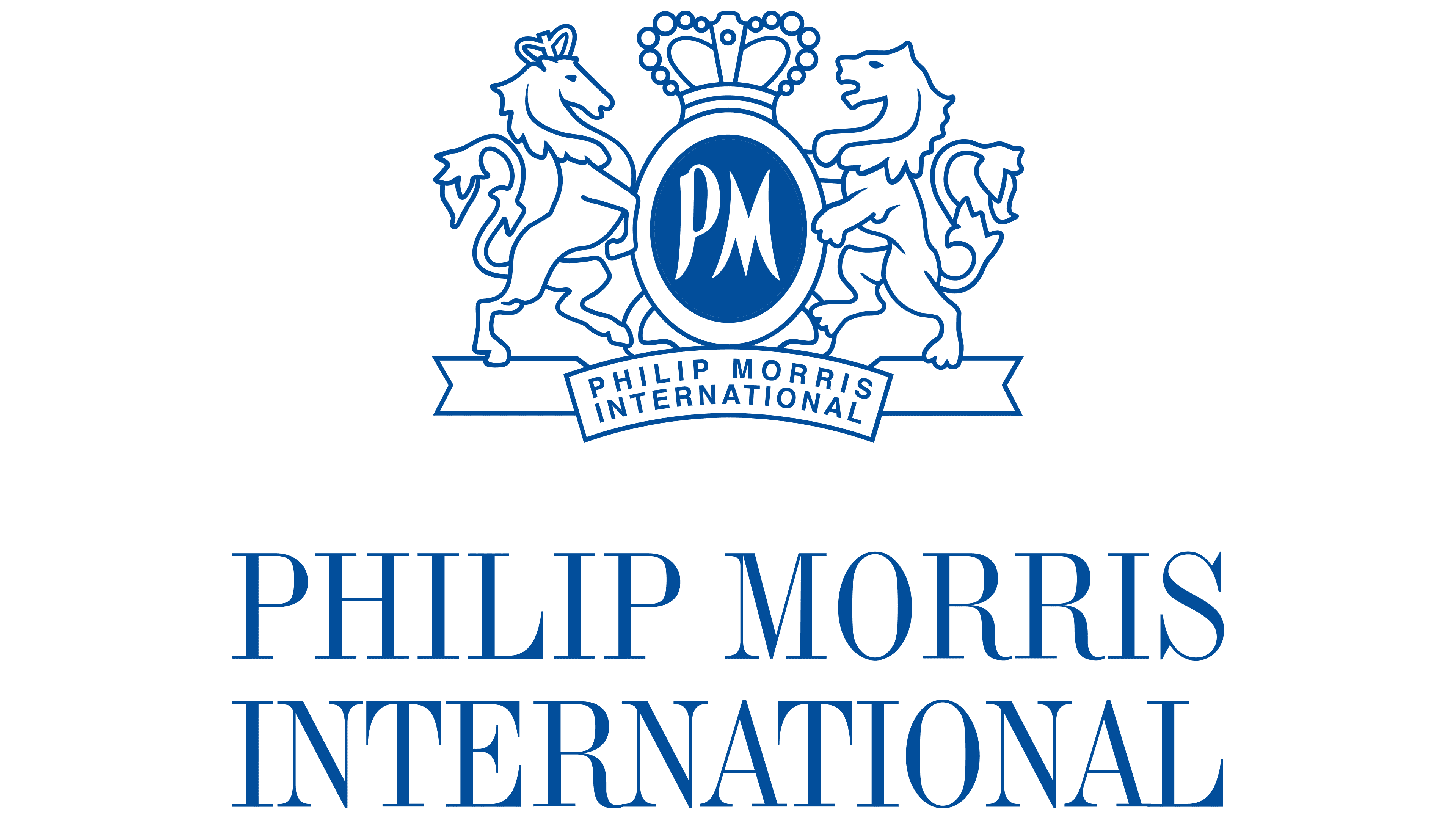
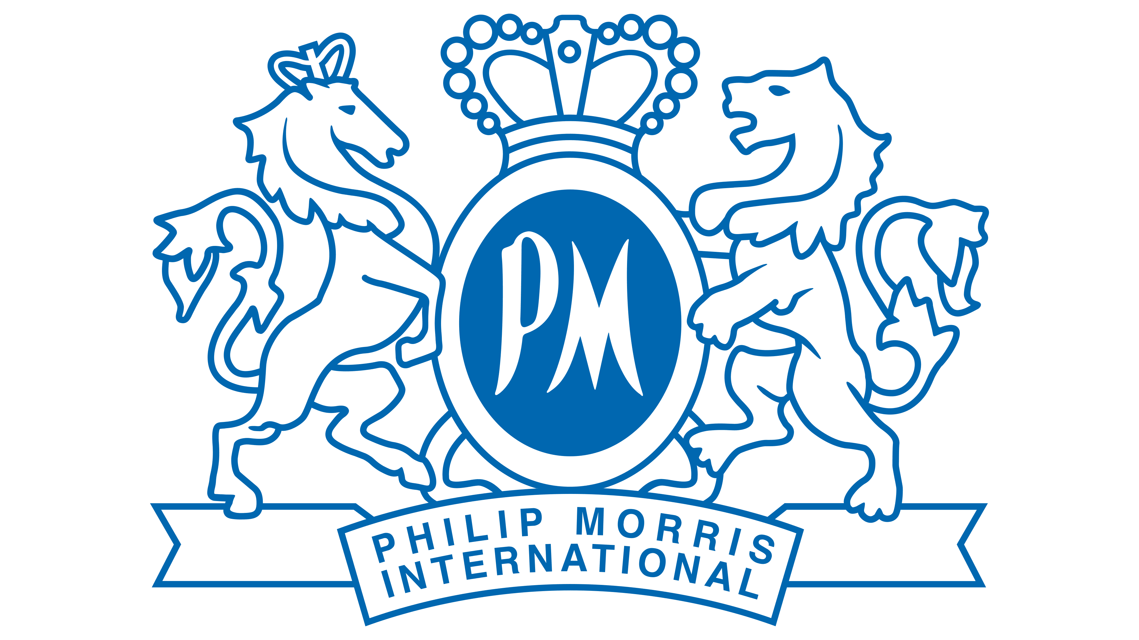
2008 – today
![]()
In 2008, FM separated from Altria Group and headed for healthier Ikos products. Therefore, the new logo has become transparent and airy, symbolizing smokelessness.
The new ideals are also symbolized by a vertical line that separates the logo’s schematic image on the left from the company name on the right. Morris enters a new, modified life. Her ambition is to make the air cleaner. The thinner lines of the inscription also demonstrate this.
Font and Colors
As the company matured, it moved from black-and-white logo designs to luxurious gold-and-purple designs. The change of scale reflected quality, wealth, and growth.
The modern Philip Morris logo features a mix of blue and white. Blue and white are light, associated with the sky, clouds, and air, creating a dreamy impression. Gamma is fully aligned with the company’s new goals.
The inscription font is Industrial 736, Std Roman.