The Philippine Airlines logo reflects the company’s national identity and pride in its cultural heritage. Symbolic images and dynamic forms highlight the brand’s connection to the aviation industry. The emblem represents freedom, lightness, and the aspiration for great heights.
Philippine Airlines: Brand overview
Philippine Airlines (PAL) embarked on its journey on February 26, 1941, thanks to a group of visionary Filipino businessmen led by Andres Soriano, and this pivotal moment marked the birth of Asia’s first commercial airline, laying the foundation for the Philippines’ aviation sector.
During World War II, the company’s operations stopped due to the Japanese occupation of the Philippines, which saw the company’s assets seized and activities suspended. This challenging period became a time of preparation for the airline’s post-war resurgence.
Resuming operations post-war, the aviation firm undertook its first commercial flight on February 15, 1946, from Manila to Baguio in northern Luzon. This flight symbolized the airline’s rebirth and the country’s recovery after the devastation of war.
1947, the airline ventured into international skies with its inaugural flight from Manila to San Francisco via Honolulu, utilizing a Douglas DC-4. This 41-hour journey with multiple stops signified the company’s debut on the global stage, paving the way for its evolution into an international carrier.
The 1950s were a period of rapid expansion for the air operator, with the acquisition of new aircraft like the Douglas DC-6 and Vickers Viscount. This growth allowed the brand to increase flight frequency and launch new routes across Asia and the Middle East.
Entering the jet age in 1962, the aviation company became the first Asian airline to operate jet aircraft on regional routes with the introduction of the BAC 1-11. This advancement significantly reduced travel times and enhanced passenger comfort.
The Philippine government nationalized the air carrier in 1970, transforming it into a state-owned entity to solidify its position as the national carrier and guide its strategic development.
In 1974, the company moved its main operations to the newly opened Manila International Airport, now known as Ninoy Aquino International Airport. This relocation marked a significant milestone, boosting the airline’s infrastructure and passenger and cargo transport capacity.
The aviation firm’s fleet modernization continued in 1979 with the arrival of its first Boeing 747, enabling the airline to increase capacity on key routes and introduce long-haul services.
The brand’s partial privatization began in 1992 when a group of investors led by Lucio Tan acquired a controlling stake. This marked the start of a new chapter, significantly changing the airline’s management and operations.
The Asian financial crisis 1998 brought severe financial challenges to the company, forcing it to suspend operations and undergo extensive restructuring temporarily.
After restructuring, the airline resumed operations in 1999, focusing on its core routes and gradually rebuilding its network.
2013, the aviation firm partnered strategically with San Miguel Corporation, attracting substantial investments that fueled fleet modernization and service improvements.
The air operator earned a four-star rating from Skytrax in 2016, acknowledging its enhanced service quality and overall customer experience.
The company received its first Airbus A350 in 2018, facilitating the launch of new long-haul routes, including nonstop flights to New York.
In 2020, the airline initiated a financial restructuring process to navigate the challenging market conditions and adapt to the evolving aviation industry.
Meaning and History
What is Philippine Airlines?
This is the flagship carrier of the Philippines and the oldest commercial airline in Asia, based in Manila. The company offers an extensive route network covering numerous destinations within the Philippine archipelago and key cities in Asia, Australia, New Zealand, the Middle East, Europe, and North America. The carrier operates a modern and diverse fleet consisting of wide-body and narrow-body aircraft, including Airbus A350, Airbus A330, Boeing 777, and Airbus A320, providing a high level of comfort and service for its passengers.
1935 – 1941
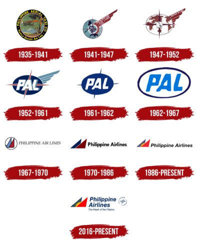
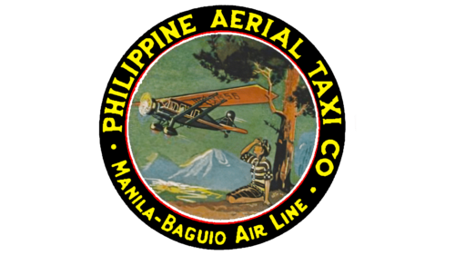
Philippine Airlines had a predecessor – PATCO. The most well-known logo of this company features its full name: “PHILIPPINE AERIAL TAXI CO.” It is positioned in the upper half of a black ring, with the route “Manila-Baguio Air Line” indicated at the bottom, where the airline planned to conduct daily flights.
The two parts of the inscription are separated by small dots, colored in the same yellow hue, and rendered in similar fonts popular during that era. The only difference is that the upper letters have short, sharp serifs, making the brand name expressive and dynamic. The combination of yellow and black is used for text clarity and to emphasize the company’s ambitious goals, as yellow is typically associated with energy and optimism, while black signifies strength and reliability.
The ring frames a circle with the image of an airplane, likely a Bellanca Skyrocket monoplane, one of those operated by the Philippine Aerial Taxi Company. The artists added speed lines like thin white streaks trailing behind the tail to convey its high speed. The plane flies past a tall tree against a backdrop of rocky mountains, depicting a typical Philippine landscape since mountain ranges entirely cover the island nation.
Under the tree, a person in striped clothing sits, watching the airplane. This imagery fills the emblem with emotions: hope, admiration, joy, awe, and anticipation. The logo’s creators aimed to ensure that all these feelings would be associated with the airline.
1941 – 1947
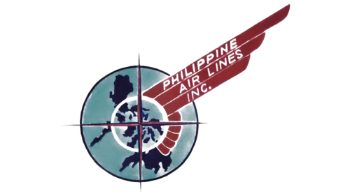
In 1941, several businessmen acquired the Philippine Aerial Taxi Company franchise and rebranded it, changing its name and logo. The Philippine Air Lines was born with a stylish emblem that combines several symbolic elements.
- The dark blue spots represent the Philippine archipelago. While the artists couldn’t depict it with geographical precision, they conveyed the approximate shape of the largest islands. The map illustrates the company’s national scale, showing that it serves all the country’s residents.
- The concentric circles (one large, one smaller) resemble a stylized radar beacon signal on a radar screen, referencing the aviation industry.
- The thin cross in the center looks like four compass arrows pointing in different directions. This signifies the company’s excellent navigation skills and plans to increase the number of routes, as the compass is a globally recognized navigation symbol.
- The maroon lines represent a stylized bird’s wing. The thin feathers associate with flight and convey a sense of lightness, characterizing Philippine Air Lines as a skilled airline.
The full brand name is written on the wing, supplemented by the abbreviation “INC.” It is divided into three parts, so the logo remains uncluttered, with plenty of space and freedom. The thin, white, sans-serif letters support the airy feeling directly related to aviation.
1947 – 1952
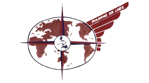
This logo was created shortly after the company began expanding its routes: its planes started flying to neighboring countries and even the United States West Coast. The old emblem with the Philippine archipelago no longer reflected the scope of Philippine Air Lines’ operations, as flights were no longer limited to just a few islands.
The airline included all continents except Antarctica in the logo to highlight its global reach and international level. The world map is depicted in a large oval and colored maroon. Inside it, at the very center, is a small circle with a blue Philippine archipelago, honoring the company’s homeland. Red and blue needles stretch from it in four directions, resembling compass arrows. Now, they symbolize Philippine Air Lines’ global presence.
The wing with seven thin feathers fills the logo with lightness and dynamism. It is associated with high speed, freedom, and movement, conveying the essence of aviation: the ability to fly and connect with the world. The brand name written on the wing looks very symbolic in this context.
1952 – 1961
In 1952, the company introduced a new interpretation of its logo. Designers made it minimalist to match contemporary style and showcase Philippine Air Lines’ commitment to progressive technology. The oval is now fully colored blue, symbolizing reliability and professionalism. Blue is associated with safety, a priority in the aviation industry. The blue oval evokes the vast expanse of the sky or ocean, highlighting the global nature of air travel.
The compass arrows became irregular, subtly creating doubt about navigation accuracy. The asymmetry infused the emblem with internal energy: the oval now appears to move forward, guided by the upper arrow. The maroon color adds dynamism, especially when combined with the pointed shape of the lines. In contrast, the wing has become pale and inconspicuous, serving only a secondary role in showing the brand’s connection to air transport.
The shortened name Philippine Air Lines – “PAL” – is written in large white letters inside the oval. The font of the abbreviation tilts in the same direction as the compass arrows, making the emblem cohesive and demonstrating the company’s readiness to keep pace with the times. Each glyph has wide gray shadows, creating a three-dimensional illusion. The letters overlap, conveying the concentrated energy that drives the brand’s growth and progress.
1961 – 1962
For a brief period, the company used a primitive logo with minimal elements. This logo appeared in the early 1960s when the company entered the jet age. The airline simplified the emblem by removing all elements tied to past aviation symbols, leaving only a simple blue oval with the white “PAL” inscription.
Without shadows, the abbreviation looks flat and monotonous. The designers tried to simulate three-dimensionality by overlapping the letters to give the logo a layered appearance. The font remained bold and italic, which is the best way to convey the company’s reliability and activity.
Four sharp spikes of the same color extend from the oval. These do not resemble compass arrows, though they essentially serve that purpose. The pointed lines give the emblem a threatening and unfriendly appearance. This likely aimed to showcase the airline’s high competitiveness and ambition to secure leading positions.
1962 – 1967
In its pursuit of minimalism, the company further simplified its logo, turning it into a universal symbol that could suit any brand, regardless of industry. The visual simplicity creates a positive impression of Philippine Air Lines, reflecting flexibility in customer service and the convenience of air travel.
The light blue abbreviation is written inside a white oval with a dark blue border. This color scheme aligns with the aviation industry, as all shades of blue are traditionally associated with the sky, while white conveys a sense of space, lightness, and freedom. Combined with the slanted letterforms, PAL is an active and forward-looking company.
1967 – 1970
In 1967, the brand introduced a completely new logo, distinct from all its predecessors. It was designed in a modern style, reflecting Philippine Air Lines’ commitment to progress in identity and customer service. During this period, the company expanded, adding jet aircraft to its fleet and launching new routes.
This persistent energy is conveyed in the elegant italic font with thin serifs for the carrier’s name. The small gaps in the letters “P” and “R” give the text an impression of lightness and weightlessness, resonating with the essence of air travel.
Another aviation symbol is located on the left within a large white circle. The designers depicted a stylized airplane tail as a maroon triangle and a blue polygon with a pointed top. Tail elements help an aircraft maintain balance and make it more maneuverable. By including them in the logo, the company hints at its ability to control every detail – from aircraft maintenance to creating comfortable conditions for passengers.
The maroon triangle resembles a compass arrow pointing north. This is a nod to when the compass, a navigation symbol, was part of Philippine Air Lines’ visual identity. The arrow represents the idea of travel, freedom, discovery, and reaching new horizons. The wordmark and emblem are unified by the black color used for all the letters and outlines. This color emphasizes the brand’s serious and reliable nature, instilling confidence in its clients.
1970 – 1986
Along with the new name, PAL received a modernized logo. The designers emphasized the “Philippine Airlines” inscription with bold lettering to highlight the importance of the company, which connects the Philippines with the world. The straight letters convey a sense of confidence and strength, while the smooth curves demonstrate the brand’s flexibility and readiness to embrace progressive ideas. The curves create a sense of movement, reflecting the very essence of the aviation industry. Overall, the style of the inscription has a powerful visual impact, presenting Philippine Airlines as an experienced and professional carrier.
The stylized airplane tail was simplified. It is now formed by simple geometric shapes: a large maroon triangle and a small dark blue trapezoid. It is intended to look like two triangles overlapping each other. The new emblem resembles an airplane’s tail assembly, making it a symbol of balance and stability. The image is no longer confined within a circle but is set in an open white space. This demonstrates that the airline has no barriers – it has endless ambitions and intends to expand its route network.
1986 – today
To create a strong emotional impact, the designers changed the colors of the triangles. The new palette looks refreshing and optimistic: red motivates and encourages action, while blue evokes the sky and sea. Together, they evoke the atmosphere of long journeys, made quick and comfortable by modern aviation. The shape of the geometric figures hints at aircraft, resembling elements of the tail assembly.
The emblem features a yellow sun with long, thin rays. This has great significance for the company because it:
- Reflects the vibrant culture of the Philippines and the beauty of its landscapes.
- References the national flag, which features a sun.
- Associates with air travel.
This universal symbol aims to showcase the brand’s cultural and national heritage. The sun adds a positive emotional touch to the logo, filling it with optimism, confidence, and vitality, all to build trust with passengers.
The inscription “Philippine Airlines” became elegant and dynamic as the designers used a new cursive font. Increased spacing between the letters gives the logo a light, airy feel associated with ease, freedom, and open skies.
2016 – today
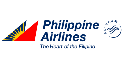
The logo has been enhanced with new elements that reflect the brand’s significant ambitions. The slogan “The Heart of the Filipino” suggests that PAL is the leading airline in the country, earning this status through extensive experience. The slogan is styled in the same cursive font as “Philippine Airlines,” adding dynamism.
The energy in the text matches the company’s field, where speed is paramount. The text is dark blue, referencing the sky where airplanes fly and the ocean surrounding the Philippine archipelago.
On the right, a wavy pattern is surrounded by a crescent and the word “SKYTEAM.” The pattern and crescent symbolize active movement, development, and potential, while SkyTeam represents the global airline alliance that Philippine Airlines has joined. All alliance members use this round emblem to confirm their membership.
The most recognizable symbol of PAL is the geometric abstraction of a red triangle and a blue trapezoid with a stylized sun. This can be interpreted in multiple ways:
- For most passengers, it represents part of an airplane’s tail assembly. It’s implied that another triangle, white and without an outline, is between the protruding ends of the colored geometric figures. This abstract design emphasizes the company’s involvement in air transportation.
- The red, white, and blue pattern can be seen as a reference to the Philippine national flag, as it shares a similar color scheme. The yellow sun, taken from the flag with slight modifications, is intended to evoke associations with national symbols, showcasing the company’s patriotism, authenticity, and national pride.
In aviation, the sun is used for navigation and helps pilots orient themselves. Culturally, it holds significant meaning for both the brand and the country. Like on the national flag, the eight thin rays represent freedom and the eight Philippine provinces that played key roles in the fight against Spanish rule.
Font and Colors
The Philippine Airlines logo features the company name in italicized dark blue font, adding sophistication and elegance. This style underscores the airline’s commitment to high-quality service. Beneath the name, the slogan “The Heart of the Filipino” appears in a slimmer font, highlighting the company’s connection to the people and culture of the Philippines.
The logo’s colors carry symbolic meanings. The dark blue signifies reliability, stability, and professionalism. The bright red triangle symbolizes energy, passion, and dynamism. The yellow sun in the center of the dark blue triangle represents optimism, joy, and the vibrant spirit of the Philippines.
The combination of font and colors blends sophistication with modernity, conveying the airline’s core values and character. The italicized dark blue text represents trustworthiness and excellence. The vibrant red and yellow elements introduce dynamic and positive energy, symbolizing the airline’s forward-thinking approach and dedication to passenger satisfaction.
The logo’s design elements create a cohesive and meaningful visual identity. The italicized font adds a sense of motion and progress, while the colors convey a balance of professionalism and enthusiasm. The dark blue text paired with the bright red and yellow triangles ensures that the logo is visually striking and rich in cultural significance.
