Thanks to the redesign of the entire brand style, the Philips logo has gained expressiveness and attractiveness for the customer. The text block of the logo is focused on minimalism, and the name, symbolizing the development of confidence and stability, is a demonstration of quality and style.
Philips: Brand overview
| Founded: | 15 May 1891 |
| Founder: | Gerard and Anton Philips |
| Headquarters: | Amsterdam, Netherlands |
| Website: | philips.com |
Meaning and History
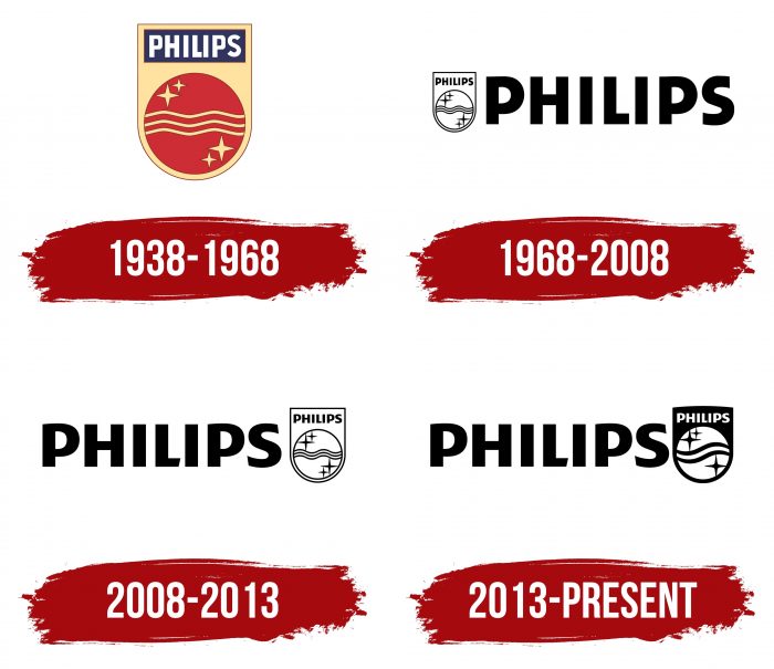
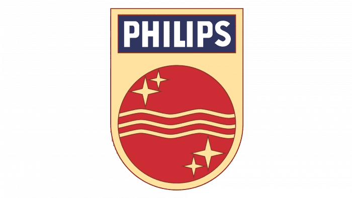
Philips was founded in 1891, but its first known logo dates back to 1938. It is based on an earlier version, which was introduced around 1925. Johan and Kalf van der Ley designed it. Johan decorated the emblem with shiny four-pointed stars, which he associated with electric light, and Kalf added wavy lines – sound waves moving through the air.
What is Philips?
Philips is the shortened name of the Dutch company Koninklijke Philips N.V., founded in 1891 by Gerard and Frederik Philips to produce electric light bulbs. Today, it is a major international conglomerate manufacturing electrical equipment. The company’s priority is the production of modern medical devices and related goods. The company’s headquarters are in Amsterdam, Netherlands.
1938 – 1968
One of the old Philips logos has an unusual shape: a vertical rectangle (at the top) smoothly transitions into a circle (at the bottom), forming a golden rectangle. Against this background, other elements are depicted: a blue horizontal rectangle with the inscription “PHILIPS” and a red circle with three wavy lines and four stars.
1968 – 2013
Without hesitation, the emblem creators removed all details and left only the blue word “PHILIPS.” In 2008, the graphic part of the logo moved to the right.
2013 – today
The 2008 redesign turned out to be less global. The developers slightly adjusted the font, making the “L” and “S” vertical ends. The graphic symbol was made inverted. Where there was black, it became white and white-black. Thanks to this, the emblem became more expressive and attractive.
Philips: Interesting Facts
Philips, also known as Koninklijke Philips N.V., is a big company that’s done a lot in the electronics and health worlds.
- Starting Out: Philips began in 1891 in Eindhoven, the Netherlands, thanks to Gerard Philips and his dad Frederik. They first made carbon-filament lamps and became big in Europe by 1914.
- During World War II: The Philips family had to leave the Netherlands because of the war. The company tried hard to keep its Jewish workers safe. Sadly, Philips’ factories were bombed, stopping production for a while.
- Light Bulb Innovations: Philips has been making new types of light bulbs for more than 100 years. They made the first Philips light bulb in 1892, energy-saving bulbs in the 1980s, and LED lights in the 2000s.
- Healthcare Advances: Philips is now a leader in health technology. They focus on making equipment for hospitals and health care, like machines that help doctors see inside the body and tools to monitor patients.
- Creating the CD: In the 1980s, Philips and Sony made the Compact Disc. This changed how we listen to music and store data, giving us a better and longer-lasting option than records and tapes.
- TV Innovations: Philips made its first TV in 1925 and has since created many TV improvements, like better color TV technology and Ambilight, which makes watching TV more fun by adding lights around the screen.
- Exploring AI: Philips works extensively with Artificial Intelligence, especially in health care. They want to use AI to help patients get better care, make hospitals run smoother, and offer health care that’s just right for each person.
- Going Green: Philips wants to be good to the environment. They’re working not to harm the planet, make products that are safe for nature, and set goals to use more green products.
- Around the World: Philips works in more than 100 countries and tries to understand people’s needs in different places.
- Focusing on Health: In 2016, Philips focused only on health technology. They sold their other businesses to develop healthcare products and services.
Philips started as a small company making light bulbs and has become a health technology leader. They’ve improved many things—from how we see at night to how we listen to music to how doctors care for us.
Font and Colors
Against the background of the old colorful logos, of which Philips had quite a few, the modern version looks strict and democratic. There is nothing superfluous in it – only the company name, designed in the spirit of minimalism.
For writing the word “PHILIPS,” designers used a sans serif font. The latest version differs from the previous one in the trimmed edges of “S” and “L.” Since 1968, the color palette has not changed: the combination of blue and white has long become an integral part of the corporate style.
Philips color codes
| Tang Blue | Hex color: | #0b5ed7 |
|---|---|---|
| RGB: | 11 94 215 | |
| CMYK: | 95 56 0 16 | |
| Pantone: | PMS 2728 C |
